As a new exhibition from art publisher MACK opens in Melbourne, its founder talks us through five of his favourite art objects
“The nature of publishing is that you get really excited if you go into a shop and see a couple of your titles on display,” Michael Mack, the founder of the eponymous art publishing house, tells me over the phone. There’s a charm to his admission: since MACK was first established in 2004, then as a branch of Steidl (it became fully independent in 2010) it has built a reputation industry-wide for creating the most spectacular, considered and conceptually rigorous art books around. “It’s also the nature of publishing that ultimately it’s about the author’s work, and their ideas, and being the translator,” he continues. “So, occasionally to have the opportunity to do an exhibition, which shows a particular, subjective curatorial approach, which is basically what our publishing has been since it began in 2004, is wonderful.”
Wonderful it is – and not least becasue an exhibition creates an opportunity to place those books which, special though they may be, have not all seen huge commercial success, into the limelight where they belong. This show, The Art of Publishing: An Exhibition of MACK Books, takes place at Melbourne’s Centre for Contemporary Photography until January 20, 2018, and focuses on just a sample of MACK’s longstanding practice – featuring publications by the likes of Roe Ethridge, Bertien van Manen and Torbjørn Rødland, among many others.
It is a collaborative process, Mack emphasises. “We work in this very particular space of making book objects, pieces of art. People have to want to work in that space – not just to want to achieve the best catalogue for sale of their work through their gallery… Often books are driven by the market, rather than by the idea. I think what we’ve always tried to do is reverse that – put some faith in the ideas of the authors and develop those in the best ways that we possibly can.” Here, he selects five of his favourites from the show.
1. Jens F. by Collier Schorr, 2005
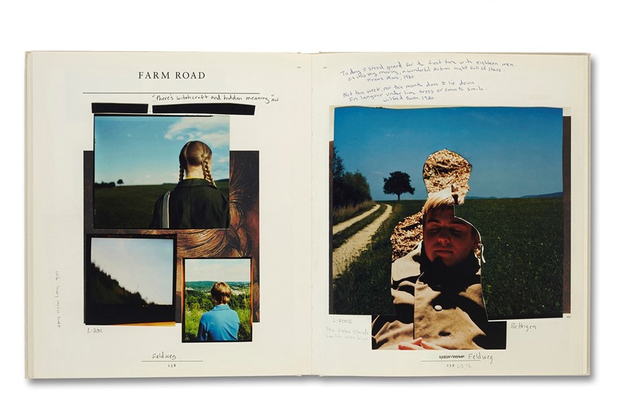
“This is a book from 2005 that I did with Collier Schorr, called Jens F. It’s an example of a project which we made with a great deal of difficulty because of the production challenges. When it was published absolutely nobody bought the bloody thing – and now it’s acclaimed as being one of the great books of all time.
“It was actually really quite original, as Collier is. She had this idea to remake Andrew Wyeth’s series of drawings of one of his models, Helga; she wanted to remake them using her androgynous models, and investigate the notion of the male gaze and represent it through her particular practice, which is one in which specific power positions are questioned consistently. So she made photographs and then overlaid them on the pages of the original book, which was published by Abrams. Our book took those pages and remade them into another, if you like, so it’s kind of a second phase. It’s a book of a book.
“[Collier Schorr] was ahead of what people were considering important and significant, and that’s what she’s always been focused on. She’s not only incredibly smart, she’s a brilliantly intelligent bookmaker. Which, again, is the highlight of what I’ve been fortunate to do – to find people for whom the book form in itself is kind of a destination. The book form is kind of the idea that they want to work with – not simply to create a catalogue of their photographs. She knew that this could not be any other shape or form.”
2. A Shimmer of Possibility, by Paul Graham, 2007
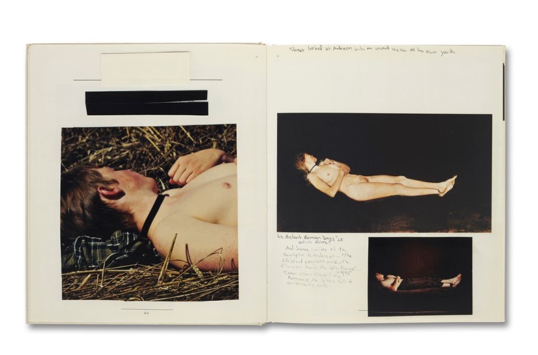
“Again, this was a real challenge to make in production terms – primarily because it’s actually not one book, it’s 12. I think in many ways working on this with Paul, which we did for a couple of years, defined many of my ideas about bookmaking, because I learned from him. And I learned from Gerhard Steidl, as well, working with him on the process. Paul was making these photographs whilst travelling across America, and whilst he was making these photographs, he was thinking about the book. He was thinking about ‘how will this work in sequence? How will this work in the structure?’
“What he did was something unusual: he took the idea of a single volume and unwrapped that – he actually made these sequences of small photographs, which were much more like film stills, and linked them together through an apparently haphazard layout in the structure of the book. There’s no grid. One of the volumes is eight pages long and has just one image in it. One of his longest is 64 pages long.
“The idea in terms of the photographs is that nothing actually happens – it’s about the celebration of the reality of existence, in a quite solipsistic manner, and the notion of valuing these seconds, these moments. There’s a guy using a lawnmower in a municipal area in America in one. He’s just mowing the lawn, and it’s a very kind of boring moment in theory, but the sun’s out, and the raindrops are caught backlit, and it becomes this extraordinary moment – it’s all built up through this sequence of quotidian activity that achieves one perfect photographic moment, and then moves on. It’s that very simple idea of the work moving away from having to be something spectacular.”
3. ZZYZX, by Gregory Halpern, 2013
“The third one is a bit of a jump, to 2013. It was a project with Gregory Halpern, an American photographer, and it’s called ZZYZX. I think the reason I chose this is that it’s an illustration of another element of what I feel so fortunate about, which is this collaboration that I’m involved in with artists, photographers, writers. We had a fantastic process with this.
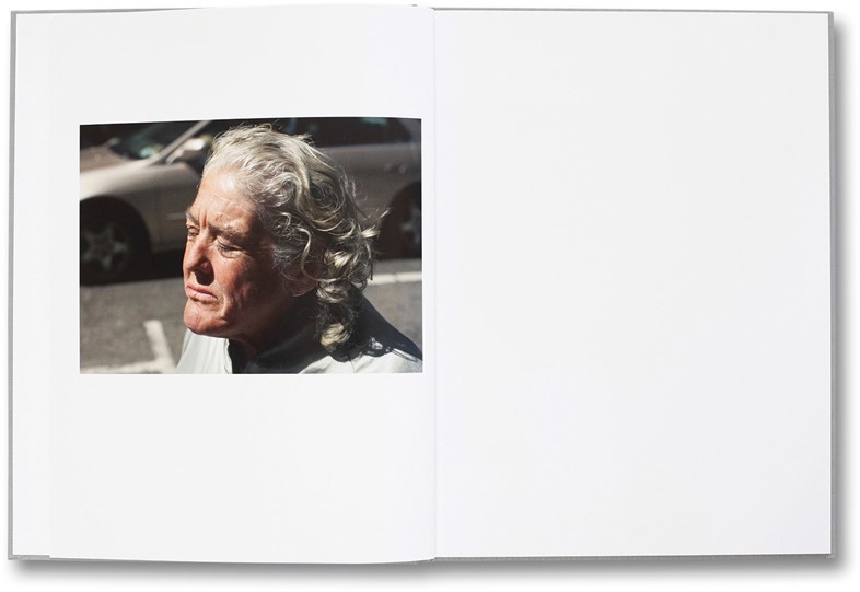
“He lives in upstate New York, and I live in London. We’d met a couple of times, but the majority of work was done digitally, if you like, and yet it was an incredibly fluid process in which he’d propose an edit, and then we went back with the suggested edit, and then he came back with another one. The design was one in which we went round and round in circles endlessly until we found this fragment of an image, which then became a very abstract cover.
“The photographs are an extraordinary series of images about Los Angeles – about the nature of street life in Los Angeles, or the lack of it, unless you’re a homeless person, which is very hidden but it’s a huge part of the culture there. It really is the grime at the edge of the glitz. He manages to bring this forward in a very human way, without presenting these people as being degraded, or having lost any moorings – it’s a very gentle portrayal certain people’s lives in Los Angeles.
“I think the success of the book – it was hugely successful – but is typified by the fact that we got to late one Friday night my time in London, when we agreed that the edit was absolutely perfect. We were really happy with the sequence – it was absolutely ideal. And then on the Monday morning I got in and there was an email from him, and he had made one more little change. He took an image out, and moved one image around, and it made it about ten times better. It was just his willingness to go back, and reconsider, and attempt to improve on the sequence, and just be willing to challenge himself, if you like. That was for me the great success.”
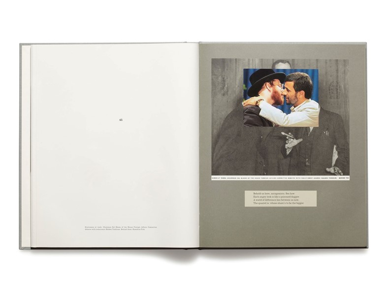
4. War Primer 2, by Adam Broomberg and Oliver Chanarin, 2011
“Adam Broomberg and Oliver Chanarin are our longterm collaborators. We’ve worked on many projects over the years, but perhaps the most extraordinary of them would be a book called War Primer 2, which is based on a Bertold Brecht book which was published in 1955, in which he brought together newspaper clippings from across the First and Second World Wars that he’d been collecting. He pulled them together with these epigrams, he referred to them as – captions basically – in which he was playing on the ways in which photography is used as propaganda to control the populus. In a very Brechtian way, it’s lacerating.
“Adam and Oli came to me with the idea that they wanted to do a version of that War Primer, and call it War Primer 2, but very specifically updated by images in contemporary media – they’re from the internet, widely available – of the wars in Iraq and Afghanistan. So, to take accessible images and to put them into a book.
“We moved towards this idea that we were going to make the usual run of three or four thousand copies of an art book; they download the images from the internet, and I’d meet with them, and we’d put them into the book and print it. We met here on the big issue, which is the fact that we couldn’t license many of the images, mainly because actually many are licensed by the soldiers through Associated Press. Morally I felt that that was completely unacceptable. It’s completely different if it’s a photographer making his living, but I don’t think those pictures deserve any payment. So we made a small edition of 100 copies by hand which sold out immediately, and won them the Deutsche Borse Prize.
“It was successful in that vein but it wasn’t in the sense of what I’m primarily interested in, which is not to make expensive art objects, but to make widely available the ideas of the authors. That’s largely why we're publishing a paperback edition of War Primer 2, which will coincide with an exhibition dedicated to at the Pompidou Centre in February, to make this important book accessible. Democratic is not the right word, but the idea of a low price point is really important to us, and we work extremely hard on that so that the author can receive a royalty and we can sustain our costs, and we can keep making books we want to make. A single copy has to sustain itself.”
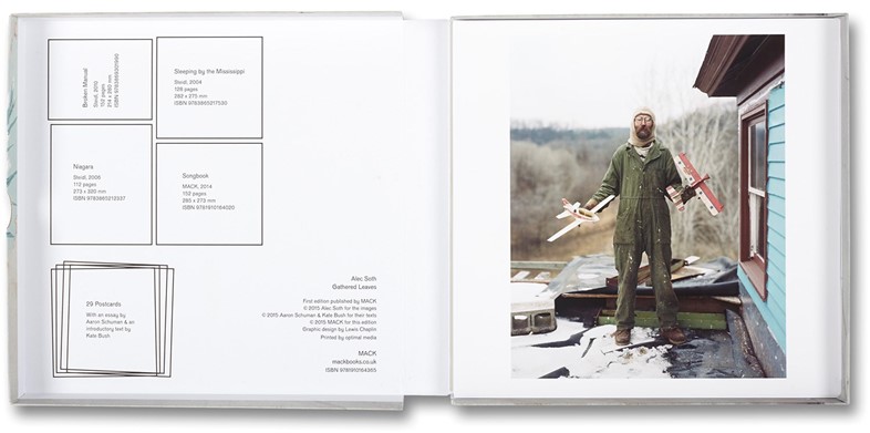
5. Gathered Leaves by Alec Soth, 2015
“Alec Soth is a good example of an extraordinary collaborator – someone who’s very open and willing to work with new ideas and push the boundaries. I make these bold statements, ‘I don’t do catalogues,’ and yet of course I do do catalogues, as here’s an example of a catalogue…
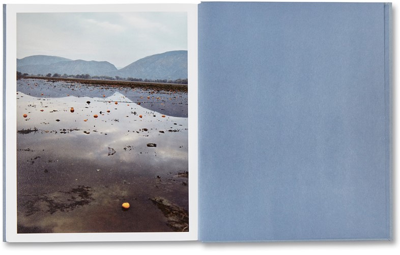
“One of the reasons I think it’s so successful is, simplistically, because he didn’t want to do a traditional catalogue. He’d come up with the idea being based around the four most important books in his career – Sleeping by the Mississippi, Niagara, Broken Manual and Songbook, and he wanted to effectively create a mobile exhibition, which would be on postcards. That was all well and good, except for the fact that I was kind of lying in bed one morning and thinking, well, for it to really work you need to have the full books.
“So crazily we took on the challenge of just making mini versions of them. It’s in some ways gimmicky, and a little foolhardy, and irrelevant by reference to the actual books themselves, but I think it was meant to have a lightness of touch, and be this strange object where you get small versions of these books. And I think it worked.”
