As this month sees the first book to be published on the visionary designer, Saul Bass: A Life In Film & Design published by Laurence King, prolific filmmaker Martin Scorsese shares his admiration of Saul Bass whom he worked with on several films...
"Saul Bass. Before I ever met him, before we worked together, he was a legend in my eyes. His designs, for film titles and company logos and record albums and posters, defined an era. In essence, they found and distilled the poetry of the modern, industrialised world. They gave us a series of crystallised images, expressions of who and where we were and the future ahead of us. They were images you could dream on. They still are...
Saul and I worked together on four occasions. The first time we met was on Goodfellas. I had an idea of what I wanted for the titles, but couldn’t quite get it. Someone suggested Saul, and my reaction was: 'Do we dare?' After all, this was the man who designed the title sequences for Vertigo, Psycho, Anatomy of a Murder, Advise and Consent, Spartacus, Ocean’s 11, and so many other pictures that defined movies and movie-going for me. When we were growing up and seeing movies, we came to recognise Saul’s designs, and I remember the excitement they generated within us: like Bernard Herrmann’s scores, they added a whole extra dimension to whatever picture they were part of. They made the picture instantly special. And they didn’t stand apart from the movie, they drew you into it, instantly. Because, putting it very simply, Saul was a great filmmaker. He would look at the film in question, and he would understand the rhythm, the structure, the mood – he would penetrate the heart of the movie and find its secret. That’s what he did with Vertigo and those spirals that just keep endlessly forming – that’s the madness at the heart of the picture, the beautiful nightmare vortex of James Stewart’s affliction. And so, when I showed him and Elaine [Bass' wife and design partner] Goodfellas, they understood what we were driving at right away: the speed, the flash, the sense of life soaring along and then jumping the tracks."
"Saul Bass. Before I ever met him, before we worked together, he was a legend in my eyes. His designs, for film titles and company logos and record albums and posters, defined an era. In essence, they found and distilled the poetry of the modern, industrialised world."
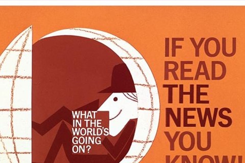
Jewish-American Saul Bass (1920-1996) is arguably one of the greatest graphic designers of our time. Creating some of the most compelling images of American post-war visual culture his ability to transform the most banal of corporate identities into iconic and succinct trademarks was pure genius. Bass’ vision was unfaltering, sculpting the corporate identity and campaigns for everyone from Continental and United Airlines to Quaker Oates and Getty. “The ideal trademark,” Bass explained, “is one that is pushed to its utmost limits in terms of abstraction and ambiguity, yet is still readable. Trademarks are usually metaphors of one kind or another. And are, in a certain sense, thinking made visible.”
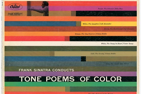
Designing posters and album covers with an incredible wit and graphic simplicity, Bass’ ability to poetically capture a mood and communicate a story have garnered him worldwide “master of design” status. For Frank Sinatra’s Tone Poems of Color, Bass offered his own poem of colour, line and pattern with Sinatra later admiring Bass’ ability to encapsulate “entire films and albums in a few brush strokes.” The strength of his designs remains testament to the fact that they still have resonance; the melancholic mood and streamlined hues of this particular cover artwork would have equal standing among contemporary cover designs today.
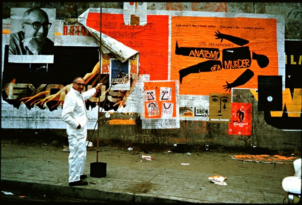
However, it was Bass’ reinvention of movie titles that caused the most impact; elevating the opening of Hollywood films to the prominence of an art form – something no one had ever done before. With a strong idea, directness and complete understanding of the film, Bass’ most notable works include Alfred Hitchcock’s Vertigo and Psycho, and Otto Preminger’s Anatomy of a Murder and The Man with the Goldern Arm. For the latter film, based on a jazz musician’s struggle to overcome heroin addiction (a taboo subject in the mid-50s), Bass controversially animated a black paper cut out of a heroin addict’s arm. Knowing that the arm was a powerful image of addiction, Bass had chosen it – rather than Frank Sinatra’s famous face – as the symbol of both the movie’s titles and its promotional poster.
Saul Bass: A Life In Film & Design by Jennifer Bass and Pat Kirkham features 1,484 illustrations spread over 440 pages and is published by Laurence King and out now.
Text by Lucia Davies


