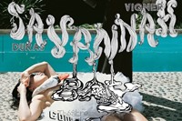
To celebrate their 20th anniversary, the release of a glorious monograph and opening of their exhibition, AnOther presents 20 Ms of M/M (Paris)...
Michael Amzalag and Mathias Augustyniak, better known as M/M (Paris), are two of the most inventive and defining creatives of their generation. Together, they have realised some of the most striking visuals of the past two decades – including artwork for Björk, iconic campaigns for Balenciaga, Calvin Klein and Jil Sander, beautiful catalogues for Yohji Yamamoto, model alphabets, art posters for Sarah Morris and book covers for Hans Ulrich Obrist.
This month sees the release of a glorious monograph, showcasing 20 years of work. "The idea of the book was to create a compass to archive our work, not just in the studio, but also in the world." They also feature in an exhibition at Gallery Libby Sellers entitled Carpetalogue. Described by the duo as a "map of the M/M brain", the exhibition presents a series of elaborately detailed and intricately hand-knotted silk carpets. To celebrate their 20th anniversary, AnOther presents 20 Ms of M/M (Paris)...
M#1. The name M/M (Paris) is pronounced em-em-paree. It is commonly mispronounced as eminem, like the American rap artist.
M#2. Michael and Mathias met as students at Les Arts Décoratifs in Paris. "It was the first day of school...we ended up having a very long and intense conversation in the courtyard. We quickly decided that we wanted to work together", Michael recalls.
M#3. Michael and Mathias have worked from their studio in the 10th arrondissement in Paris for the past 15 years. It has no windows, only a big skylight; Mathias describes it as "a place for contemplation". Before this, the pair worked in a small room in Michael's father's dental practice.
"Mathias is an Aries, Michael is a Gemini – a perfect astrological balance"
M#4. Mathias is an Aries, Michael is a Gemini – a perfect astrological balance.
M#5. The duo describe their work as a conversation. "An image never interests us as such. Its relevance lies in the fact that it contains the sum of preceding dialogues, stories, experiences with various interlocutors, and the fact that it induces a questioning of these pre-existing values. This is what makes for us a pertinent image. A good image should be in between two others, a previous one and another to come."
M#6. M/M (Paris) created an avatar called The Agent, a simple figure symbol which first debuted in 1999.
M#7. M/M (Paris) made postcards from the beginning of their career, two or three times a year. They stopped only when the printer that they used retired in the early 2000s.
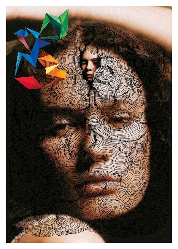
M#8. Key leitmotifs of M/M (Paris) work include alphabets, vibrant colours, hand drawn illustrations, collage, layers, symbols and characters. Their iconic dessin dans l’image (or "drawings in the picture") debuted in the Yohji Yamamoto spring/summer 1999 catalogue.
M#9. Michael and Mathias are charming, generous and enthusiastic about every project they undertake. This is reflected by the number of longstanding collaborators in the M/M (Paris) family.
"Their world is like a labyrinth and there's always a new path" — Nicolas Ghesquière
M#10. "Their world is like a labyrinth and there's always a new path. You don't know where you're going, but it takes you to another world", explains Balenciaga's Nicolas Ghesquière.
M#11. M/M (Paris) designed the cover of Jefferson Hack's curated album SX 70 for Colette.
M#12. Thames & Hudson first approached M/M (Paris) to do the book 12 years ago. The most time-consuming aspect was the captioning of each of the works.
M#13. The book's cover features double-exposure test polaroids of the pair by Inez van Lamsweerde & Vinoodh Matadin during their shoot for Etienne Daho's Corps & Armes album cover in 2000.
M#14. Despite its 528 pages, the book is incredibly light as a result of its soft cover and delicate paper stock.
M#15. The book was designed by Graphic Thought Facility. "They are good friends of ours and we trust them", Michael explains. "We've always been close even though our work is very different. When we were approached to do the book, it took as a while to convince Thames & Hudson that we didn't want to design the book ourselves; we are too close to the work. It was important for us to put ourselves in the position that we have put so many other artists – what it feels like to put our work in the hands of someone else."
M#16. The order of the book is unusual and deeply engaging. Rather than documenting their work in chronological order, the book takes its reader through in-depth conversations with key collaborators and accompanying works, followed by an alphabetical arrangement (ending in M). Editor Emily King interviews Michael and Mathias separately for the start and end. Credits and acknowledgements feature in the well.
M#18. M/M (Paris) have embraced social media, communicating to their worldwide audience via twitter and facebook. #modern
M#19. The M/M (Paris) website is beautiful in its simplicity, reminscent of the early Apple Mac interface circa 1984.
M#20. M/M (Paris) love yellow, a colour that symbolises happiness and joy. Michael owns three pairs of yellow New Balance trainers. It is expected that the pair will post some delightful yellow products on AnOther Loves this week.
M to M of M/M (Paris) is published by Thames & Hudson this month. Their exhibition Carpetalogue, 1992-2012 runs at Gallery Libby Sellers from October 10–December 15, 2012. Click here to view M/M (Paris) Loves.
Text by Laura Bradley
