For LA-born artist Alex Israel, Hollywood is a verb and Los Angeles is his landscape. Taking reference from the 'dream factory' – an industry that still dominates his hometown, Israel has created a new series of works...
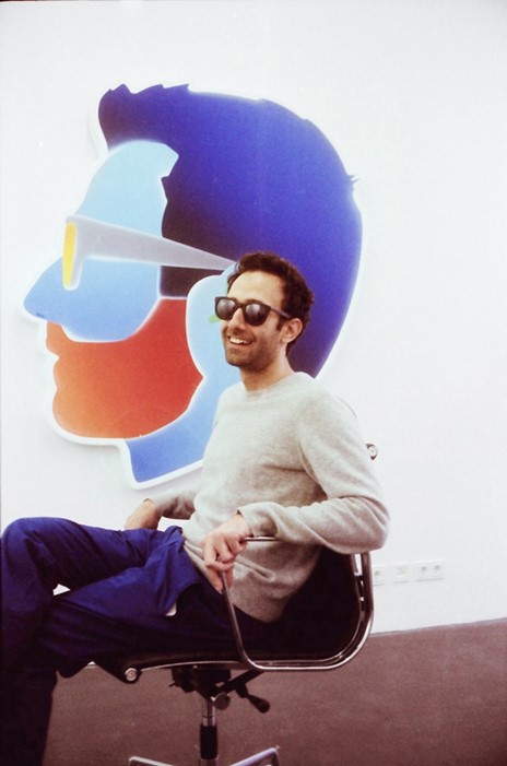
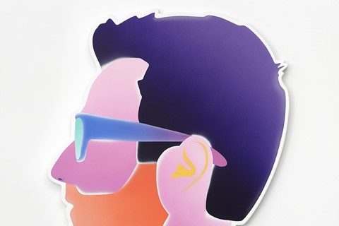
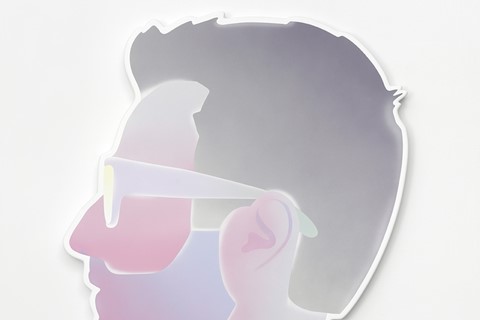
For LA-born artist Alex Israel, Hollywood is a verb and Los Angeles is his landscape. Taking reference from the 'dream factory' – an industry that still dominates his hometown, Israel has created a new series of works that present themselves as an alluring hybrid between self-portraits, stage props and his own brand logo. Currently displayed at the newly relocated Peres Projects in Berlin, Israel worked with Warner Bros. in Los Angeles to construct these large-scale airbrushed flat sculptures. Hung on the walls and framed in the windows of the gallery, Israel's own image is repeated in a series of bright and hypnotic colours, reflecting both the allure and overbearing culture of Hollywood. But Israel has always looked to Los Angeles for the material of his work. A few years ago, he began a video series called 'As It Lays' which took on the format of a TV talk show. In these works, he took on the role of presenter and posed ordinary questions to his LA celebrity subjects, which included Bret Easton Ellis and Marilyn Manson.
During the annual Gallery Weekend Berlin, we caught up with Alex Israel to discuss LA, Alfred Hitchcock and the idea of branding.
Let's begin with the new works, how did the self-portrait series develop?
It all started with the logo for 'As it Lays'. In each episode, at the end of the opening credits my face – basically my video graphic self – turns into a graphic logo. It is done with a very rudimentary computer-generated process of morphing and it was done as a homage to Alfred Hitchcock. I love that moment where Hitchcock became his logo and I thought it would be a great thing to reference. That is how it started.
Then I began using the logo, so it became my Facebook profile picture and then I started thinking about the colours I had chosen for it. I wanted to experiment with different colour combinations and evoke or reference different moods and things that I like. In some cases, the colours that I used for the self-portraits are directly referential to something else – a movie, a painting or something from nature. Sometimes it was to do with influences, but the references were as broad as David Hockney, Ken Price, Gauguin, Avatar or even tropical fish.
Were you interested in the idea of constructing your own image? Staging yourself in a certain way?
I like the shorthand of these images. I like that it reads instantly and it becomes a logo; a logo for a brand that is me. In my work, I have been interested in multiple contexts as outlets for my creative endeavours, they have ranged from the internet, to the gallery, to sunglasses being sold in a shop. So it felt like this image could help the overall project by serving as a context in itself, or as a marker that indicates that the context is me. That it is not any one kind of platform, but that it is all of these platforms. That it is all coming through me.
"I like the shorthand of these images. I like that it reads instantly and it becomes a logo; a logo for a brand that is me."
Something that is often associated with your work is the idea that you use Hollywood as a verb – that Hollywood is in fact the material for your work. When did you begin to think about using it in this way?
I didn't really think about it. I just did it. It is part of my DNA. It is where I grew up. I didn’t grow up with a family that was in the movie business, but I grew up in a city that runs on that business.
But when did your fascination with that culture begin?
It is hard to say it is a fascination. I think I take it for granted. For me, going to the studio is a phrase that can only refer to going to a movie studio. That is why I made my work at Warner Bros. I am also a fan. I like movies and TV.
I am interested in how you've used the gallery space. Particularly with your decision to hang the works in the windows, exposing the backs of the works to passers by on the street...
The space has seven giant showroom windows that face the street. It is amazing for natural light but each window also acts as a frame. I wanted to utilise the framing that is built into the space, so I decided to hang seven self-portraits in the window and I liked the idea of my profile being seen seven times from the street. I really liked that you could see the backs of the works through the windows and that you could see that they were made at Warner Bros. and that each one was stamped with their seal. From the front and the back they look like different objects. The front is so perfect and the back is so rough. It is always an interesting insight to see what is behind an object and how they are made.
Were you tempted to turn the works around?
I liked the idea of the windows almost becoming a fourth gallery wall. It seemed like it would maybe build some intrigue by showing the backs to the street. I like intrigue, it is a key part of building an experience for the viewer.
What materials did you work with?
It is important to know that they are made out of fibreglass and bondo. They are both very common materials in Los Angeles, often used to make cars and surf boards. The fact they are airbrushed further reiterates their materiality. I also made some stickers of the works, which are like the kind of stickers you get when you buy a pair of board shorts. There is a lot of specificity in the materials, the colours and the ephemera. They all relate back to LA and my life there.
Finally, will you return to working with video as a medium again? Continuing the series 'As It Lays'?
I am going to be doing an interview next month with the playmate of the year from Playboy. I definitely think there will be a season two of 'As It Lay's later this year, as well as other video works. So, I will definitely be behind and in front of the camera again.
Alex Israel: Self-Portraits is at Peres Projects, Berlin until June 15.


