As a new book of his posters comes to the UK, we talk to the designer responsible for some of visual culture’s most unforgettable signatures
Now 89, Milton Glaser is one of the foremost graphic designers in the United States, best known for his iconic series “I love NY”. Throughout his illustrious career, which includes solo exhibitions at the Museum of Modern Art and the Pompidou Centre among others, Glaser has elevated graphic design to an artform all its own.
And yet, of course, it’s not an art at all. “Design is one activity, art is another, and they have different objectives,” he explains from his office in New York. “Design is purposeful and intends to accomplish a goal, which is premeditated and defined at the beginning [whereas] what art does is guide you towards avoiding premeditation. It illuminates what is real and what is not real.”
Yet in the hands of a master, there is interplay between the commercial aims of design and the illuminative possibilities of art, and this can readily be seen in Glaser’s posters, of which he has made more than 450 since 1965. In celebration, Abrams will release Milton Glaser Posters on March 27, an incredible compendium of poster art at its best. Here Glaser shares insights into five of his favourite works.
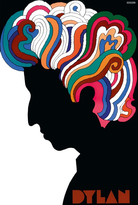
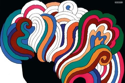
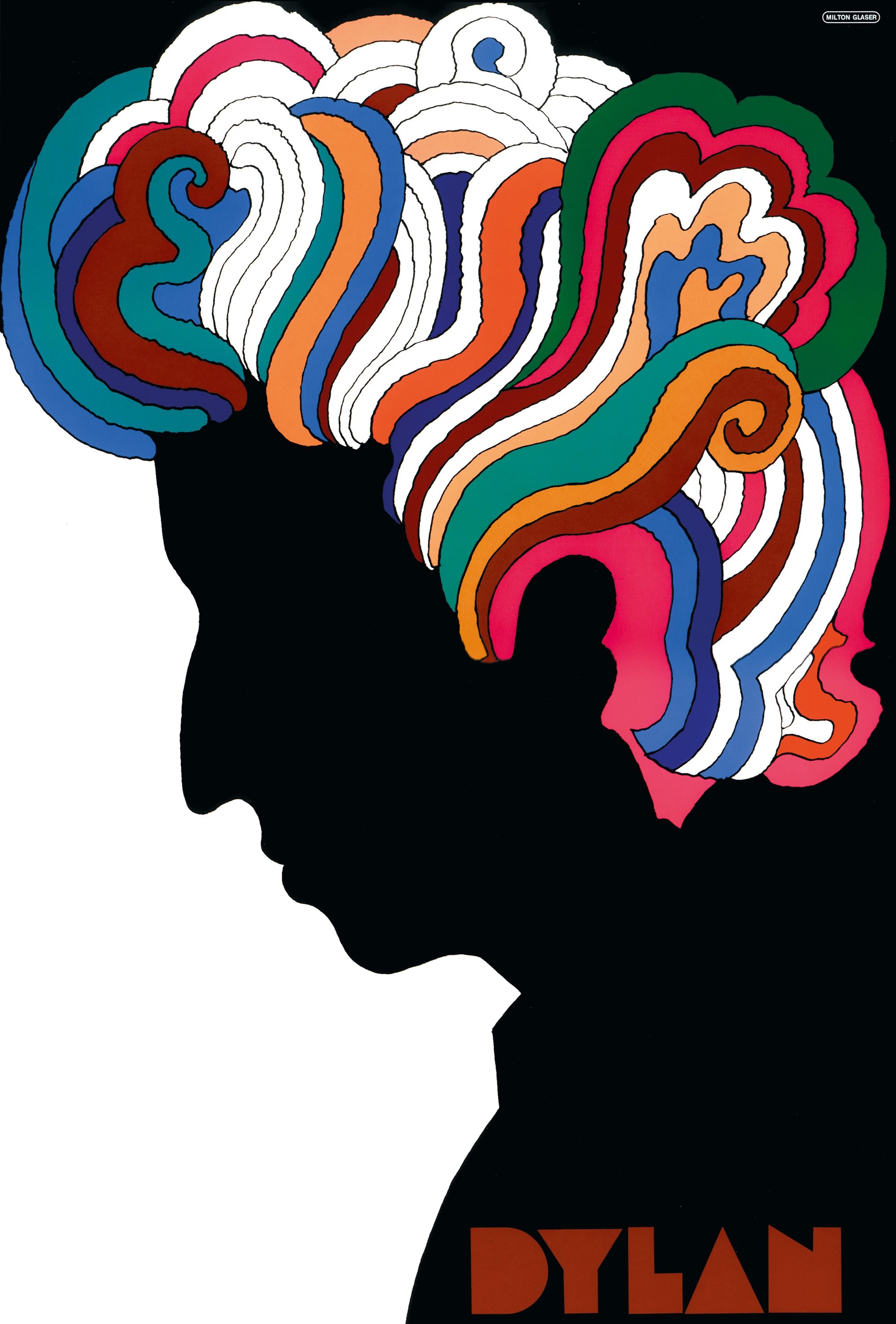
On the Bob Dylan poster...
“When I first saw the Marcel Duchamp self-portrait, I was moved by how extraordinarily memorable the division of space into two simple components, black and white, was. It was as simple as you could go in terms of eliminating complexity. When I got the Dylan poster, the first thing that came forward was this black silhouette, except it was Dylan, not Duchamp.
“I made it more like Dylan by using Art Nouveau. It had all of the feeling I wanted to have about Dylan: complexity, simplicity, power. You never know what is going to happen to the work; you never know if it’s going to be acceptable or interesting to people – but in this case it turned out to be both.”

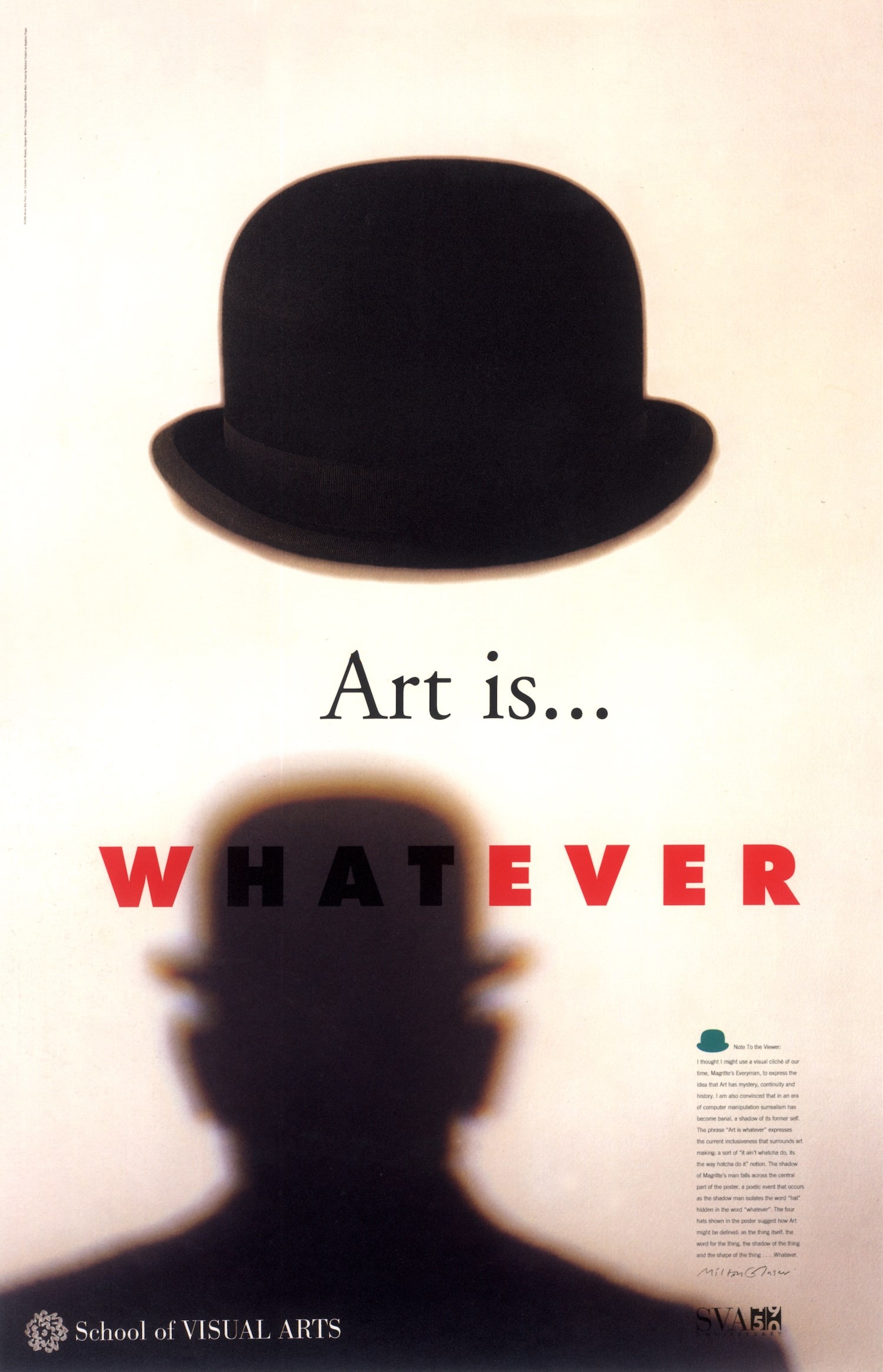
On the Art Is... Whatever poster...
“The line ‘Art Is... Whatever’ came from Silas Rhodes [co-founder of the School of Visual Arts]. When I got the line, I made an observation: that the word ‘hat’ was concealed within ‘whatever.’ Now, that wouldn’t be worth observing except if you were making a point and the point I wanted to make here was that anything could be art if the context was right.
“I thought, ‘How can I make that visible?’ A bowler hat always makes me think of a piece of beautiful contemporary sculpture. So we have the hat as an example of something that was not art to begin with but became art when you observed it.
“Then I have another illusion, of someone casting a shadow on the poster and having the hat obliterate a moment in the word ‘whatever’ where ‘hat’ is emphasised. That’s when you see how the integration of all these forms makes that possible. The most important point is that there are no unrelated forms in the universe and everything shares this relationship.”
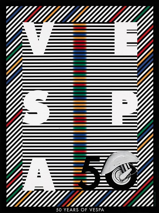
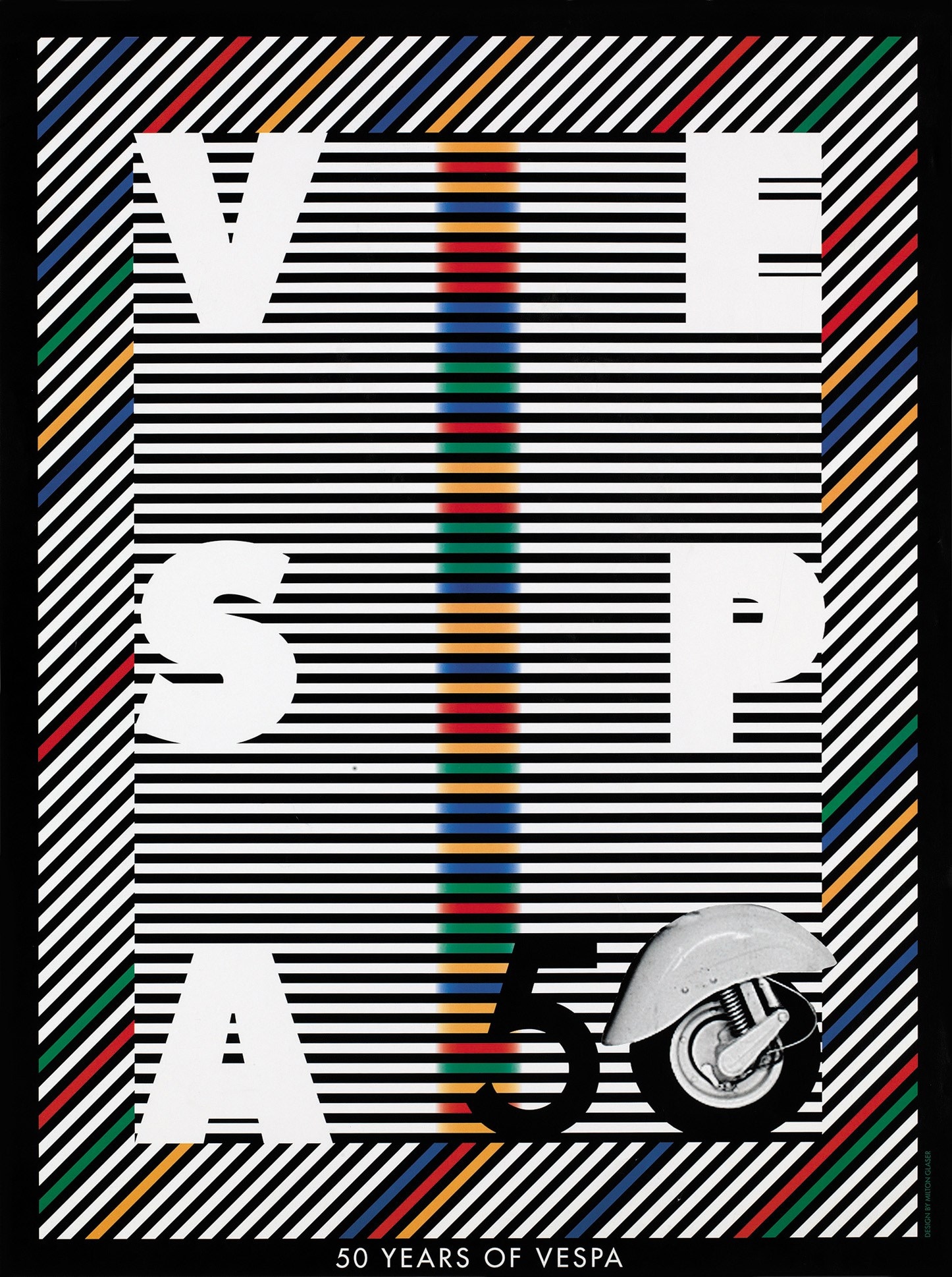
On the 50 Years of Vespa poster...
“Vespa is about moving in space so I thought I would move the stripes so that they were blurred, so that you immediately got the idea that this is what happens when you are sitting on a Vespa: you see the world go by, they get fuzzy at the edges. Then I thought I would take advantage of how well the Vespa was known by treating the type vertically instead of horizontally, so that I challenge you to understand what you are reading or looking at.”

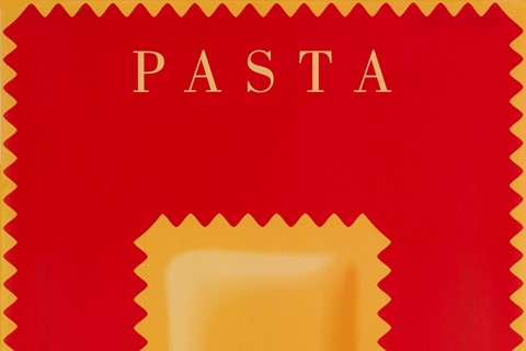
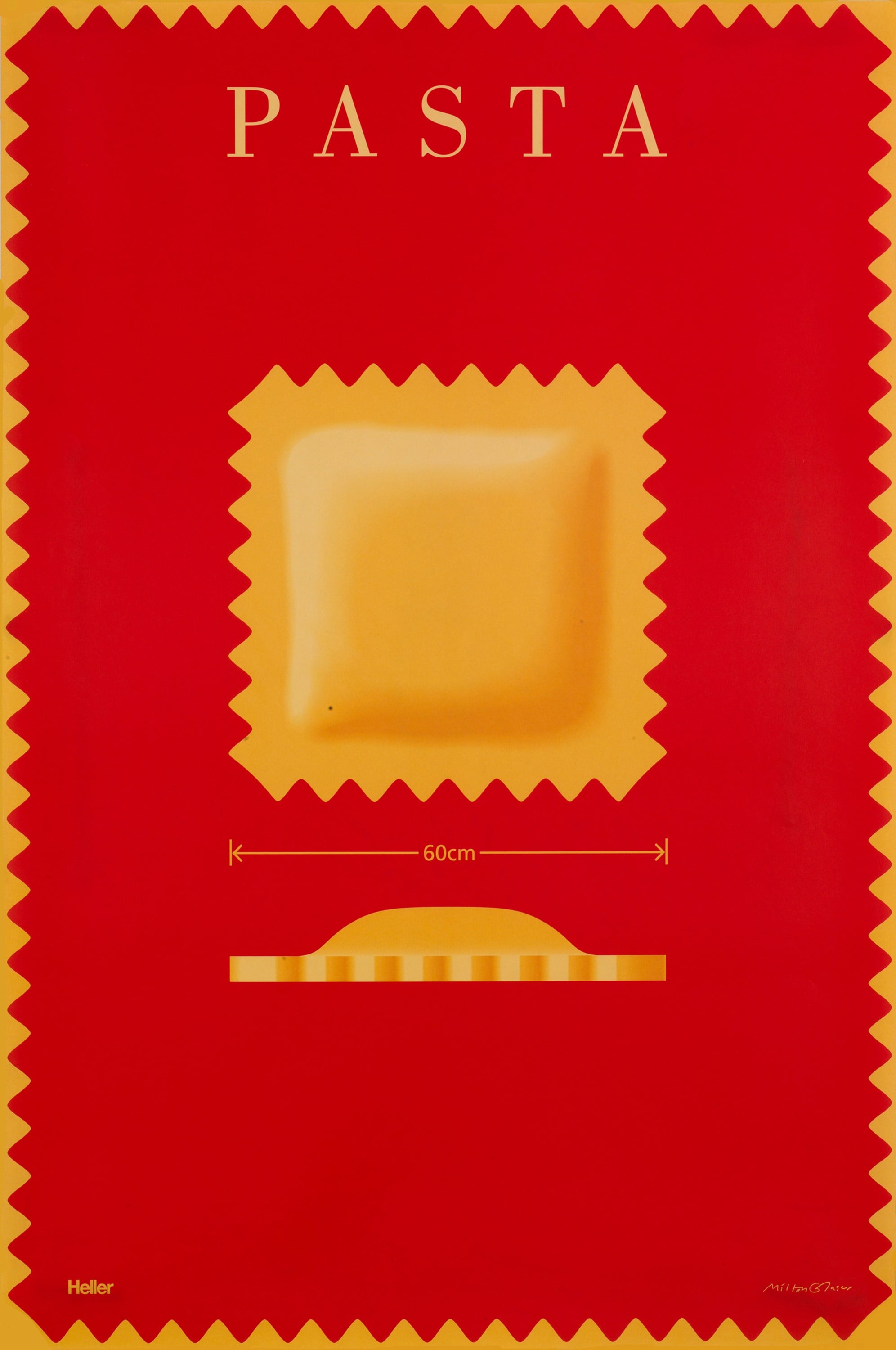
On the Pasta poster...
“Even though it clearly states ‘60cm’ and the information is all in the size, the visual trick here is to take advantage of the saw-toothed jagged edge, which conveys an enormous amount of energy and response. You realise that every sign or change of form or shape has consequences, neurological ones. You look at something and it moves you in ways that you don’t understand.”
Milton Glaser: Posters is out March 27, 2018, published by Abrams.
