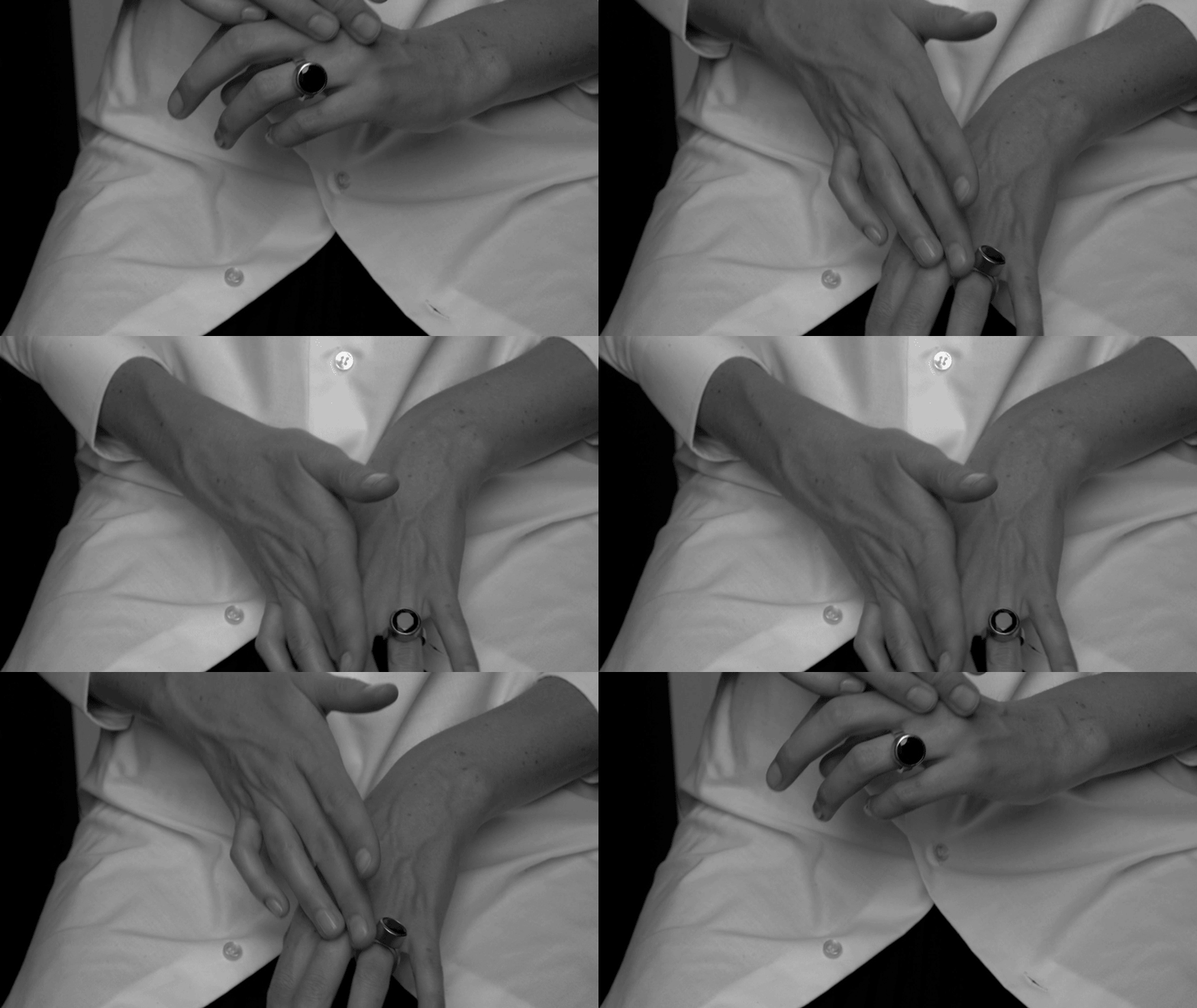
In this modern age, creating beautiful products is simply not enough; in order to aptly communicate brand identity, one ought to have a thoughtfully-curated social media feed, a meticulously shot lookbook, and an intuitive website to boot. This is particularly true when it comes to the domain of jewellery – after all, so much about the pieces, from form to finish, are near-impossible to communicate digitally without appropriate context. How to translate the weight of an ear cuff, the shape of a ring or the sway of a necklace without being able to weigh or touch or swing it? There are several brands that have embraced this challenge with glee, who see their brand identity as an extension of their creativity, and who are using social media, lookbooks and websites with remarkable finesse. In honour of the launch of URiBE's three-week residency at the Amastan Paris Hotel, we examine three contemporary jewellers who are getting it right.
URiBE
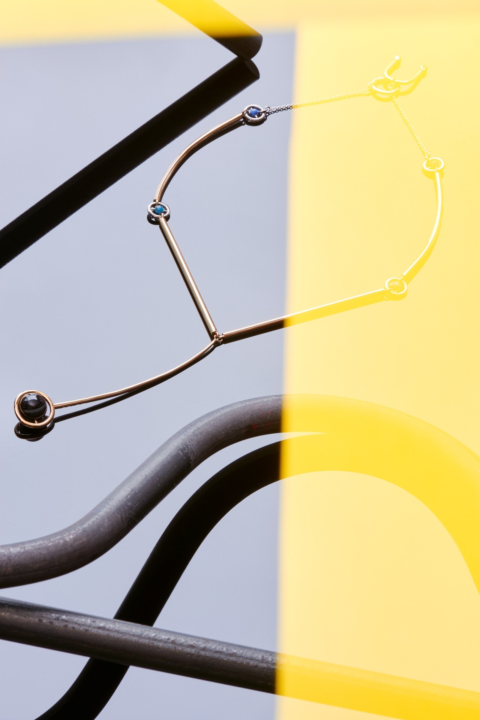
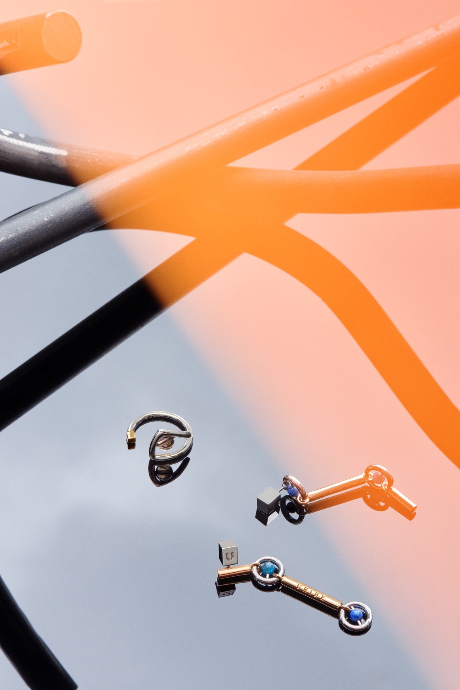
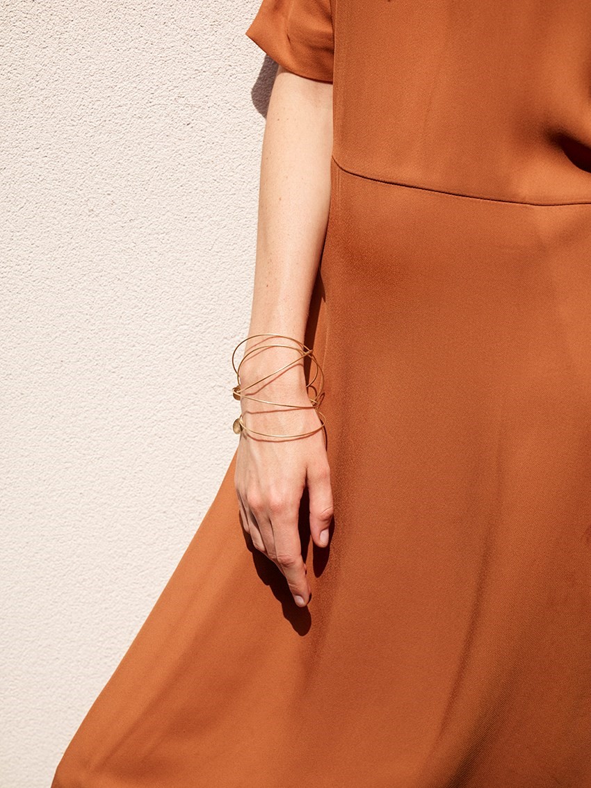
Created by designer Tiffany Phillips and her husband, creative director Sion, URiBE "is defined by [their] backgrounds, heritage, travel and experience as designers and as a couple." Thus the pieces themselves – informed by everything from astronauts (see: Buzz, Aleksei and Laika from A/W15) and to furniture design (this season, it was Mario Botta's chairs) – are a brilliant amalgam of eclectic inspirations but, above all else, are completely covetable. The pieces are sculptural, yes – as Tiffany Phillips explains, "our main objective in design is to create pieces that are as beautiful on their own as they are when worn" – but resolutely wearable; Zaha Hadid becomes an organic yet angular rhodim ring, Neil Armstrong a gold bangle orbited by beads.
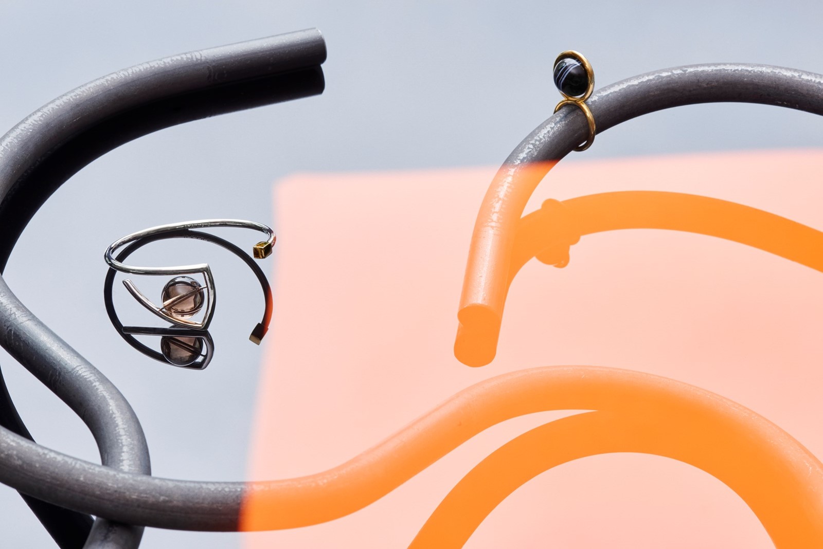
However it is not just the pieces that look fabulous; as one would expect from the pairing of a creative director and a former Chanel jewellery designer, their self-presentation is equally impressive – spanning from a digital journal that catalogues their references to a lookbook shot by Matthieu Lavanchy featuring specially-created steel sculptures by artist Justin Morin. "The cutout shots for buyers and press are helpful for seeing just the pieces and details, but it’s not enough to share the real feeling and mood of what we want to communicate for URiBE," explains Phillips. "Plus, it’s so easy to lose peripheral vision when you are totally emerged in your mood boards, sketches, and pieces, (your universe basically) that it becomes very important and almost imperative to let someone else interpret what you’ve done and expose that with different eyes." The perfect product of creative collaboration.
Lia di Gregorio
Lia di Gregorio is renowned for her refined subversion of the conventions commonly associated with luxury jewellery: concealing freshwater pearls on the inside of a ring rather than proudly displaying it, for example, or sewing her gemstones with a finely-woven gold thread. Having spent her “formativo” years in Rome, where her high school taught her about everything from architecture to sculpture, and later arriving at a Goldsmithing school where she studied the classical techniques of jewellery making, what she manages to create are utterly contemporary pieces embedded with traditional form and proportion: a modern update of time-tested codes.
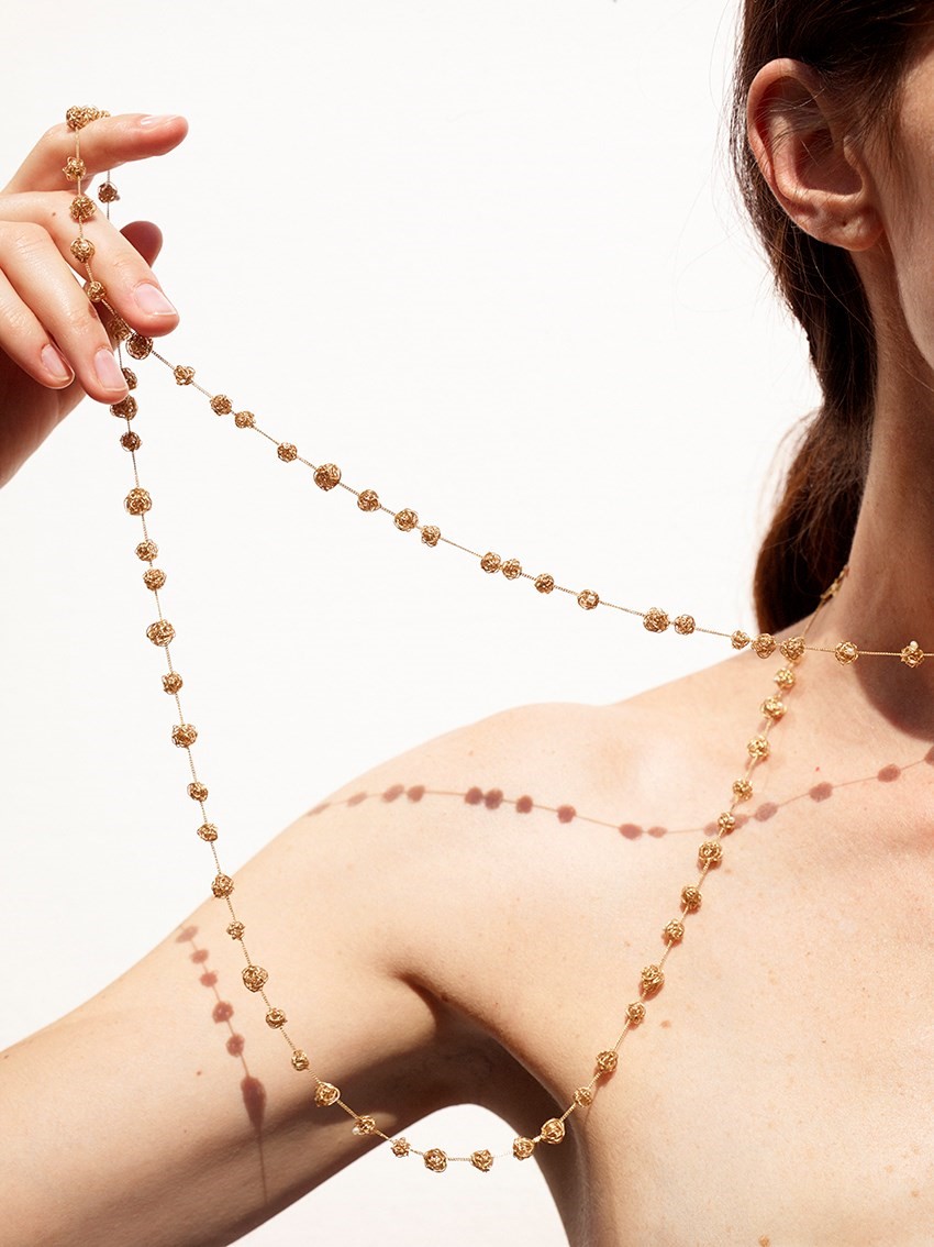
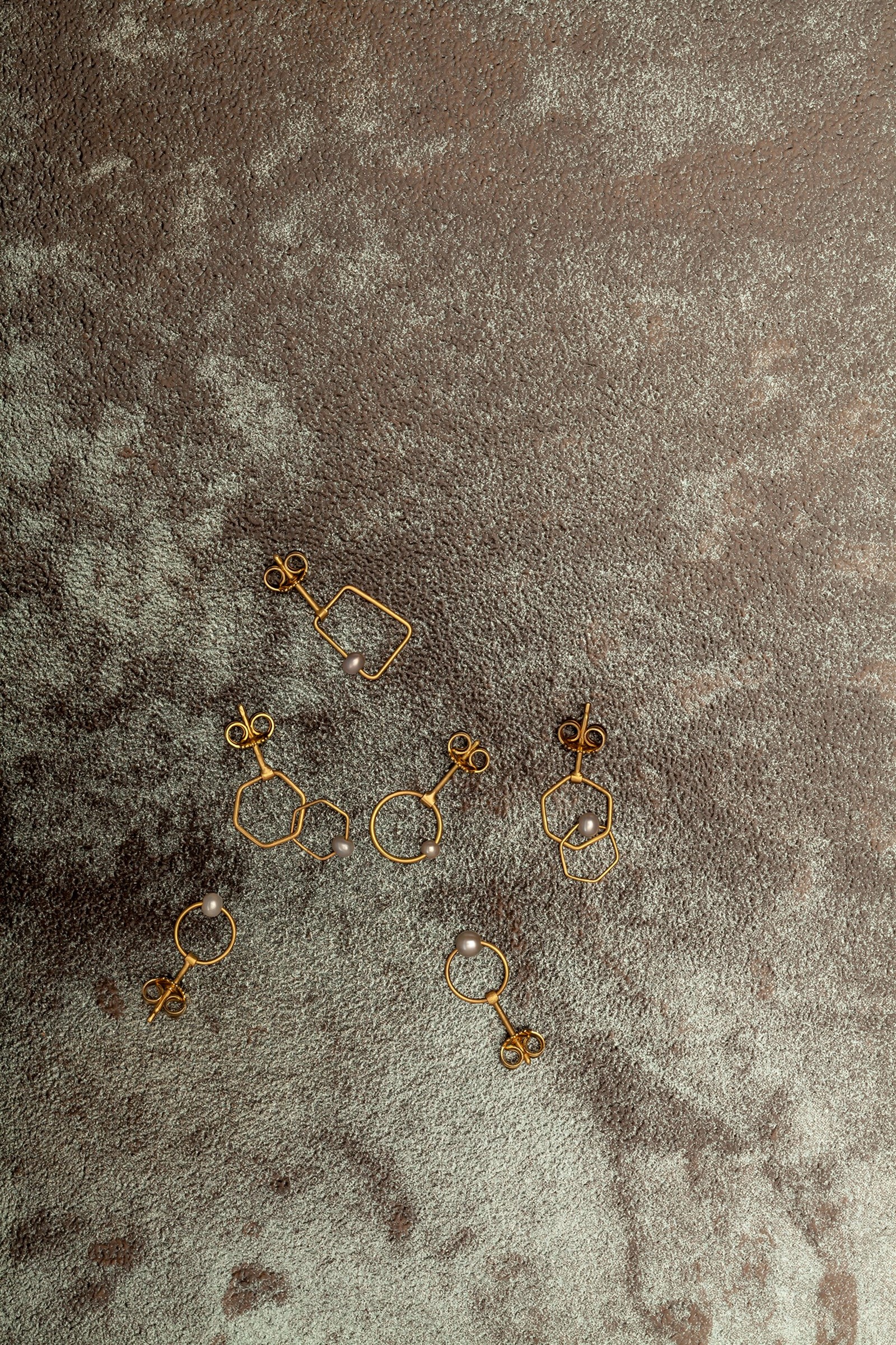
However, this carefully-crafted contemporary aesthetic is something that extends beyond the pieces she creates and into the domain of her lookbooks and digital presence, which are equally artfully designed; “we want to keep a style throughout,” she explains. Art directed by Stephanie Bartes and Karina Frey (the duo also responsible for Double’s redesign alongside working with brands like Céline and Hermès), everything from the brand’s Instagram to the brilliant and strangely captivating GIFs that appear on the website are the ultimate embodiment of clean, modern elegance. A prime example of one’s digital presence matching one’s ethos.
Savoir Joallerie
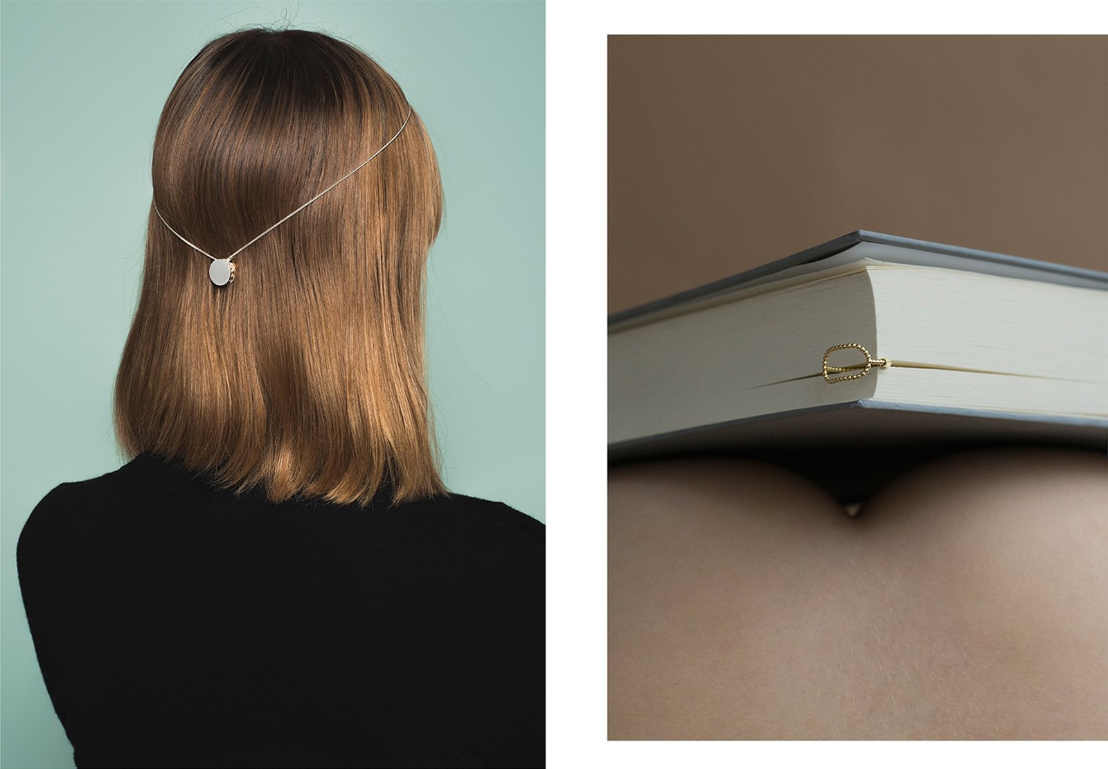
There is something remarkable about Lou Andrea Savoir's eponymous jewellery brand that is apparent as soon as you pick up a piece: it is, somehow, perfect. "Fine jewellery is the most precious, intimate vessel," says Savoir, "We fall in love with accessories that connect us to an aspect of ourselves that is crucial we express," and thus those seeking to connect with something perfectly formed within themselves will find salvation here. Miniscule spheres of gold melt together to form rings, silver chains become fine, fringed earrings, brilliant-cut diamonds peek slightly inwards – and it's all just lovely.
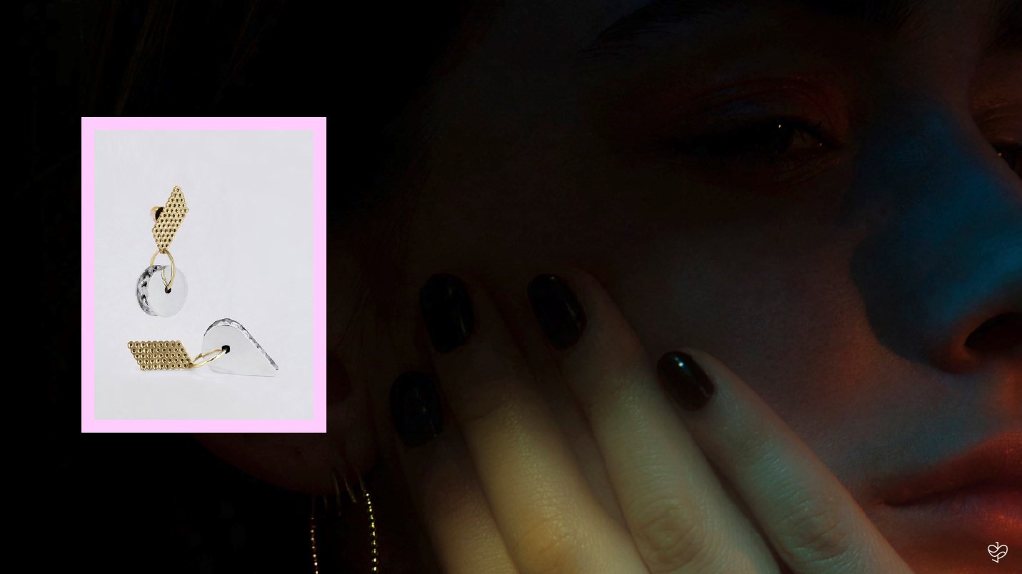
"The brand started out as very conceptual because I come from a post-modern fine arts background," Savoir explains. "But when concept is refined through craft, an emotional connection arises. I started really understanding this through my clients' connection to my work over the years. You can read this evolution pretty clearly through the lookbooks." The seasonal imagery she creates (that which illustrates her lookbooks, but also her digital presence) is a conceptual endeavour in its own right, placing pieces within various fantastical universes while simultaneously retaining a down-to-earth sensibility. Plus, it looks great. Success all round.
