In celebration of Phaidon's rerelease of their covetable Kelly monograph, we present five lesser-known facts about the extraordinary abstractor of reality
Ellsworth Kelly was one of the most important American artists of the 20th century, blazing a trail that was entirely his own with his evocative studies in shape, colour and form, while laying the foundations for many of the principles of Minimalism, Hard-edge painting, Color Field, and Pop Art. As such, he has always avoided ready categorisation: it’s far easier to feel the effects of his bold works – be they paintings, sculptures, drawings or collage – than to explain them, which is exactly as he intended. Rarely has an artist working with abstract forms been so accessible in terms of the pure joy his pieces elicit. But accessible does not equate to simple. As Kelly himself said, "I don't like the word simple. I like easy better. I want [viewers] to forget about the technique. I sweat and worry but I don't want it look like that."
Now three years after his death, aged 92, art publisher Phaidon has rereleased its glorious 2015 monograph of the artist's work. The publication, edited by Tricia Y. Paik and made in close collaboration with Kelly himself, maps his extensive and diverse oeuvre, spanning some of his earliest work from the 1940s through his final pieces (he kept on working in his studio in the leafy New York hamlet of Spencertown right up until his death). Here, in celebration of the book’s re-issue and of the great man himself, we present five lesser-known facts about the extraordinary abstractor of reality.
1. He knew his own mind – and aesthetic preferences – from a very young age
Right from the get-go, Kelly was an astute observer and willful aesthete. One of his favourite anecdotes to recount was how, while growing up in Pittsburgh, the milkman would deliver milk and butter to his family home, leaving it on an inside doormat. One day, a three-year-old Kelly spotted the big block of butter sitting there, and displeased by what, in a short documentary by Phaidon, he termed its “bulk, thickness, three dimension” stamped it perfectly flat with his little feet; flatness would of course become a signature trait of his art.
The artist’s lifelong love of nature was also cultivated in early childhood. A shy child, he constantly suffered from ill health in his early years, prompting his mother and grandmother to introduce him to birdwatching at the age of five to ensure he had plenty of fresh air. He took to it like a duck to water (if you’ll pardon the pun) and often described the first time he saw a Redstart (“a small black bird with a few very bright red marks”) as being vividly etched upon his mind. As Tricia Y. Palk writes in the book’s accompanying essay, his zeal for the activity “revealed an early ability for focused and extended observation, as well as an enthusiasm for finding forms in the natural world”. Kelly remained a keen bird-watcher thereafter, and frequently described nature, with its myriad colours and shapes, as one of his most important inspirations. In the 1950s he began creating a series of plant drawings and prints, a pursuit he continued up until his death.
2. Paris shaped him as an artist
Kelly first visited Paris in 1944, while serving in the US army during World War Two – in a special unit that designed camouflage, as well decoy trucks and tanks, to detract the Germans’ attention from the real troops. He fell in love with the city and, after completing art school in Boston in 1948, decided to move there. The six years he spent there would prove integral to his artistic development and the evolution of his unique style.
Interestingly, however, it was a sojourn to the island of Belle-Île off the coast of Brittany, in the summer of 1949, that acted as the catalyst for Kelly’s move away from the figurative drawing modes he’d learned in art school towards the abstract. One morning, he found himself captivated by the framework outlining the window of the small cottage in which he was staying and painted a distilled version of its lines in black against white. Then he began painting flattened, simplified takes on the island’s yellow and white-painted kilometer markers, with their curved, tombstone-like forms. “[On Belle-Île] my perception really started,” he recalls wistfully in 2007 documentary, Ellsworth Kelly: Fragments.
3. He was inspired by anything and everything, as well as the artists he encountered
When he returned to Paris, Kelly's desire to take elements from reality and re-envisage them through his newfound abstract lens became unstoppable. “I realised I didn’t want to compose pictures,” he reflected in a New York Times interview in 1996. “I wanted to find them. I felt that my vision was choosing things out there in the world and presenting them. To me the investigation of perception was of the greatest interest. There was so much to see, and it all looked fantastic to me.” Indeed, he found inspiration in both the elevated and the everyday, drawing indiscriminately on everything from Byzantine and Romanesque architecture to the curves of the Paris bridges; from the shadows cast on a stairwell, right down to the toilet in the Turkish baths he regularly visited.
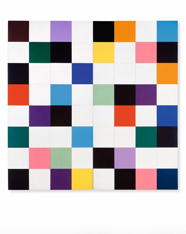
Meanwhile encounters with many of the city’s most famous residents proved extremely influential. Brâncuși’s simplification of natural forms and the innate spirituality apparent in his work had a profound effect on the artist, for instance, and a meeting with the Surrealist Jean Arp triggered Kelly's experiments in composing by chance. This led to his creation of his first totally abstract paintings, made by randomly arranging and conjoining different coloured panels. The most famous of these is arguably Colors for a Large Wall (1951)– a painting comprising 64 square canvases combined, from which much of Kelly’s later work, with its juxtaposing panels in various shapes, sizes, colours and materials, would stem. His investigations in colour, meanwhile, were propelled by a visit he made to the late Claude Monet's house and studio in Giverny in 1952 – after which he was inspired to paint Tableau Vert, his first monochrome work, in a sumptuous green.
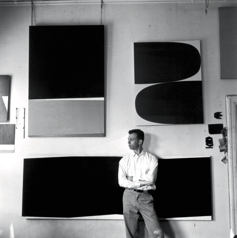
4. He saw his works as objects
Finding himself in financial dire straits, Kelly left Paris for New York in 1954, his hopes for commercial success bolstered by an article he’d read in ARTnews praising the abstract painter Ad Reinhardt. He settled in a cheap apartment in Lower Manhattan and by 1956 had secured his first solo show at Betty Parsons, as well as his first sculptural commission. In 1959, he was selected to appear in the renowned MoMA exhibition Sixteen Americans alongside Robert Rauschenberg, Jasper Johns and other important artists seen to be pushing American art into the future. Still, because his work proved hard to categorise – being such a far cry from the vastly popular Abstract Expressionism taking New York by storm – it wasn’t until the 1960s that Kelly achieved real success, all the while continuing to push at the boundaries of medium and form.
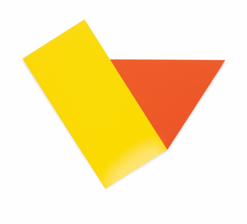
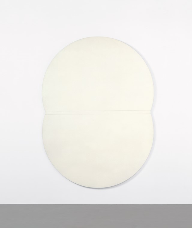
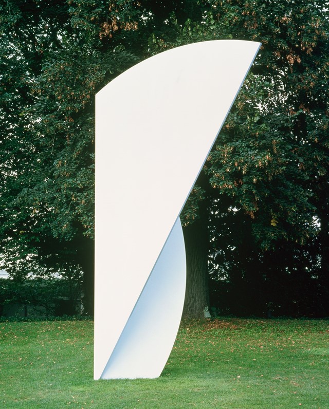
He made panels from cut-out wood and steel to function as monochromatic paintings, and started overlapping his canvases to create layered reliefs – a modern take on the Renaissance concept of "figure and ground" – that trod the line between painting and sculpture. In 1966, he produced Yellow Piece, the first of many shaped canvases, with two rounded corners and two square (incidentally, he was one of the first artists to break with the standard square or rectangular canvas format). Kelly’s aim was to use his work to challenge familiar conceptions of space – and of the very nature of painting itself. “My paintings don’t represent objects,” he would say in 1996. “They are objects themselves and fragmented perceptions of things.” He took this concept of fragmentation one step further with his freestanding sculptures of the 1970s, which each represented a “fragment” of a vast circle.
5. His works were made to provoke an instinctive, not a critical, response
Kelly always said that his creative approach was very much based on his own instincts: he described himself as having “a sort of inner sense for scale”, and on the subject of colour professed to being a natural colourist, while not understanding exactly how he chose what colours to use. In turn, his aim was to incite visceral emotion in his viewer – in particular, elation. While his innovative use of shapes sometime saw him referred to as a geometric artist, he described geometry as “moribund,” saying, “I want a lilt and joy to art”.
To prompt this instinctive, physical response from his audience, Kelly spent a great deal of time considering the surrounding space in which his art would be shown and how that should relate to the artworks themselves. He described the walls on which his mounted works hung as being part of the pieces themselves, and agonised over their positioning, taking into account every detail, right down to the colour of the shadows they cast. His large-scale multi-panel installations – such as the Berlin Panels (2000), four different coloured trapezoids that dance across the lobby wall of German Bundestag in Berlin – were created specifically for the buildings they inhabited, and upon installment became an integral part of the architecture itself, rather than mere decoration (a concept that Kelly despised).
For Kelly, another important means of ensuring a totally immersive viewing experience was making sure that no evidence of manufacturing was evident in his work – no trace of a brushstroke or indent from a tool – so that your sole focus is on the object itself, its physicality in space, and the profound experience of perceiving it. New Yorker staff writer Peter Schjeldahl sums up the tangible effect of Kelly’s efforts in his closing paragraph of the tribute he wrote to the artist upon his death in 2015: “Some great art enfolds us in sensuous pleasures, making us happier, and some snaps us to rigorous attention, making us better. Kelly’s does both at once, if you let it.”
Ellsworth Kelly is available now, published by Phaidon.
