Graphic, modern and elegant. Three words that come to mind when you see the new Céline space at Dover Street Market. Like Juergen Teller's Céline campaign imagery, it is well and truly focused on Phoebe Philo's highly sought after product...
Graphic, modern and elegant. Three words that come to mind when you see the new Céline space at Dover Street Market. Like Juergen Teller's Céline campaign imagery, it is well and truly focused on Phoebe Philo's highly sought after product.
That said, the area warrants as much consideration as the collection itself. Unveiled as part of the store's bi-annual Tachiagari, the space is located on the second floor, which has been the brand's home since its introduction to the store for spring/summer 2010. The floor is unofficially known as the "men's floor" stocking Comme des Garçons Homme Deux, Margiela and Raf Simons. It's clever positioning – Philo's approach to design is more akin to menswear design than that of her womenswear design contemporaries. She has regularly described her collections as a wardrobe of separates; interchangeable, investment pieces; designs with no unnecessary details.
Alongside all of the Comme des Garçons lines, Dover Street Market stocks an array of designers, many of which have their own curated spaces. When the Georgian-fronted five-storey store first opened, Comme des Garçons were quick to point out they hadn't worked with an architect; they prefered to work with set designers to create individual spaces. These areas are more than a backdrop for the collection, it's an opportunity for a designer to tell the 'story of the brand'. Take Azzedine Alaïa who has been in situ since the store opened in 2004. Located on the first floor, directly below the Céline space, Alaïa presents his designs on rails and gloss black mannequins, accompanied by striking black chairs designed by Marc Newson and cabinets of Carla Sozzani's jewellery. Like Alaïa, Céline has no standalone boutique in London so this retail space has even more currency.
Since taking over the French house in 2008, Philo has completely re-modelled the brand and has quickly established a number of highly distinguishable house codes. She favours chic industrial minimalism. Her first show location, the disused bank at Place Vendôme promoted this, as does her Paris boutique. Although slightly more 'designed' and showcasing her selected artworks (including a Tim Noble and Sue Webster neon 'Forever') so does the renovated Georgian townhouse in Cavedish Square which serves as the Céline headquarters. Considering the current collection, one half-expected Philo to use the wood-print effect in her shop interior, or maybe a wall of bright orange. But Philo is good with surprises – this, after all, is a brand who keeps all collection details firmly under wraps and controls all of their backstage photography.
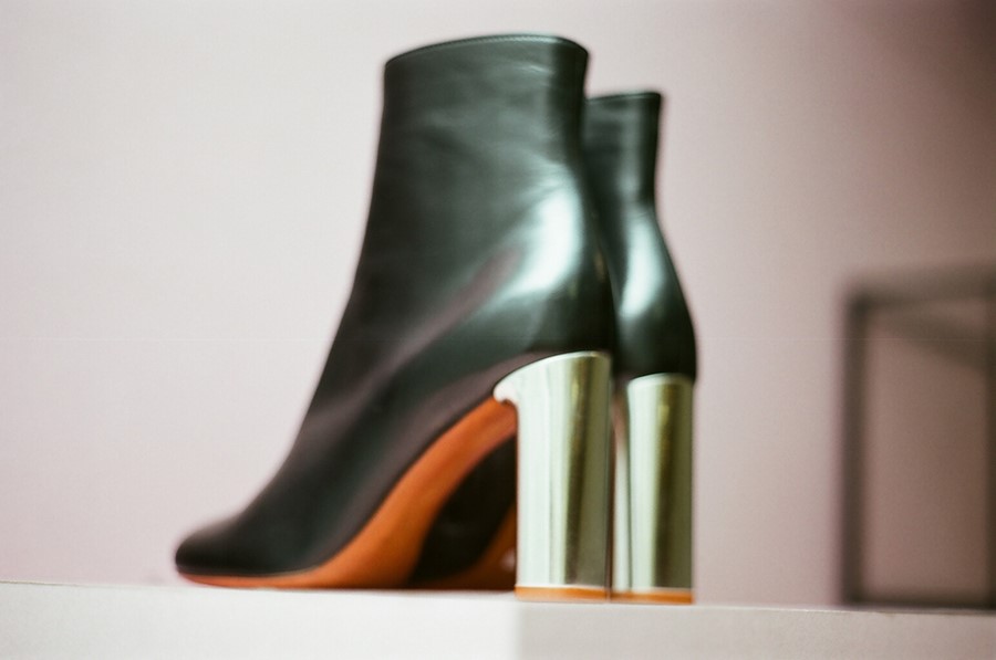
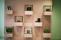
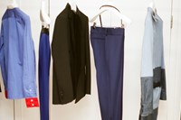
The Céline space, conceived entirely by Philo, is beautiful in its simplicity. Think of it as the "Céline walk-in wardrobe". There are no mannequins, just two black rails, high enough to showcase the season's long statement coats, an arrangement of grey and white boxes to display the new Trapeze bag and a pink accessories wall, which has deep shelves and glass boxes containing the "classic" clutch and the metal-heeled, orange-soled boots. A clever way to highlight the fine workmanship employed by the brand. The graphic, sharp retail aesthetic is softened with the inclusion of an inviting white beanbag with a shearling rug bound across the top; a fabric Philo used in her spring/summer 2011 collection. One tip: if you like what you see here, get down there fast. This stock moves fast.
Text by Laura Bradley
