Presented with a maze of undefined, cavernous rooms three storeys beneath Rue Montmartre, Silencio’s consulting designer Raphael Navot worked closely with David Lynch and an extensive creative team to interpret the director’s vision, transforming
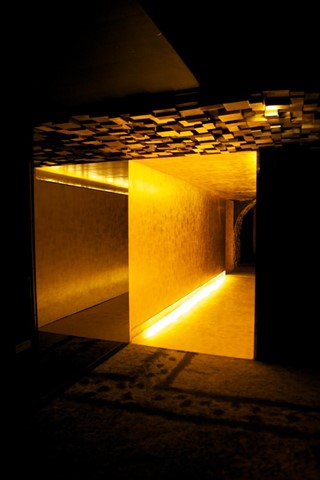
Presented with a maze of undefined, cavernous rooms three storeys beneath rue Montmartre, Silencio’s consulting designer Raphael Navot worked closely with David Lynch and an extensive creative team to interpret the director’s vision, transforming this underground morass into a one-of-a-kind oasis: Paris’ first private members’ club. Envisioned by its owners as a place where artists from across disciplines can meet and exchange ideas, the unassuming building in the 2nd Arrondissement is steeped in colourful history. In the early 20th century, it was headquarters to the Paul Dupont printing house, where several papers including Le Radical and L’Aurore were printed, as well as Emile Zola’s famous article "J’Accuse". Before this, in 1806, it had been the shelter for the old Saint Joseph market, and even earlier, the cemetery where Molière and La Fontaine were buried. More recently, it had been home to a heavy metal club and also used as a recording studio.
After two years of planning and execution, Silencio opened its doors late last year with a programme of music, film and visual arts. Soon after, photographer Neil Wissink visited for Silencio’s week-long, magic-themed Curiosity Salon, and was the first to be given exclusive photo access to the club, including performances by the magic creators and roving performers inhabiting the space, as well a concert by British songwriter Tom Vek. AnOther also spoke exclusively with Navot, who recounts here what it was like to create a custom-made universe with one of the world’s most imaginative directors and multidisciplinary artists.
How did you come to the Silencio project?
[Silencio co-owner] Arnaud Frisch and I had worked together before, and he always talked about creating a platform for artists to talk and exchange. Places like this used to exist a long time ago in Paris – they used to define the city, but they had all disappeared so we thought the only way to do it was to literally move underground. He wanted to work with David Lynch because it was about merging disciplines. So we met with him and went through the space, and actually, the project didn’t start as ambitious as it ended up; it grew on its own terms.
What was the process working with Lynch to develop the design? Did he come in with specific ideas or did you grow them together?
It was quite organic. There was no real discipline to it – which was better for this space. Lynch had in mind all sorts of motifs, space divisions and ideas from design to architecture to furniture, and at the beginning my task was to form a bridge between the needs the club might have and his vision. He imagines things as situations, or as experiences. Sometimes it was very tangible, sometimes a very rough sketch, and sometimes just words; a mood or idea. When you start any collaboration it's about understanding the terms or creating the language, and from a certain moment, it just worked. He’s really interested in anything that is a visual expression, and he has very strong opinions.
"Places like this used to exist a long time ago in Paris – they used to define the city, but they had all disappeared so we thought the only way to do it was to literally move underground"
The predominant colour in the club is monochrome gold, which is translated across multiple materials and throughout all of the rooms. Was this Lynch’s idea?
That was definitely something he was obsessed with. He doesn’t discriminate, he keeps a certain naivety about materials, like gold, which has a really bad reputation, especially in Paris where it is associated with the aristocracy and bad taste, but he feels that gold is beautiful, and the idea was to translate that in the design. So we took a crafty attitude about it, that's where the idea of working with metal and gold leaf, and wood and brass and rough materials came about, so that the gold is not intimidating, it’s not showy. Yes, the space, even with all its gold, is still defined by organic splits in the materials, and uneven lines throughout. David Lynch is very free and he's very into matter. He doesn’t care if something is considered more or less luxurious – it’s about the expression of it. He likes gold, he likes red, he likes blue and other things that are elemental, and we worked with those elements. He's very much into working with elementals and elementary colours in his films as well.
Over the years Lynch has famously done drawings for furniture design, did you interpret these as well?
We went back and forth to LA, and I saw these 2D sketches of furniture, flat, graphical images from the last 30 years. They could all happen visually, but some of them practically could not, so that was a lot about interpreting, and a lot of the furniture was developed from these images.
What was your biggest creative challenge?
Funnily enough, the worst critique I would get from him was that things were ‘too elegant'. Coming from him that was an insult! He would stare at something and say ‘Raphael, this is so elegant,’ or, another bad compliment would be ‘it looks like a five star hotel.’ That was really bad. During the process what I started to understand was that to build something nice, sometimes you have to make it less perfect in order for it to be good. When we were putting the gold leaf on the wood on the walls, we didn't put it everywhere, and if it cracked, that was good.
The space itself would have been daunting enough to work with, but then also interpreting Lynch’s very strong design vision, and making it work as a club – how did you balance these elements?
We made very few compromises. We worked with a lot of architects, including the firm ENIA, and specialists and craftsmen, and all the materials were developed only for here, so these materials do not exist anywhere else. The wall cladding, the patch work and the gilding; the whole space is entirely custom-made, even the taps in the toilet are something we created. For me the most important thing was that it was transformed into another world, so you can't find any sofa, or even any lamp that resembles anywhere else. And this is what makes it a coherent universe. Even though each room within the space is different and has a different function and a different feel, it's still one body, just different organs – or one movie and different scenes, and you can cross through from scene to scene.
For you, what is the spirit of Silencio?
I would say curiousity. There's something about it… a challenge about elegance in the entire space, because everything is justified; there's not one shape or material that is decorative, there's no decoration. There’s also no paint used anywhere in the club, which is very rare. Everything is real, even the toilets are decomposed marble. Everything is breathing. And that’s actually going back to Arts and Crafts in terms of design, but I wouldn't say it's retro, I’d say it’s timeless. So for another word about the spirit: timeless. Or a nostalgic future. Lynch described it at some point as a thing between primitivism and Art Deco, but overall it's about the feeling, the experience, and not the analysis.
The next Curiosity Salon at Silencio will be In Praise of Slowness, 27 March to 1 April, 2012. David Lynch's Crazy Clown Time is out now.
Text by Ananda Pellerin
