A bold and brightly coloured Pop aesthetic underscores the distinctive style of fine artist duo Craig Redman and Karl Maier, AKA Craig & Karl, who have recently expanded their practice in a new, and rather unexpected, direction...
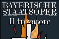
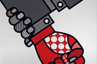
A bold and brightly coloured Pop aesthetic underscores the distinctive style of fine artist duo Craig Redman and Karl Maier, AKA Craig & Karl. The pair – whose unique working relationship is long distance, transacted between New York and London – have achieved success with a wide variety of illustration and installation projects for clients that include Nike, Apple, Vogue and The New York Times. But recently they've expanded their practice in a new, and rather unexpected, direction: designing imagery for the Bavarian State Opera.
Founded under Princess Henriette Adelaide of Savoy in 1653, the opera company has premièred the work of some of the genre's greatest composers, notably Wagner and Mozart, and is still considered one of the best in the world. Craig & Karl's innovative, and wonderfully thematic designs for the company have been so well received that they have been invited to continue the collaboration for another season, the first artists to be asked to do so. Here, we speak to the pair about their surprise at being commissioned, and find out more about the design process, alongside an exclusive gallery of their artwork and working drawings from the project.
How did the Bavarian State Opera commission come about?
All of the opera's visual communication is handled by Bureau Mirko Borshe, a brilliant design agency based in Munich, who suggested working with us for the season. It did seem to come a little out of the blue though and initially we thought it somewhat strange that an opera should want our crazy, pop stylings. That was before we met them of course. They're a very progressive organisation and we're really happy with the results of the collaboration.
Your use of colour is very striking – can you discuss the use of colour for the Bavarian commission?
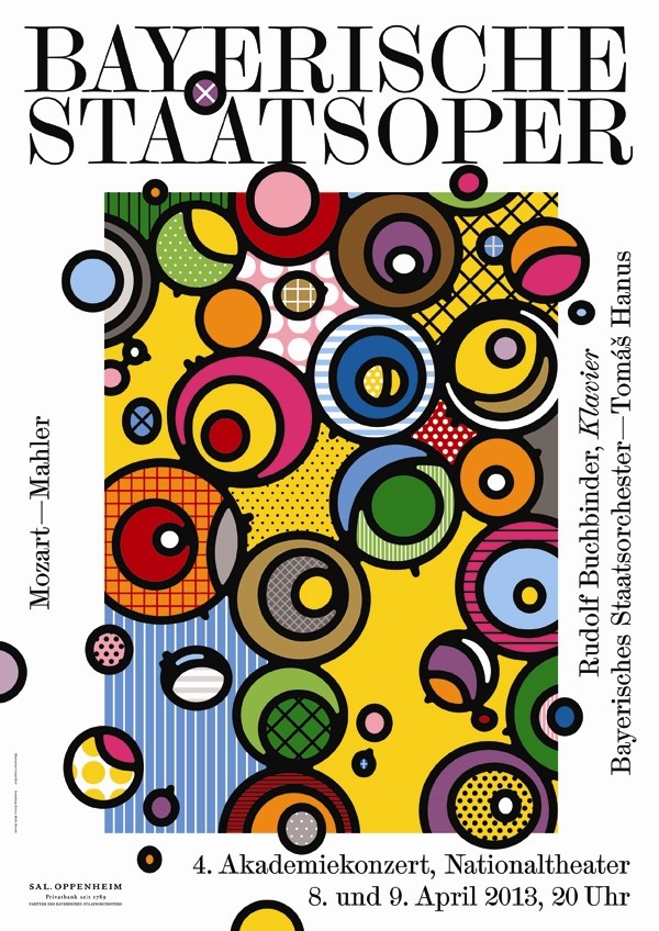
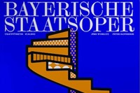
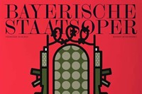
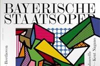
There are two components to the season – a series of orchestral concerts and the opera premieres – so it was important that there be a clear delineation between the two. For the concert series we opted for a bolder, more expansive palette whilst the operas make use of more limited palettes – usually two or three colours – that are appropriate to the mood or theme of each.
"Our aim was to obviously communicate the essence of each opera but to do so in a new or unexpected way"
What were your key starting points and considerations when first embarking upon the designs? To what extent did the music itself influence the design process?
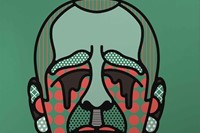
The artwork for the concert series was certainly inspired by the sounds and emotions related to each performance. The opera artwork draws more directly from each performance's central themes. For instance, a throne constructed of war machinery for the Russian opera Boris Godunow.
What do you hope your designs add to the productions, from a viewer's point of view?
Each of the operas involve quite varied and often complex themes. Our aim was to obviously communicate the essence of each but also to do so in a new or unexpected way, so as to arouse a sense of curiosity or anticipation about the premiere. Each was also conceived in relation to specific elements of the production so that there is a strong link between the artwork and the performance.
What are your personal experiences with the world of opera?
Prior to this project, very little to be honest. When we were in Munich we were fortunate enough to be able to see a final dress rehearsal of Wagner's epic, Ring, which was amazing in it's scale and setting. It really opened our eyes to a new modern style of opera.
How would you describe your working process as a duo?
It's very much like a conversation with pictures. As we're based in different cities, we're always sending files back and forth, discussing ideas and moving projects along that way. It's a unique situation and probably not for everyone, but it works well for us as it allows us to be independent but also interdependent in our creative lives.
What inspires your practice?
Anything from PONPONPON to Urs Fischer, Peter Max to My Bloody Valentine, NeNe Leakes to David Hockney, The Renaissance to Memphis design to John Baldessari. There's no conscious decision to head towards one thing or another, it's just our personalities loosely guiding us in a direction.
You've worked on a wide variety of projects in your career – do you have a dream project or collaboration for the future?
We're really interested in installation work and immersive environments, so we'd love the opportunity to work more in that realm. We're always really open to working in areas that are new to us though, it's slightly terrifying but also exciting to be mapping uncharted territory.
Do you have a motto for life?
Make it a double.
Text by Daisy Woodward
