We talk to Jason Evans about his new photo series
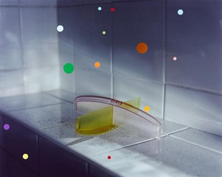
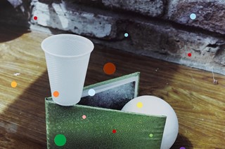
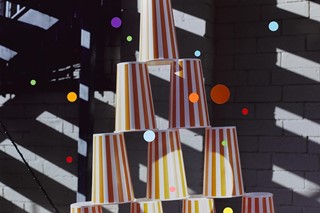
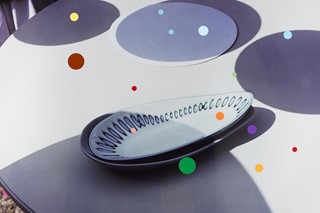
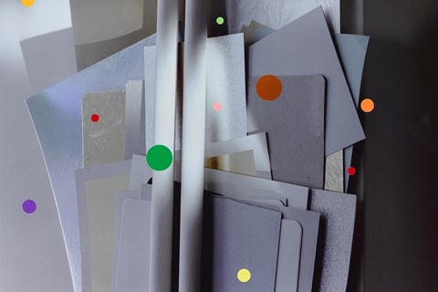
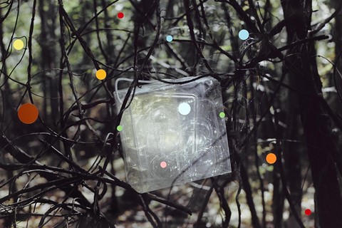
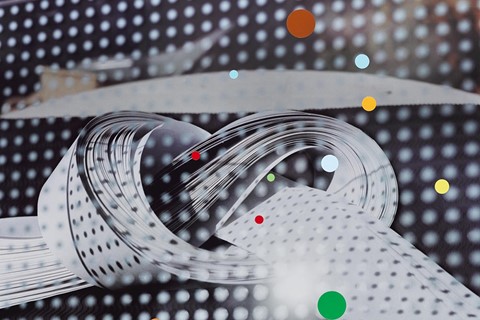
When photographer Jason Evans first visited Georgian Bay in Northern Ontario, Canada, he was captivated by the region’s outstanding natural beauty. At the time, UK-based Evans was holding a residency at the Art Gallery of Ontario (AGO) in Toronto, but it was in the wilderness that he found the inspiration for Monkey Face, his latest photo series. Currently on show at the Aperture Gallery in New York, the prints feature inanimate objects in unexpected combinations and situations, to which Evans has applied coloured dot stickers in intuitive patterns ranging from the evocative to the amusing.
For more than 20 years Evans has built a reputation for his cross-disciplinary work, including a body of critically-acclaimed fashion photography, exhibitions that employ multiple mediums in relationship with photography, as well as his photo-a-day website, The Daily Nice. Here, he discusses interactivity in his work, why archiving is not all it’s cracked up to be, and how he found his way amongst the dots.
How did you get the idea to apply stickers to photographs?
When I first started doing this in 2005 it was just for fun. Of course there’s a history of it, I’ve not invented anything new here, but everyone makes gestures for their own reasons. Drawing is about making a mark, or at least in its purest form it can be. To me these are sticker drawings. I’m interested in photography in relation to other things, sound and sculpture for example, and I hadn’t done anything yet with photography in relation to drawing - although I think photography is a kind of drawing itself because you’re always framing things up. You start with an empty rectangle and you fill it.
I also wanted to make something unique. I don’t want to make editions; I don’t want to buy into that art market thing where you produce stuff just for collectors to collect. It seems disingenuous to me.
How so?
As far as I’m concerned, photography is, or at least should be, a democratic medium. You have a negative, you can produce an unlimited number of prints from that, so why shouldn’t you? But when you make a drawing, there’s only one.
Are the dots supposed to represent anything in particular?
On one level I was trying to represent the visual energy of Georgian Bay, but I’m also creating a formal response to the different qualities in front of me, whether they’re pictorial qualities, or qualities of light on paper. During my AGO residency they lent me these amazing lamps so I could look at the dot placement under five different colour temperatures. Some were a combination of daylight with tungsten, or daylight with fluorescent, for example, and if you have one of the Monkey Face pictures in your home, it will look very different throughout the day, especially at twilight. If you don’t turn the lights on, the colours will oscillate. Also, the photos are printed on super reflective metallic paper, they’re almost 3-D, while the stickers are super flat, and it’s all framed behind non-reflective glass, which does something very odd to the paper, gives it a depth.
"I made these pictures the day I got back from Georgian Bay...the sun was shooting through the water, and bouncing off those incredible limestone escarpments that go right out into the lake"
Georgian Bay is impossibly beautiful. How did your time there influence these works?
I made these pictures the day I got back from Georgian Bay. I had one weekend during my residency where I travelled up there and camped in the woods, and I had my mind completely blown. The limestone beaches were just amazing. I’ll never forget the place as long as I live. There were only about three other people on the campsite, you can’t imagine not having to share something so beautiful.
The sun was shooting through the water, and bouncing off those incredible limestone escarpments that go right out into the lake. I’m guessing the crystallised forms in the limestone were reflecting the light in such a way that the ripples and the colour refractions were creating reds, purples – colours I’ve never seen before in water. If you look at the dot patterns going across the images, they were inspired by the patterns I saw in the water at Georgian Bay. So while I was trying to respond to the surface of the image with my stickers, I was also representing something that I’d deeply felt.
The photos in Monkey Face are from a wider series entitled, Pictures for Looking At, Drawing for Photography. What are they actually pictures of?
A lot of the elements in the photos are waste. I incorporated my own waste into the images, making something throwaway into something beautiful. Broken vases and things like that.
You chose to use dot stickers. Does this shape hold particular interest for you?
Circles are incredibly important to me. Photography is a light sensitive process and all light comes from the sun, the sun is round, our eyes are round, lenses are round, it seems an appropriate motif for the photographic process. I find circles and spheres quite pleasing things.
You call Monkey Face an installation. What other elements are at play aside from the photos?
I always paint gallery spaces in diagonal colours to create my own sense of belonging. Also, right slap bang in the middle of the room where the photos are hung is a large bouquet of fake flowers. They’re bloody expensive fake flowers and they look real, but just as they’re a representation of real flowers, the pictures are a representation of what they’re pictures of, so there’s a similarity there. Also, I love it when my audience isn’t sure whether they’re real or fake. I’m trying to get more interactive.
Do you think that’s important?
Oh yeah. I don’t like work that stands there looking back at you with its arms folded. I want people to feel something - even if it’s confusion.
Do you have any concerns about the stickers ruining the images?
In a way, putting stickers on a photograph is a kind of desecration, especially because they’re extraordinarily beautiful prints, and the glue is going to destroy the surface over time. But I love that. Hervé Guibert wrote a short piece entitled, The Cancerous Image, about a man who fixates on a photograph that’s glued to a piece of cardboard. Eventually the glue starts to destroy the image and he tries to assimilate what’s left of it. He’s my favourite photography writer and it’s my favourite photography essay. It had a lot to do with me wanting to apply gluey things to pictures.
I personally enjoy watching things fade. Part of the pleasure of this series is that when the dots start to fall off in twenty years’ time, there’s going to be something underneath. Life is change. You’ve just got to let things go. If you think about how I operate The Daily Nice, uploading one image a day then replacing it the following day, it’s all about letting go. Look: it’s beautiful. And it’s gone.
Monkey Face is at the Aperture gallery in New York until 15 August, 2013.
Text by Ananda Pellerin
Ananda Pellerin is a London-based writer and regular contributor to anothermag.com.
