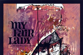
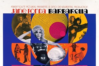
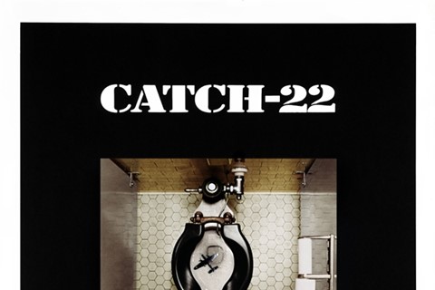
What do the films A Streetcar Named Desire, Dial M For Murder, Bonnie And Clyde, Bullitt, My Fair Lady, A Clockwork Orange, Get Carter, Dirty Harry, The Untouchables and Unforgiven all have in common? Designer Bill Gold is the answer. Spanning six
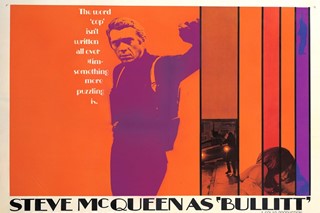
What do the films A Streetcar Named Desire, Dial M For Murder, Bonnie And Clyde, Bullitt, A Clockwork Orange, Get Carter, Dirty Harry, The Untouchables and Unforgiven all have in common? Designer Bill Gold is the answer. Spanning six decades Gold has been the man behind some of the most eye-catching movie posters and they remain iconic pieces of artwork today. Often making the only lasting impression of a film that many would get, Gold’s posters have an ability to capture a whole film in just one image, and his ability to adapt to whatever brief he was given has kept Gold at the top of his game for an incredible 60 years. This month sees the launch of Bill Gold: Posterworks, with a forward from long time collaborator and friend Clint Eastwood – Gold worked on 35 consecutive Eastwood films. This 450-page detailed book is the first time the full scope of Gold’s work will be presented. Here we speak to the inspirational 89-year-old about his biggest challenges, the secret to making a good poster and the one he wished he had made.
Studying illustration and design at University, did you always have an interest in creating posters?
I had loved all aspects of drawing and illustration from a young age and had also always loved the movies. After art school, lots of my friends wanted to work for the big ad agencies, but that did not interest me at all – advertising fridges and hoovers year after year – what could be more boring. I loved the movies and became determined to work for an outfit that would allow me to do that.
When creating your movie posters how do you go about defining a film in just one image?
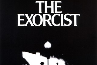
Each campaign that I worked on was different. Sometimes, we would work endlessly for months, working on different designs and ideas until we cracked it, and sometimes, for example the campaign for The Exorcist, I immediately was taken by the now famous image of the priest at the door and as soon as I turned it into a design, it felt right and both the director and the studio were really not interested in seeing anything else.
How involved with the actual film cast and directors did you become?
Again, this varied greatly. Sometimes with directors like Stanley Kubrick, Peter Bogdanovich and obviously Clint Eastwood, I would get very involved and other times we would just deal directly with the head of marketing of the various studios. Occasionally we would also deal with the cast, for example in Dog Day Afternoon, I shot all the photographs of Al Pacino.
What are the biggest challenges you face?
Sometimes it was very difficult to get the studios to think outside the box. Studios also wanted to show the faces of the actors and make the design as obvious as possible. I called this “The Mount Rushmore effect” – four heads! When they did manage to think outside the box, as was the case with the advance poster for Unforgiven, which has become an iconic design and won several awards, the results were inspirational.
You have created an enormous amount of posters throughout your 60 year career – which are your favourites and why?
Oh boy, that’s tough! People always ask me this and I find it very hard to pick favourites. They are all like my children. If I had to choose, my most satisfying work was the campaigns I did with Clint Eastwood – every single one of his films from Dirty Harry to Mystic River.
Did you ever feel restricted by repeatedly working to the format of a movie poster?
No, because every movie told a different story and presented us with different challenges. This is why I chose to solely concentrate on designing movie posters because they are a great canvas for telling a story.
What do you feel is the secret to making a good movie poster?
Less is more!
Are there any movie posters you wish you had created?
This is a great question! I love the poster for King Kong (1933) with the gorilla at the top of the Empire State Building. This was just before my time, but I would have loved the chance to have taken a stab at that.
If you were to create a poster for a recently released film which one would you choose and what would it be of?
I recently did some sketches for Clint Eastwood’s upcoming Hereafter. Unfortunately although we had the sketches and preparatory designs ready, which Clint loved, Matt Damon, the film’s star, was unavailable for a photo shoot and so it didn’t work out....
Do you feel movie posters have less of a presence and importance in today’s modern age?
Definitely. It’s definitely a lost time, where money and creativity was poured into the art departments. It’s a shame, but what can you do…
What do think of the recent domination of photography over illustration as an advertising medium?
I do not have anything against designs that use photography, in fact, it was a medium I liked to use myself if it was right for the campaign. However, there seems to be no real thought in the design of most modern posters that I see.
What is your favourite film of all-time?
That’s an impossible question to answer! I am a big fan of the movies and there are countless films that I love and I find it very difficult to narrow it down to even a handful, never mind just one!
Text by Lucia Davies
Bill Gold: PosterWorks is released on 11 November.
