AnOther explores artist Hamish Robertson’s ingenious interpretation of smartphone photography
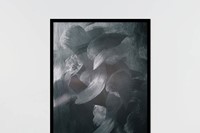
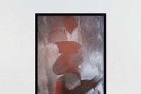
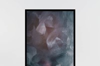
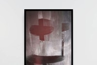
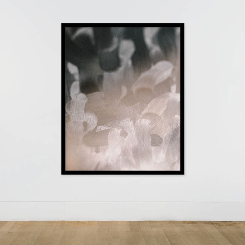
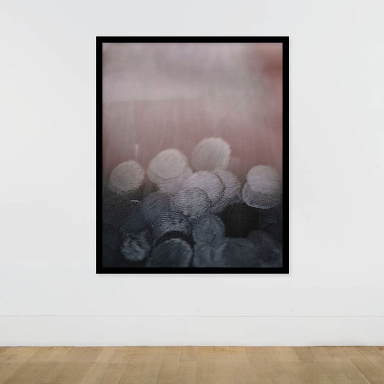
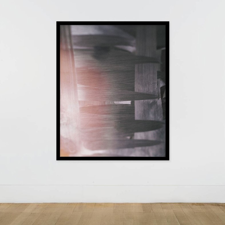
When Apple encouraged users to capture their world on an iPhone 6, it probably wasn’t expecting the beautifully subversive and ingeniously literal response from Los Angeles-based artist and photographer Hamish Robertson. Inhabiting an overwhelmingly instagrammable city, punctuated by towering billboards of images ‘Shot on iPhone 6’, UK-born Robertson is well aware of how ubiquitous smartphone and touch screen devices have become in our lives. However, rather than pour data into the portable Obisk, he sought to produce a series of works that explore our most personal of contributions to them. Apstracted is a series of photographic works that capture the unique mark patterns made by the oil of the fingertip on the glass of the iPhone screen when using different apps.
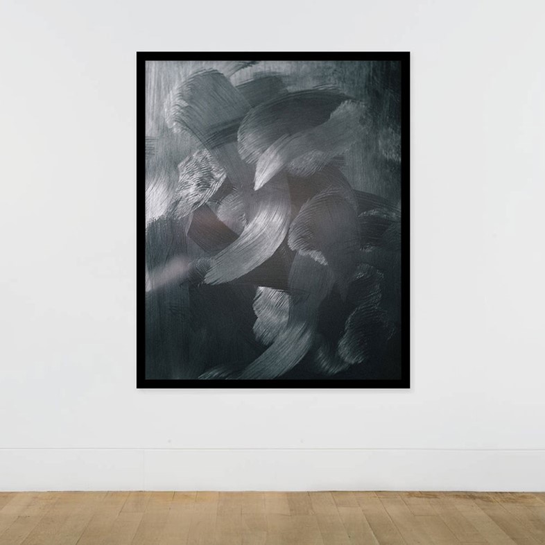
Capturing something of the loaded simplicity of abstract expressionism, Hamish Robertson’s Apstracted, a contemporary take on oil painting, puns in a way that is not lost on the photographer. For this project, Robertson would prep his canvas by polishing the screen of his phone – an iPhone 6 Plus – and use an app for around 30 seconds before putting the phone to sleep. He would then photograph the screen with a macro lens to capture his fingerprints and motion smudges. Any colour in the shots is absorbed from his surroundings – whether clothing or plants or furniture – reflecting off the oils. AnOther spoke to Hamish Robertson about what he extr-ap-olated from his studies.
On the inspiration behind Apstracted...
"The foundation of my studies is to capture or represent neglected beauty through overlooked occurrences or involuntary mark making. There are seemingly dozens of billboards here in Los Angeles housing Apple’s ‘Shot on iPhone 6’ campaign, each depicting traditional beautiful scenes and moments. I wanted to find a simple response in my own work that was itself made on iPhone 6, only my works would interpret that literal definition in a new way."
On Apstracted as a contemporary take on oil painting...
"I approached the subject with a view to a reverse take on iPhone photography, but the more I collected them and noted the painterly effects the more I enjoyed the relationships the final works hold to childlike finger paintings – especially considering the ease with which children operate these highly sophisticated devices."
On the surprising lessons learned while making the project...
"Beyond how much oil is apparently on my fingers? I enjoyed documenting a process that is entirely unrepeatable, even though the actions themselves could be repeated the final marks will never be identical. For all the design and planning that goes into the different app user experiences on meticulously cloned devices, the final operational gestures are as unique as the person using them."
On which pattern is the most beautiful...
"I’m fond of the Music image, perhaps because it invokes bars on sheet music. Contacts, too, seems to represent the overlapping relationships co-existing in our personal contact books, while Messages appears as a crowd advancing upward."
