One of the team behind this year's spectacular British Pavilion at the Venice Architecture Biennale tells us why our methods of living are outdated
If you were lucky enough to visit the British Pavilion at Venice's Architecture Biennale this summer, you'll have encountered an ambitious and insightful breakdown of everything you never think to question when it comes to where, why and how we live, and the repercussions those choices have. Curated by Shumi Bose, Jack Self and Finn Williams, the stand, entitled Home Economics, took the concept of the spaces we live in, and broke it down into its simplest parts, only to reassemble it in five new, satisfyingly forward-thinking ways.
The approach was a natural one for the team, whose diverse disciplines lend their ideas a unique malleability. "Jack, Finn and I are friends – we share concerns about home, housing and particularly economic realities," Shumi Bose explains. "But we come at it from different angles; Jack is a young architect, putting his principles into practice in his design career; Finn is an architect who chooses to work as a public servant, at the coalface of setting planning policies and parameters, while I spend most of my time teaching future practitioners." This multifaceted background gave the triumvirate a highly original approach; they decided to respond to the Biennale director Alejandro Aravena's call to "report from the front line" by dividing the notion of the home as we know it into five segments. "I suppose our approach was not to simply show nice houses, but to use the opportunity to rethink the complex cultural, social, political and economic preconceptions of home, inviting various multidisciplinary collaborators to challenge and update these ideas," Bose continues. "We proposed to unpick ideas of home not by looking at different ‘types’ – apartment, detached house, bungalow and so on – but to think about ‘how’ we live."
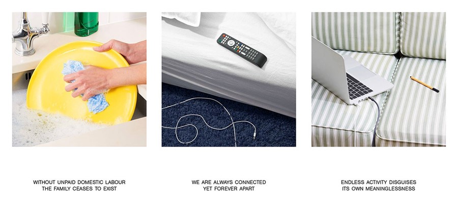
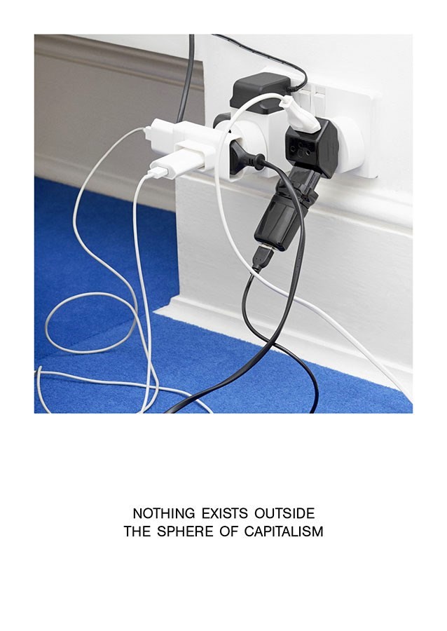
Fortunately for those who didn't make it, the exhibition was conceived alongside a corresponding publication; a beautiful printed work, designed by studio OK-RM and partnered with a witty photo series by photographer Matthieu Lavanchy, shown here. The book serves to compress the complex, abstract ideas on display into a digestible and two-dimensional format, as well as including some materials which didn't make the show. "The book remains after the exhibition comes down," Bose continues. "The first part sets a critical agenda – with essays from people like Aditya Chakrabortty, senior economics commentator at The Guardian and Tom Dyckhoff, presenter of The Great Interior Design Challenge on BBC Two. The middle features exhibition photography from Thomas Adank, and the final section contains the full development of the proposals for the five rooms." Here, we speak to Bose about the complex aims of the exhibition, it's manifestation in its printed partner and where exactly our understanding of the home is doing us a disservice.
On Home Economics' proposed 'five new models for domestic life'...
"We proposed to unpick ideas of the home not by looking at different ‘types’ – apartment, detached house, bungalow and so on – but to think about ‘how’ we live. And in Home Economics, the parameter we used to examine this is time – another resource in universally short supply. The five ‘models’ exhibited in Home Economics examine what a home could be in five incremental units of time: Hours (designed by Jack Self, with Finn and myself), Days (by Åyr), Months (by Dogma + Black Square), Years (by Julia King and Naked House) or Decades (by Hesselbrand, who also acted as exhibition architects). Each timeframe and proposal holds a number of complex provocations, but the temporal lens allowed our collaborators to get away from standard separation of rooms by function, instead allowing us to question things like private ownership versus sharing, the influence of new technology versus physical permanence, the notion of asset value versus dwelling."
On their collaboration with Matthieu Lavanchy...
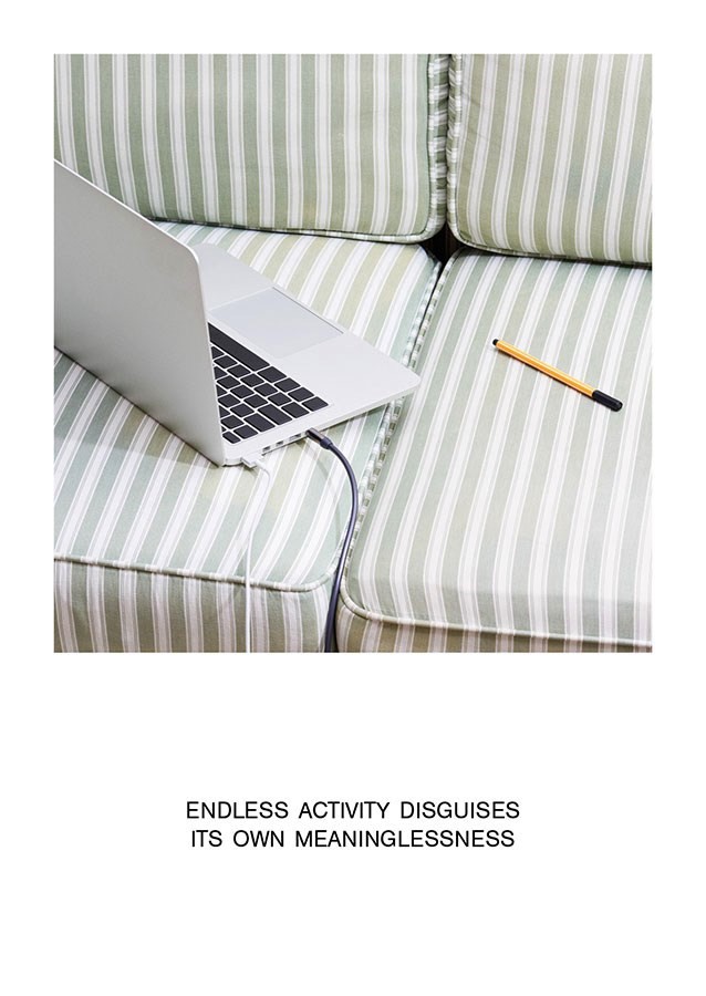
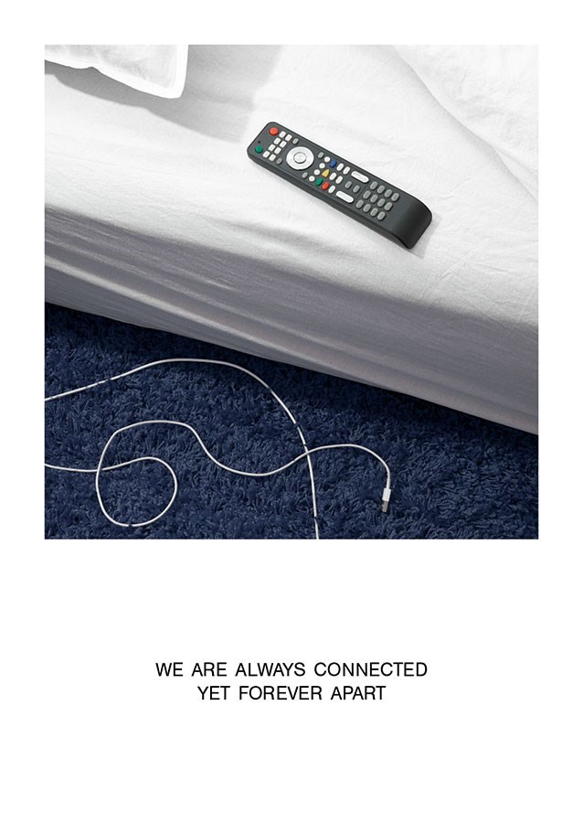
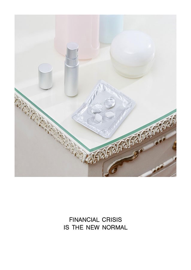
"We were introduced to Matthieu’s work by OK-RM, and immediately felt an accord with his distinct but subtle style. In the run-up to Venice we wanted to share a mood or an attitude, rather than a preview of the exhibition itself. As the topic of home is universal, we wanted the visual language that we used to also be ‘everyday’ – almost banal, even. It certainly made sense to use a non-architectural photographer, as we were showing intimate moments of daily life, rather than buildings. Matthieu’s work – the careful way he uses light, for example – reaches this stylised point of tension, between the uncanny and the everyday. He perfectly understood our brief to stage ‘typical’ domestic scenarios, which then sat starkly against polemic statements. We hope it achieved an effect that was powerful and provocative; designed by Matthieu with OK-RM, these compositions are strong enough to stand as artworks in their own right."
On her favourite room in the exhibition...
"Not the most visually spectacular perhaps, but my favourite room is the home for Years, designed by Julia King with Naked House. Firstly, it was a pleasure to give Julia a prominent platform; she is a phenomenal British-Venezuelan practitioner, achieving amazing things in the unglamorous environs of peripheral New Delhi. She examined issues of private ownership; in the UK, inflation of house prices has turned the ‘home’ into a speculative financial asset, rather than a place to live. It’s complicated, but I love this room because we were able to work with major high-street banks and financial consultants to reach a really radical but practical solution – making home-ownership possible for a smaller outlay in perpetuity. Indeed, a version of this scheme will probably be built soon, in North London. From speculation to provocation to reality: as an architectural curator, you couldn’t ask for more!"
On the key areas to reconsider in our own homes...
"Having worked on this show, I think we could do with addressing historic stereotypes: do we need to separate rooms by rigid function, for example? Is there such a thing as a ‘standard’ shape of family? And crucially, do we need to own everything – the possibility of interaction and communality are so prevalent in various areas of life (think of Uber, for example), so why not in domestic terms? But crucially, I think the changes that need to happen are structural, in terms of economics and financial realities. The gap between average wages and house prices is higher than ever before, by a long way; the stigma and precarity around rent needs to change, but more fundamentally, we need to address the divergence between those who can have, and those who can never, ever dream of having. If shelter and home are basic human rights, we need to do more to make housing a more equitable proposition."
On her favourite space in her own home...
"Well, the first rankle is that it’s actually not my own home – I pay exorbitant rent to share a flat in North London, close to my places of work. I do like the bright, open-plan lounge kitchen, which runs the length of our flat, and is book-ended by my two favourite places to be: the stove on one side, and on the other, the cosy sofa spot next to my floor-to-ceiling bookshelf. I spent part of my childhood in India; when we moved back to England, I asked for the smallest room in the house, which I painted it with intense, deep colours to make it feel even smaller. Having grown up in a huge joint family, the idea of a room of my own was both intimidating and thrilling; I still make diminutive little ‘nests’ when I do have my own space, and I love homes where extended family can feel free to drop in or stay for a few days, just like I remember."
The exhibition Home Economics, has been commissioned by the British Council for the British Pavilion at the Biennale Architettura 2016. Home Economics is published by The Spaces and REAL Foundation 2016.
