With his distinct, graphical style illustrator Andrzej Klimowski has been creating powerful and provocative imagery for several decades. Most notably he has designed posters and book jackets for PG Wodehouse, Harold Pinter, Milan Kundera and Kazuo
With his distinct, graphical style illustrator Andrzej Klimowski has been creating powerful and provocative imagery for several decades. Most notably he has designed posters and book jackets for PG Wodehouse, Harold Pinter, Milan Kundera and Kazuo Ishigure, alongside drawings, TV graphics and animations. Currently working as Professor of Illustration in the department of Communication Art & Design at the Royal College of Art, Klimowski is also responsible for tutoring the crème de la crème of postgraduate illustrators.
The most immediate medium through which an idea can be articulated Klimowski’s latest book Andrzej Klimowski On Illustration brings together his knowledge and wisdom of the artistic practice in a 96-page hardback form. Exploring the narrative nature of illustration as well as its importance in the development of our imagination, Klimowski’s book not only gives an insight into his personal work but the medium as a whole. As the role of the illustrator declines in the face of digital technology, the art form bares an increasing significance and one that we, at AnOther, continuously seek to support. With a section of the book dedicated to AnOther’s In the Cut illustrator (and his ex-student) Zoë Taylor, and with the RCA Show 2011 currently taking place until 3 July, we take time out with the master of illustration to learn more about this slowly vanishing medium.
What to you makes a piece of illustration successful and persuasive?
A successful illustration has to address its subject matter in a relevant and thought provoking way. It needs to attract the eye, the mind and the heart of its audience.
Why do you feel this artistic discipline is so important?
An illustration not only draws our attention to a given subject, it also enriches our experience of it and prolongs this experience.
Can you describe your distinct illustrative approach and style?
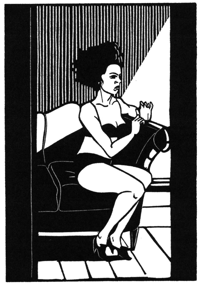
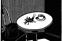
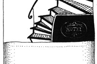
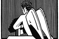
I have to understand the subject that I may be illustrating. It is not simply a question of translating a written form of communication or expression into a visual equivalent. There is no point in such activity. One has to search for a visual metaphor or symbol that “signals” the literary content. Sometimes I will focus on the dramatic nature of the subject, on other occasions it may be on its decorative, humorous or ironic nature. It is the subject that determines my stylistic approach. I also think of what sort of impact the image needs to make. When designing a film or theatre poster I often resort to collage or photomontage. The abrupt act of clashing two or more realities through collage can have an immediate, dramatic and powerful effect. It communicates in a flash. A cover for a volume of poetry would require a more subtle and intimate approach. The contemporary illustrator has an ever growing range of techniques at their disposal given the fast expansion of the digital realm. I seem to move in the opposite direction. I am drawn towards working in a primitive, simplified mode. I use black ink and brush or the linocut, a discipline that requires me to reduce a design or composition to the bare essentials, leaving space for the viewer’s imagination. I always think of the audience as my collaborative partner.
What has been your favourite commission and why?
One commission that gave me great pleasure and satisfaction was to provide a set of illustrations for the covers of all of Harold Pinter’s plays. Faber&Faber had bought the back list of his plays from Methuen and had to find an illustrator to work out a coherent concept for packaging the collection. Pinter chose me from a number of illustrators that Faber presented to him. I could identify with his lapidary use of language and established a minimalist collage style, drained of colour. I continued making images for his new plays and adapted some into posters for newly staged productions. We had a mutual understanding and became friends.
Who are your favourite all-time illustrators?
My favourite illustrator is my old professor, Henryk Tomaszewski, whom I write about in the book. He never suffered fools gladly. He liked to tease, provoke and revelled in contradiction. He had much in common with Saul Steinberg, whom I also admire. A more poetic, dream like illustrator was Jean Michel Folon. He created some beautiful images for Olivetti typewriters. A few years ago when on holiday in Viareggio on the Tuscan coast, I cycled to Pietrasanta in the foothills of the Apennines. The town square was full of Folon’s sculptures. His ubiquitous men in hats and raincoats took on a three dimensional existence.
Who are your ones-to-watch?
The illustrators to watch can be found amongst my students and recent graduates from the Royal College of Art. Zoë Taylor, who graduated a couple of years ago is slowly making her mark. She has a strong feeling for narrative and has made several small picture books that are mysterious and enigmatic . The characters that inhabit these stories are aloof and complex. I see a future for her and most of my other students. My hope is that more art directors and commissioning editors will take greater risks. If they brief these illustrators well, then they have nothing to fear. They will have the satisfaction of developing something that is new and vital. There is no sense in perpetuating staid formulas.
Andrzej Klimowski On Illustration is published by Oberon Books and out now
Text by Lucia Davies


