Tomorrow marks the arrival of Chanel's latest handbag. Joining the family which includes the iconic 2.55 and the Bowling bag is the new 'Chanel Boy'. To mark the occasion, we invited London-based illustrator Ellie Tzoni to reinterpret it in her
Tomorrow marks the arrival of Chanel's latest handbag. Joining the family which includes the iconic 2.55 and the Bowling bag is the new 'Chanel Boy'. To mark the occasion, we invited London-based illustrator Ellie Tzoni to reinterpret it in her unique print style. Inspired by a cartridge bag that was originally made for hunters and was carried by the fashion visionary herself, this Object of Desire is distinctly androgynous. As Karl Lagerfeld explains, “Chanel used men’s underwear to make dresses; she had this boyish attitude, in fact it is the very spirit of Chanel. She got it from Boy Capel, the great love of her life, which, incidentally, explains why the new bag is called the Boy.” With an understatedly chic design, the Boy is characteristically Chanel, with its clean lines, rectangular flap, overstitched graphic bands of mattressing and a large chain of round links. Showing a beautiful attention to detail the six letters of the legendary Chanel name appear in subtle relief on the top of the glazed calfskin bag, whilst a double 'C' forms in the centre circle of the bag’s clasp.
The Boy is far from the conventional feminine clichés and thus a perfect fit for Tzoni’s clean, graphical and anything-but-girlie style. Here we speak to the illustrator about her working process, the settings she created for her bags and how she would wear Boy.
What were your first impressions of the Boy bag?
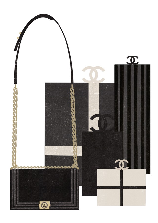
I was really pleased about being given a Chanel product to interpret. I knew instantly I wanted to keep the illustrations very simple and limit my colour palette to black, cream and grey.
What elements did you want focus on and bring out, and why?
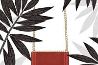
I wanted to focus on the chain as I thought it was an important part of the design so I decided to draw the bag as if it were being worn, with the strap rigid and upright. I also wanted the red bag to stand out as a statement piece so I surrounded it with grey tones to enhance the red.
Can you explain your illustrative technique and process for creating these final creations?
I created textures by hand, using print techniques, and then cut shapes out of the paper and scanned them in to put the image together digitally.
What about the settings you placed the bags in?
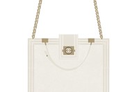
I thought the black bag looked like the most classic of the three, so I decided to incorporate the double 'C' logo and really make most of the black and cream colour palette. I thought placing the bag next to beautiful gifts would present it as something new and special – an Object of Desire. The red bag provides the only flash of colour throughout the set so I thought the jungle-like setting would suite its boldness and vibrancy. The cream bag needed a simple surrounding. Showing it being pulled out from a magician’s hat suggests it is not necessarily what you might have been expecting.
What would you wear this bag with and where would you wear it?
I think the bag is quite versatile, I could imagine it being dressed up for night time and worn casual day-to-day for an understated Parisian chic.
Text and curation by Lucia Davies
See more Objects of Desire here.


