This season, AMO and Prada decided to create The Ideal House for the stage of the A/W13 men's collection. It's not the first time a house has provided inspiration. For the A/W11 show, the setting was a two-storey steel 'house' comprising of various
One can always rely on Prada for a good set. Since their collaboration began just over a decade ago, Rem Koolhaas' OMA and the AMO think tank have created a succession of memorable backdrops for Miuccia Prada's men's and women's collections. Debuting at the S/S04 menswear show, OMA first designed a series of posters to line the runway for the Prada show. Since then, they have realised a Bauhaus-style decor (men's S/S07), a spiralling orange structure (men's A/W07), an underwater scene (men's S/S08), a metal grille elevated stage (S/S11) and foam cars (women's A/W12).
This season, AMO and Prada decided to create The Ideal House for the stage of the A/W13 men's collection. It's not the first time a house has provided inspiration; indeed for the A/W11 show, the setting was a two-storey steel 'house' comprising of various rooms, all connected by a corridor which acted as the catwalk.
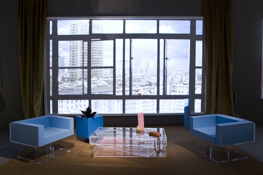
"The audience faces an “ideal house”: an interior populated with geometric wood, metal and Plexiglas furniture, blue foam and wood objects and manifestations of everyday life"
The latest design, unveiled this weekend in Milan, is an inversion of the traditional catwalk configuration, comprising a set built around the perimeter of the audience, who are seated on an irregularly shaped central island. The audience faces an “ideal house”: an interior populated with geometric wood, metal and Plexiglas furniture, blue foam and wood objects and manifestations of everyday life. It is reminiscent of the work of Thomas Demand, an artist who first creates breathtaking three-dimensional cardboard structures and then photographs them.
The models wove through the set, made entirely from wood, acting as characters in a sequence of sophisticated domestic scenes. A series of images were projected through multiple windows frames onto the perimeter wall, alternating between outdoor urban images and interiors. The entire scene was unified by a neutral light grey colour that covered both stage and the perimeter wall.
The furniture is a taster of the upcoming series designed by OMA for Knoll: a collection of 12 pieces of essential design and maximum adjustability that meet the most diverse range of uses and will be launched later this year.
Text by Laura Bradley


