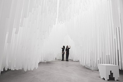
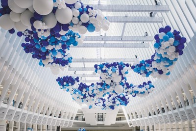
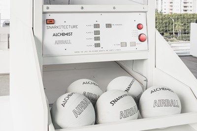
From giant ball-pits to clouds of balloons, design practice Snarkitecture is celebrating a decade of their immersive installations
Snarkitecture co-founders Alex Mustonen and Daniel Arsham epitomise a generation’s obsession with the fusion of fantasy and the everyday. Creating some of the most talked about collaborations of the past ten years, they innovate beyond the confines of domestic convenience and efficiency, instead focusing on experiential pleasure and delight. This indulgent approach to the mundane is prevalent throughout Snarkitecture’s impressive portfolio of work, which is celebrated in a new book from powerhouse publishers Phaidon, showcasing more than 70 of the studio’s projects.
The New York-based design studio’s name was inspired by Lewis Carroll’s poem The Hunting of the Snark, with the pair citing Carroll’s childlike use of language and his development of playful portmanteaux as central to their own design process. Mustonen and Arsham’s unstoppable appetite for enhancing everyday experiences by recontextualising basic materials and architectural formats has captured the attention of clients throughout the worlds of fashion, art and architecture, and has seen them work with some of the world’s most recognised names, including Calvin Klein, Cos, WeWork, Design Miami and more. On the eve of the launch of their debut monograph, we talk to the duo about their career so far.
On gaining momentum…
Daniel Arsham: “On the installation side there’s a project that we did called The Beach, which was a massive all-white ball installation with a pool of clear spheres you could jump into. We’ve had multiple iterations of this project which started in Washington DC – it was in Paris for the 20th anniversary of Colette, it was in Sydney, it was in Bangkok, and in each of these locations it maintained some of the original ethos of the project but used the existing context of the architecture around it to give a different experience.”
Alex Mustonen: “I think one of the early ones that was important to Snarkitecture was for Design Miami in 2012. It did a couple of things for us. It was the first exterior architectural scale project that we had realised and it was bigger than anything we’d done. It also brought us to a new audience. Even though we’d been doing some some work in New York with brands around fashion and a little bit of retail, to be able to step up to the audience of international design fairs in conjunction with Art Basel and Miami. It was also one of the first projects we did around really soft architecture – taking something that we think of as heavy and weighty and turning it into something very soft and playful.”
On the interpretation of scale…
AM: “In terms of the studio, we like to think of the range of things we create as having shifts in timescale – there are projects we work on that might take a month to complete, and others that might take a year or multiple years – as well as physical scale, from Pillow, which is another favourite project that we’ve created. It’s something that you hold in your hand, but potentially has a similar transformation of the everyday as one of the larger installations.”
DA: “We try to make things that we want to see exist in the world. Sometimes there are these basic things that you feel like they’ve always been around.”
On the development of ideas…
AM: “There are hundreds, if not thousands of designs that for one reason or another haven’t seen the light of day yet. They exist in a sort of archival state in the studio. There might be something that we have in the back of our mind where we’re just searching for the right opportunity to realise it. With The Beach, the idea of balls as an architectural material was something we’d actually talked about years earlier, not in any kind of context, but the idea of using those spheres as an architectural infill and something that would move and be fluid was just something we were interested in. So when the commission came up from the National Building Museum in 2015 there was a natural stick.”
On the development of ideas…
AM: “I guess we should also talk a little bit about [streetwear brand] Kith, which has been a pretty significant collaboration for Snarkitecture.”
DA: “We had worked on a couple of retail applications of our work prior to working with Ronnie, but it’s been the most extensive collaboration and a way for us to grow into that area and learn about how we might transform that experience. We started out with the original Bleecker store and I think we’re up to our sixth or seventh project, the most recent of which just opened in Los Angeles. It’s a very interesting space because it’s very LA. The main entrance of it is off a parking garage so the facade of the store actually fronts into this underground space and we have employed a number of different tactics in terms of creating a kind of journey through these spaces. You know, one of the great things about working with Kith is that is it is a brand that is not interested in replicating the same experience within every single store. In every store there’s an ethos about it that might be similar, but the kind of language and really the design is drastically different.”
On design and architecture’s invasion of fashion and popular culture…
D: “I think those universes found us – and certainly our collaboration with Kith didn’t hurt. We’ve worked with a number of other brands including Public School and on collaborations, within my own practice, with Dior and Vuitton, but I think we’re seeing a new cross-discipline culture where people can blend. Virgil can do an exhibition with Takashi and Gagosian in London where people go there and don’t distinguish between what’s fashion and what’s visual art. This new universe is fertile ground for us to push that a little bit. I think certainly the ‘Hypebeast’ universe is something that has crossed over into our world, but at the same time we’re doing exhibitions at the National Building Museum and in the Collection of Cooper Hewitt. It’s an interesting place to sit, where I feel the biggest benefit is in expanding a younger audience’s knowledge of design, of architecture, of visual art. In a way it’s like they feel ownership of it, they’re not afraid of it anymore.”
Snarkitecture is published by Phaidon, out April 2, 2018.


