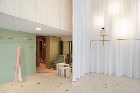
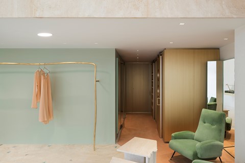
Italian fashion brand Forte Forte’s newly unveiled store is an ode to the intimate experience of shopping for clothes
Forced to refocus perspective by the relentlessly increasing popularity of online shopping, designers of retail spaces are being challenged not only to compete with each other, but to provide tactile experiences unattainable in the ethereal world of digitised consumerism. Having worked alongside Forte Forte co-founder and wife Giada Forte to curate a fresh shopping space, art director Robert Vattiliana presents the fashion brand’s newly unveiled Milanese boutique as a union of action and observation.
On minimising architectural elements to maximise presentation…
“For me it was not about building an architectural manifesto, but about focusing on and developing the idea of Giada, my wife. She works very much with the tactility of touch, rather than appearance. For me it was about addressing this point within the project. I am a Swiss graphic designer, so I always try to reduce the elements. For me the idea was therefore to reduce the elements of the architecture, so basically to go on two elements.
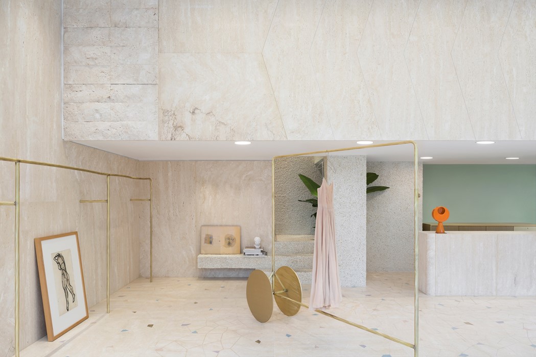
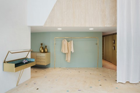
“In this case we worked with a marble Travertina – it was a very Italian contribution to the work, and was very much about the heritage of the counter. The Travertina, for me, was about the interpretation of the different finishes. We have the Travertina, which they pour over, where you have flat surfaces with little holes, which are natural. Then we have the Travertina with the lines and cracks. We then have the brass. It is worked in a very delicate way – we have a couple of finishes for this as well. And then, for the floor, we wanted to achieve a little bit of the old, but then to integrate it in a modern way. So we have a really big one metre by one metre surface, cut by CNC, and then inside we put coloured glass from a company founded in the 1800s in Venice. All the work is done by hand. The attitude is about handmade processes.”
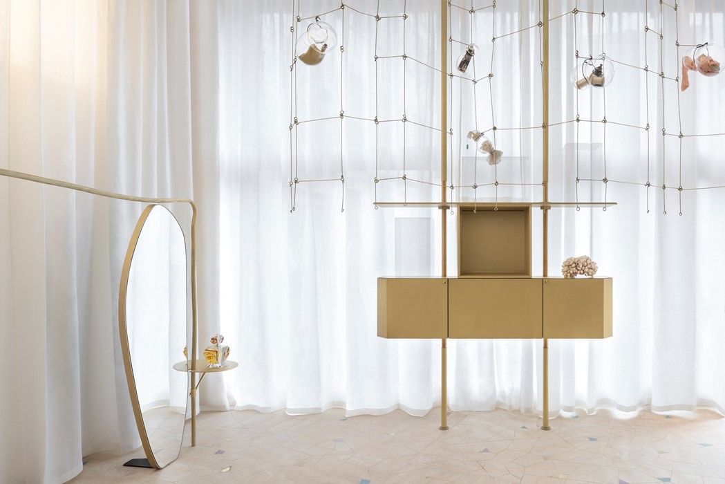
On redefining the role of retail spaces…
“I had two goals, personally. One was to create an atmosphere; I actually tried to work on different spaces in a way to build an idea of paths – you walk around and experience the sensation of being in a private space like a house, from the living room, to the kitchen and then through to the garden. This was very important. Secondly, it had to be a space that contributed to the presentation of Giada’s collection. It must not overtake. Very often in retail it is just a case of building racks, and building the identity of the space through different racks, but nobody thinks about the clothes. For me, I had to develop an identity that would enhance the collection.”
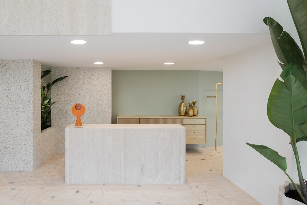
On referencing traditional designs to create contemporary experiences…
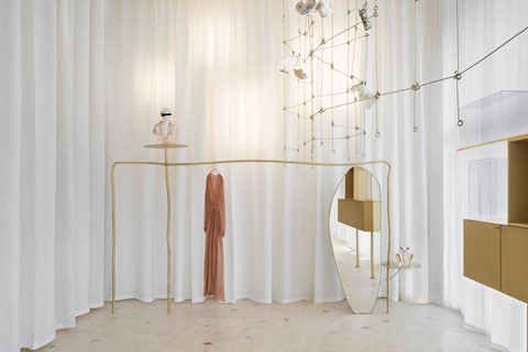
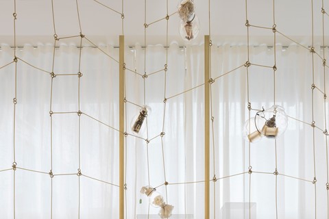
“For me, it’s the idea of building a kind of living space, and when you are living in a house you are living in different ways. For example, the high space is really important and the chandelier dictates the attitude, and then you have the stairs. The stairs are covered by thousands of little powder pink stones. The changing room, which is very important, is the space that the women goes into and takes her clothes out, so the approach had to be completely different to the other spaces. We combined velvet and buttons to create a feel of intimacy. Also, the doors are inspired by Jean Prouvé, a designer I love very much. These sliding doors connect the design and give the idea of the old style trains with little compartments. The idea of these old carriages was to go into a space and take a trip, so that’s the experience we tried to recreate.”
