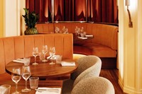
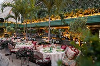
“Beauty should be edible, or not at all.” Salvador Dalí was an artist with an appetite for indulgence. “At the age of six I wanted to be a cook. At seven I wanted to be Napoleon. And my ambition has been growing steadily ever since.” For the famed Surrealist, pleasure was as synonymous with a fork full of food as it was with the stroke of a paintbrush, and, as illustrated in his outlandish cookbook Les Dîners de Gala he viewed the opportunity to wine, dine and entertain as an artistic performance in itself.
In modern society it is restaurants that have become the canvas for this particular platter of expression. In cities blooming with diversity, the ravenous wanderer can eat their way around the world in less than a few miles while those with an eye on social status chart a path of upward mobility with the reservations held in their name. As the world becomes increasingly digital, we crave a comprehensive sensory bliss that extends beyond the plate or mouth. It is the job of architects and interior designers, working in collaboration with restaurateurs, bartenders and chefs, to put on a show as exemplary for the eyes as it is for the tongue.
Coinciding with the timely death of minimalism, today’s dinner guests are searching for a brave tactility reminiscent of the experimental interiors of the 1970s and theatrics of the 1920s. While established adopters of this mentality such as Bob Bob Ricard and Sushi Samba know they can rely on costume uniformity, gimmicks such as “press for champagne” and skyscraping locations, newcomers to the more casual side of the bar and restaurant world are challenging our regional expectations of the dining experience.
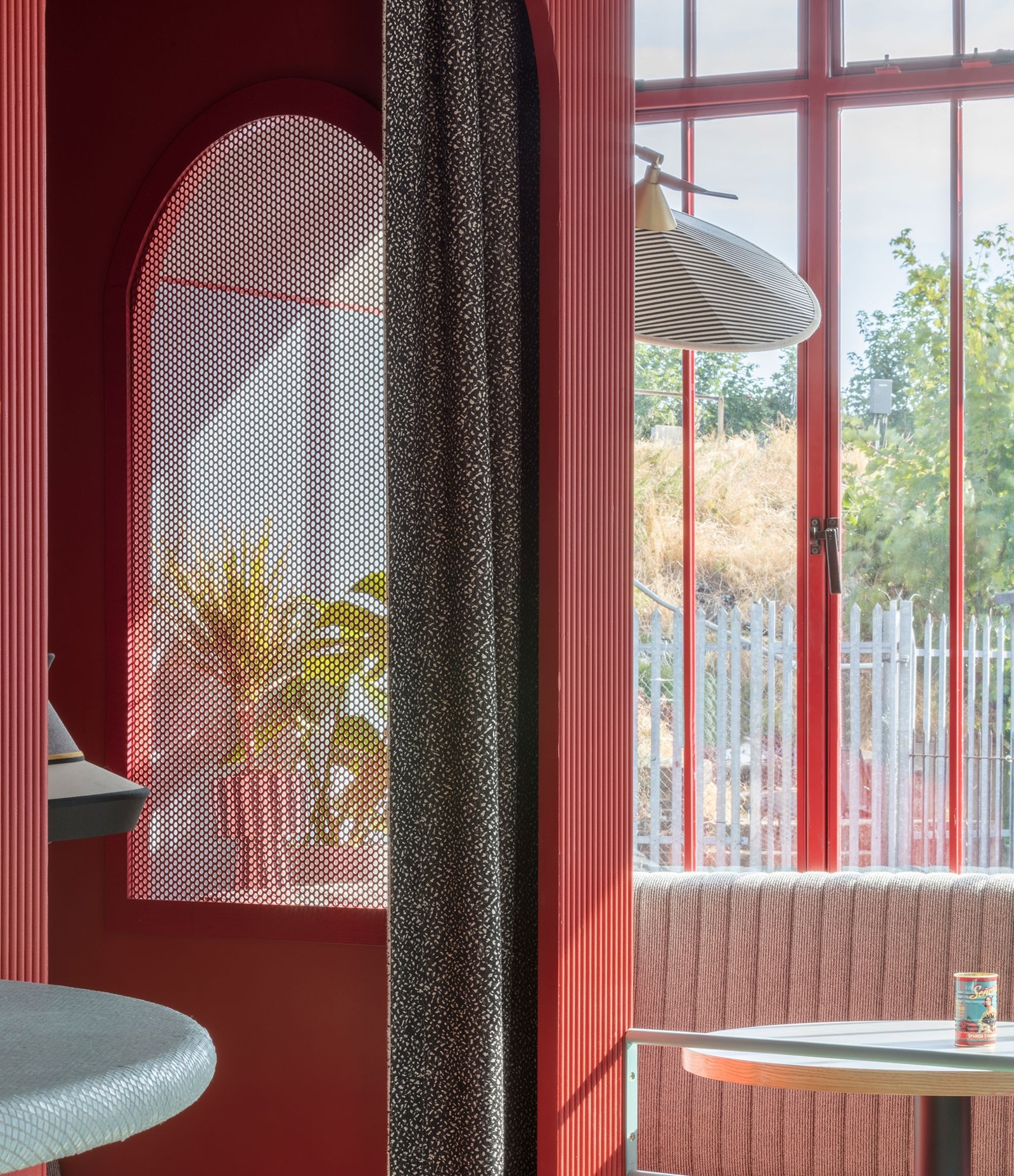
New to south London’s growing food scene, recent Balham opening Piraña is a South American-inspired bar and eatery from nightlife entrepreneurs Alastair and Nicholas Heathcote. In hiring multidisciplinary design studio and aficionados of experience Sella Concept, the brothers replaced the risk of creating not much more than a themed venue with an opportunity to create a unique destination. “While the food concept touches on South American cuisine, the brief was to create something unique with no particular cultural reference but that invites guests to eat and drink in a relaxed manner throughout the day. Our approach rests on colour and flow, creating spaces within spaces to drink and dine,” explains Sella Concept co-founder Tatjana von Stein. Looking beyond the basic functionality of a bar or restaurant, Von Stein explains how they create a window to another world: “We are both fascinated by the psychology of behaviour behind design and the question of how to encourage behaviour through layout, design and materials – what design makes us feel. Our favourite projects are those that allow us to answer one question: how can we transport an audience? We adore experimenting with new styles and palettes so Piraña for us was an incredibly refreshing departure from our previous work. The forms, materials and furniture should transport the visitor with it's mosaic tiles, retro metal stripes and oddly wonderful and unique red, blue and grey combination palette.”
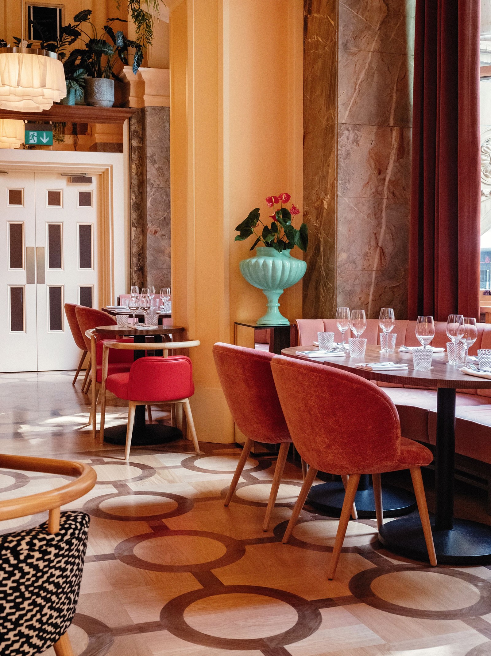
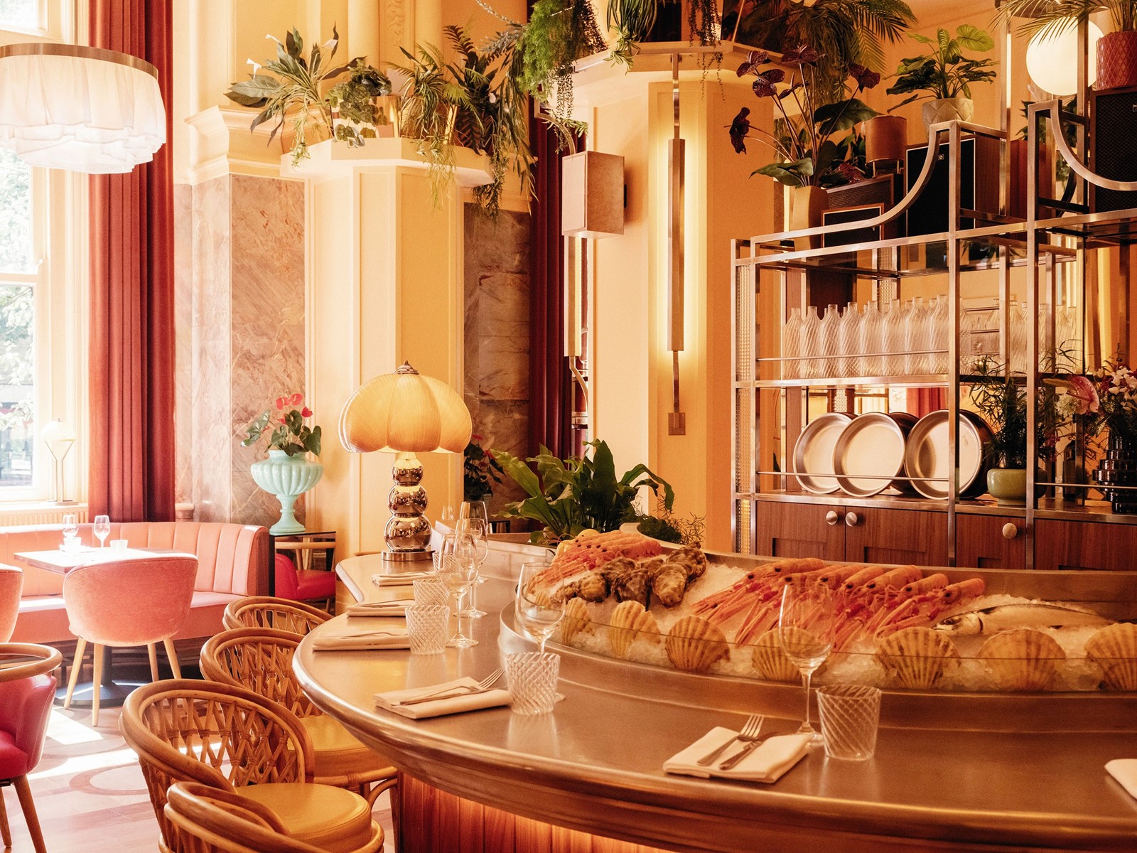
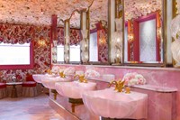
International influences, both aesthetic and edible, are central to restaurants and their identities, but some spaces are approaching representation from the world of arts and culture. A much-Instagrammed haunt of the who’s who of London’s cultural bourgeois, Bloomsbury’s Neptune is the second restaurant from Margaret Crow and Brett Redman. Serving seafood kitsch in a Grade ll-listed building, the venue’s interiors and branding have been elegantly constructed with gentle nods to 1960s Californian counterculture, while the walls of the space are adorned with a rolling series of works by emerging artists curated by Antonia Marsh. Boasting easily the oddest toilets of any restaurant in London, and the certainly the pinkest dining room, India Mahdavi’s interior design work for Sketch took art’s role in hospitality design to a more playful conclusion and has spawned many imitators, so the challenge now is for hospitality designers to produce new concepts that continually seek to surprise the increasingly unshockable diner.
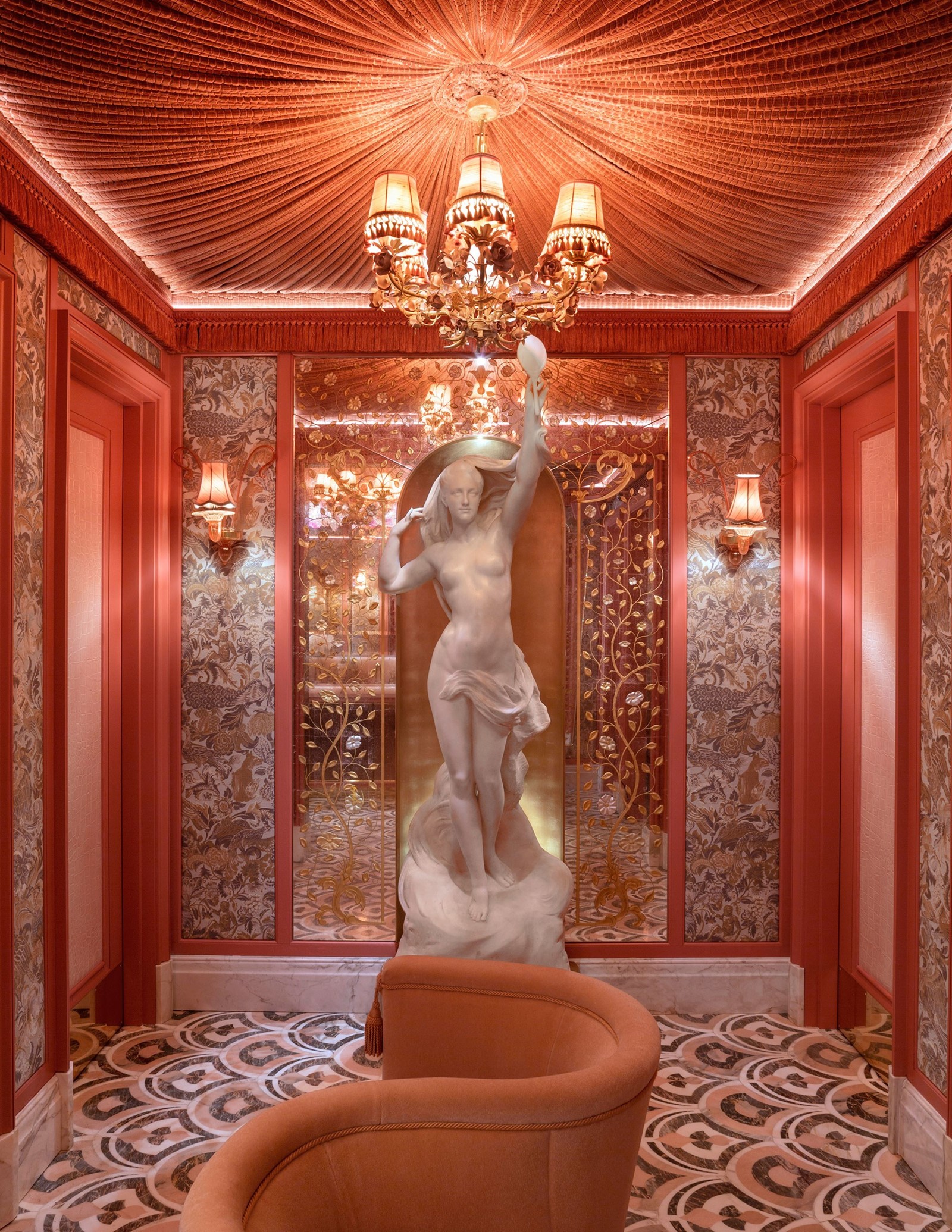
The concept of a member’s club is undeniably obscene, so it is unsurprising that many of them come with the absurd interiors to match. Liberated from the shackles of a one service requirement, designers of destinations such as Soho House and Annabel’s are faced with the rare prospect of creating a home away from home (or rather an escape) for the club’s members. Naturally, and much thanks to Soho House, a cosy, homely vibe was quickly established as the coveted style. However, this year, Annabel’s – which first opened in 1963 – revealed a new Grade I-listed Georgian mansion house location at 46 Berkeley Square. Designed by Swedish master of glamour Martin Brudnizki, the interiors feature clashing patterns and conflicting styles almost as pretentious as the club’s application process, but for a venue known to host the likes of mother-of-the-bride-of-the-moment Sarah Ferguson, President Nixon, Kate Moss and even the Queen herself, why hold back?
