I remember many magazines – like markers – accompanying me through adolescence. The holographic cover of National Geographic, the ‘Special Future Issue’ of Interview with Tracey Ullman on the cover, and my guilty pleasure, MAD magazine, with its interactive fold-in back cover. But it wasn’t until I got to London, aged 17, and started the student magazine Untitled with Rankin and Ian C. Taylor that I began making the pilgrimage to Tower Records in Piccadilly Circus to flick through the pages of The Face, Maximum Rocknroll, Ray Gun and Mondo 2000. It was the early 1990s, and that was the place to find the best imported magazines. The first drop of the new issues of Interview and Vogue Italia were an unmissable event for fashion and design students alike. It was a special kind of club.
I didn’t realise at the time, but the reason I think I was so drawn to Interview was its graphic design: the paper was matt with a rough texture and smelled of deep tones of wood and ink. It was unusually large; I connected with it on a sensorial level. Q&A interviews were also my favourite format; they just weren’t the formula du jour in the self-conscious dialectic of NME. I also loved the photography, the mix of extraordinary portraiture – the subjects becoming simultaneously irreverent and iconic. The covers that stand out are Laura Dern – a Stetson completely obscuring her face – as she crouches down to the ground, her name as a cover line printed upside down on the floor. A repentant looking Mike Tyson, his hands in prayer, wearing a towel as a nun’s habit and a comic-looking John Lydon tugging his ears to the edges of the page, with cover lines radiating from his brain. There was humour, these were larger-than-life characters shot by some of the greatest image-makers like Herb Ritts and Bruce Weber.
I would later discover that these issues were the result of an explosive relationship between Ingrid Sischy and Tibor Kalman. For those who don’t know her, Sischy was the incomparable editor who put Comme des Garçons on the cover of Artforum and who radically changed the art-fashion dialogue. A book of her essays, Nothing is Lost, was published recently, and it is a brilliant compendium. Tibor Kalman’s contribution to magazine culture is less well documented. In the early days of Dazed & Confused, he encouraged and inspired me. Tibor headed up an influential graphic design agency, M&Co, and after a brief tenure at Interview became the driving force behind COLORS. Funded by Benetton (at a time when brands weren’t invested in making editorial statements), COLORS was another revolutionary magazine where Tibor continued to break new ground. The Queen was Photoshopped to look ethnically black; a double-headed cow and an oil-slicked bird appeared in the ecology issue. COLORS looked at AIDS, race and religion. Tibor taught me that social consciousness and entertainment could be mixed.
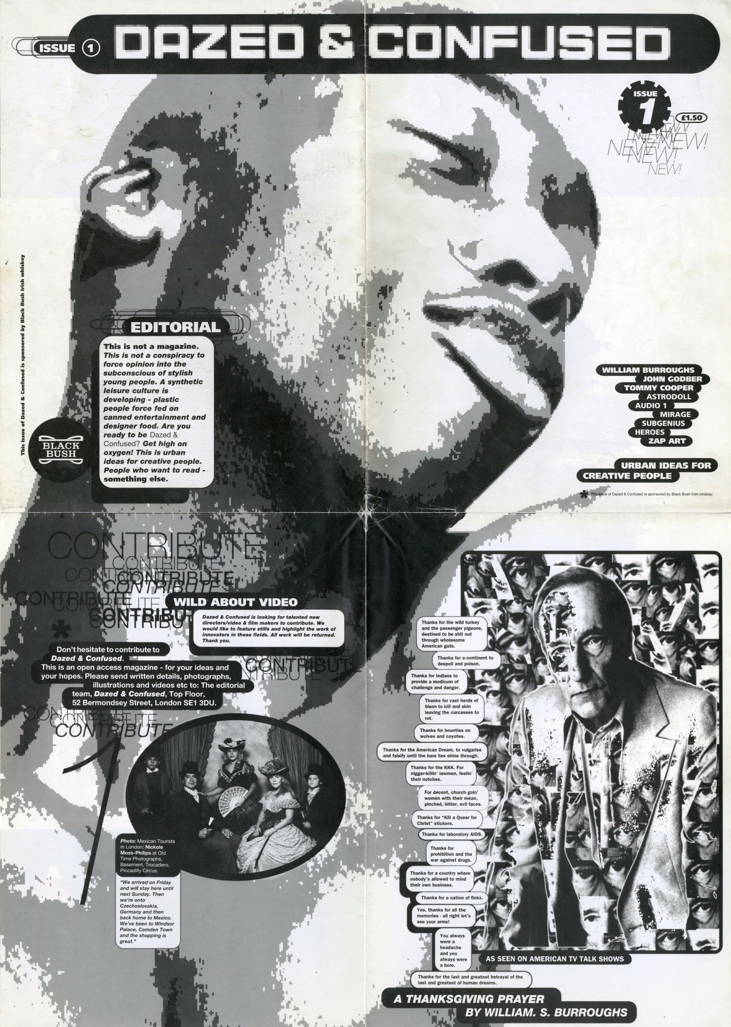
‘This Is Not A Magazine’ I wrote on the cover of the first issue of Dazed & Confused. I understood early on, drawing on personal experience and my own position as a fan, that the best magazines are about physical communities as much as they are about communities of thought. The purpose of Dazed & Confused was to challenge conventional stereotypes and hierarchies with an outsider agenda that welcomed otherness; it allowed a new generation of talent to define its own reality.

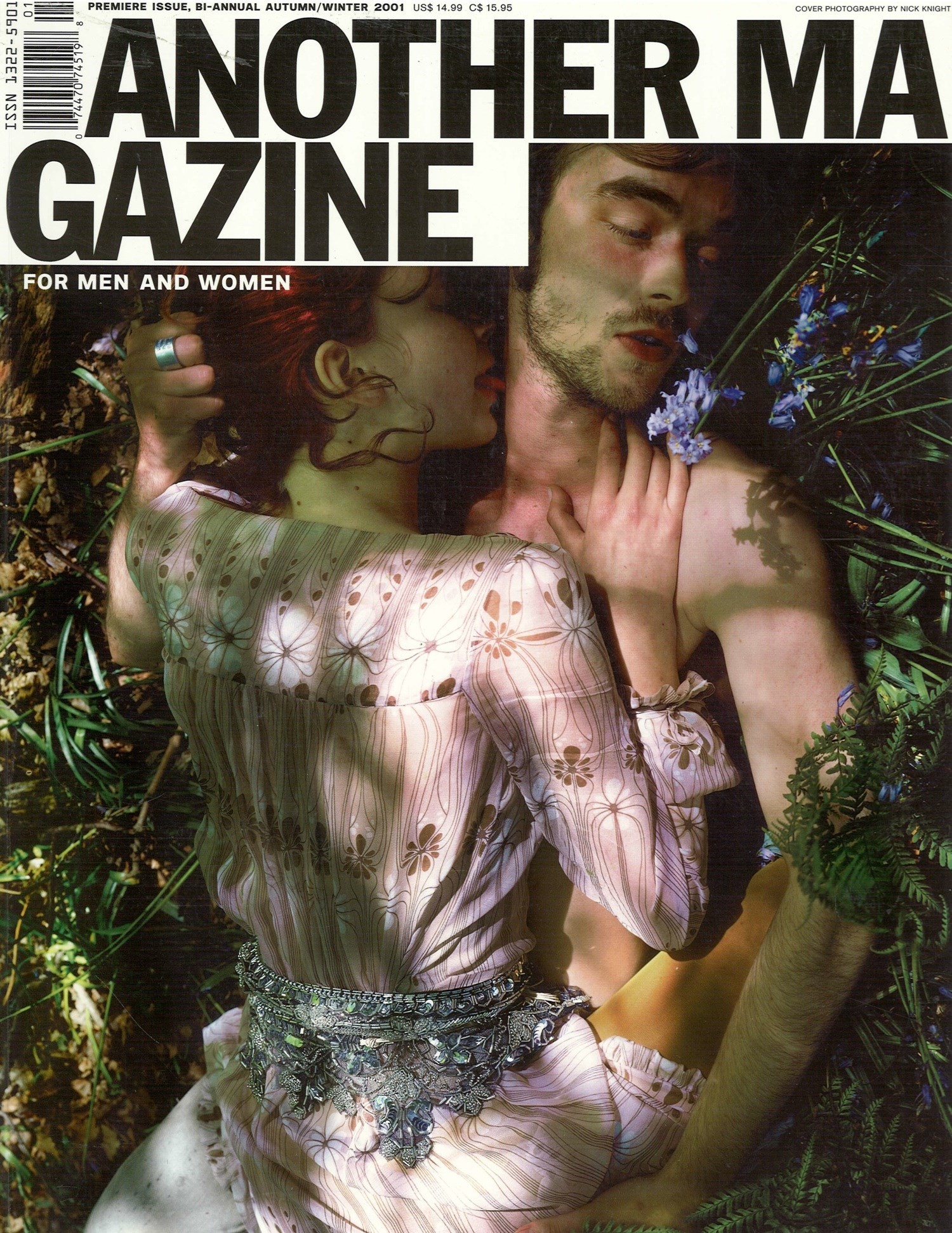
‘AnOther Magazine: another point of intervention, another set of discoveries, another way of looking at things, another 30 minutes of your time, another kiss, another curious idea that just came to mind, another reason to get out of bed in the morning, another sense of déjà vu, another chance to do it all over again next season. Another damn fine day.’ So opened my editor’s letter for the first issue of AnOther Magazine in 2001. If Dazed was about accelerating culture, then AnOther was about slowing it down, zooming in. It was a hybrid between a magazine and book. It felt like such a risk at the time, like all these things do, but its success shows that slowing down was exactly what its audience wanted at least when it came to fashion and culture in print.
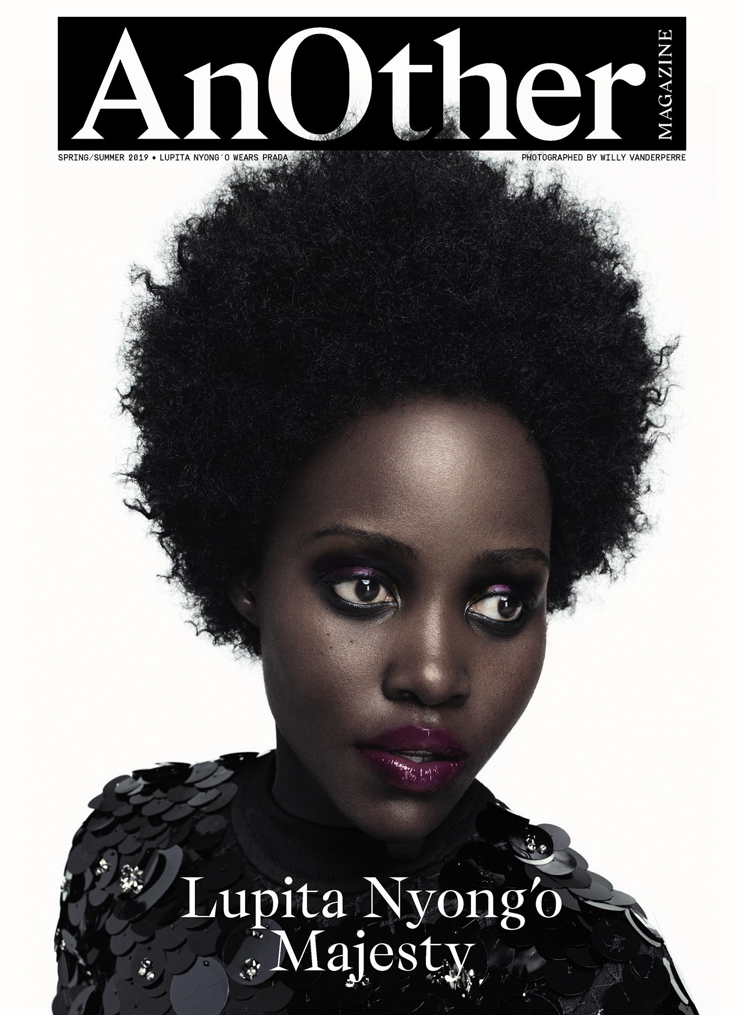
Dazed, AnOther and Another Man have continued to thrive because of the power, impact and newsworthiness of their visual and editorial agendas. Their issue launches trigger mass commenting and sharing on social media as well as press coverage in newspapers and online. The images and ideas from print kickstart trends, inspire memes and often fuel critical debate that leads to a reorientation of public and popular opinion on many social and cultural issues.
“In magazine pages, the eye is travelling first class; on Instagram, the eye is in virtual free fall”
Niche is the new currency, and being meaningful within a niche, or several niches simultaneously, is critical for media and brands alike. Alessandro Michele, Riccardo Tisci, JW Anderson and Kim Jones are examples of a new generation of designers who inherently understand that there is no mainstream anymore, just multiple concurrent streams.
Magazines like Re-Edition, 032c, Brick, Candy, Buffalo Zine, Kaleidoscope, gal-dem and, of course, System, all share this luxury niche sensibility. Each issue is anticipated and celebrated by a specific community, by fans. It is about a relative scarcity, coupled with a highly focused editorial point of view – as opposed to scale and reach – that creates the ‘must-have’ effect for print. IDEA has defined that mindset with its ALLCAPS bulletins announcing new issue drops. I recently ordered the 25th anniversary double issue of Self Service and regularly hit the ‘I Want That’ button for one-off print magazines and books on IDEA’s Insta-shop. It’s deliciously addictive.

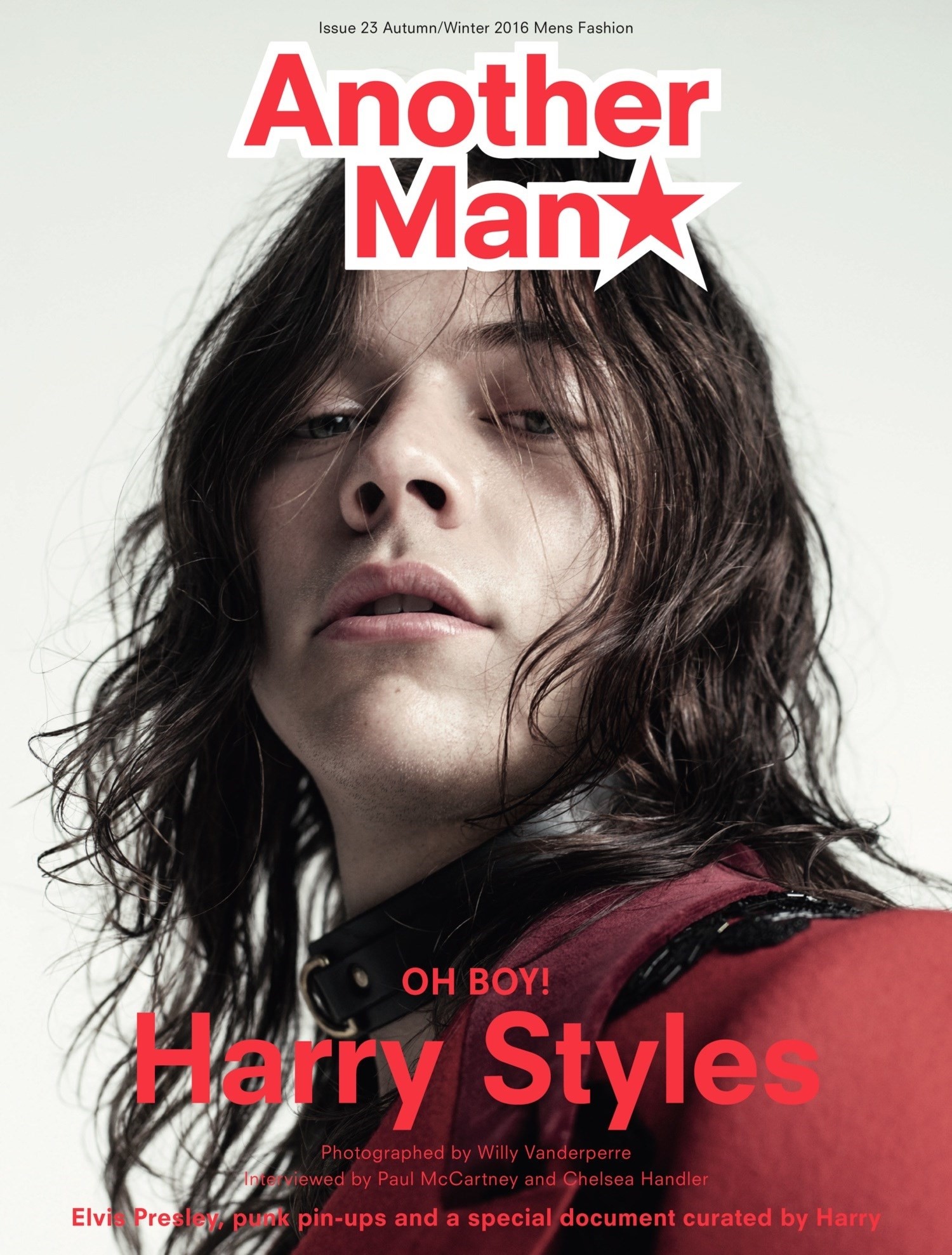
For a new generation of consumers who have grown up with digital media, print is, by its very nature, limited. The fans who email Dazed Media every week for a copy of the Harry Styles issue of Another Man – now three years since it was published – are a testament to that. With 50 pages of images of Styles, conceived by Alister Mackie and shot by Ryan McGinley, Alasdair McLellan and Willy Vanderperre, the issue acts as the ultimate fan magazine. It costs an astounding £350 on eBay, a magazine resale value that eclipses even George Lois’s seminal 1968 cover of Muhammad Ali for Esquire, which is a mere £190 in comparison.
Dazed Media’s social channels are powerful but smaller print publishers, which make up for a lack of followers in counter-cultural currency. The power of the audience lies not in its size but its level of investment in a brand’s point of view. I read somewhere that generational change happens when the industry is busy discussing disruption and, yes, businesses will crumble, media empires will fall, those that were heralded as the new avatars of publishing will disappear into the shadows. But those with a knack for understanding their audience will always make print work. Physically connecting – and digitally connecting – print audiences as if part of an exclusive club is key. From the very beginning of Dazed & Confused, we hosted parties, staged exhibitions, created happenings that were about community and bringing the magazine’s ideas and the culture to life; we pioneered the idea that magazines could be participatory and open, and our digital channels have been essential in helping us continually redefine our relationship with our audience.
“The best magazines live on coffee tables and are statements of identity when you come into someone’s home; they are held by fans walking down the street, the magazine or its tote bag, symbols of identity and belonging”
So what makes the physicality of a print magazine – especially a print magazine where photography, strong graphic design and high quality, long-form journalism are prized – so enduring, so appealing, so necessary today? If you’ve ever watched the documentary Diana Vreeland: The Eye Has to Travel, you will know. For Vreeland, there needed to be highs and lows within the unfolding linear narrative of a publication. Without this inherent ‘drama’, there is no emotional connection. ‘We are a physical people,’ she says, and the best fashion stories, magazine layouts, or ‘flow’ as we call it, all have a direct connection to our internal rhythm and our natural sense of our own physicality – entirely unlike the hyperspeed of digital’s sensorial overload, where an emotional sensibility is forsaken for speed.
The image in today’s digital media is atomised. There is also, as a result, no reference. Is it new, old, faked, authentic? Who is the author? Who contributed to the creation of the image? Are there more associated images that make a whole story? On social media there is no genuine way of knowing. The point of the image then is not its authorship, its affect, but purely its repurposing. On Instagram, the image is bootlegged into something new, something unintended and often abstracted. Very occasionally, on an author’s own feed, there is an attempt to provide a frame of reference and authenticity through credits and tagging.

The landscape or double-page spread is a key format in magazine layout. The physical turning of the page also naturally gives pace to the flow. In magazine pages, the eye is travelling first class; on Instagram, the eye is in virtual free fall. While exhilarating, we simply don’t experience images in the same way, with the same nuance and depth, like holding a magazine and flicking through the pages at high-speed, trying to take it all in at once. Fashion and art photography, portraiture, long-form journalism and social reportage may look amazing on specially designed screen-based browsers, but they are best in the context of a bound and printed magazine or book. This is collectable, a physical memory, a reference that endures. The best magazines live on coffee tables and are statements of identity when you come into someone’s home; they are held by fans walking down the street, the magazine or its tote bag, symbols of identity and belonging. This is the enduring power of physical magazines as symbolic social signifiers.
I was looking through my archive of Egoïste magazines, at Avedon’s cover portrait of Warhol’s naked, scarred torso and the special gate-fold pullout of the Factory group inside. I have seen those images reproduced, life-sized, in many exhibitions. But if it wasn’t for Nicole Wisniak, Egoïste’s founder, who commissioned them for her magazine, they wouldn’t exist. The best magazines actively engage and create culture at a deep level. Egoïste is the source and the agency of those Avedon images. It is also, due to its context, the most authentic expression of the image, the issue itself a time capsule, with an ability to transport you back in time with immediate cultural context in the way an image on the wall at Gagosian cannot.
What we are witnessing now with a resurgence of independent print publications is the re-establishment of analogue media, a reinvention where explorations of certain values – the luxury of time, emotional connection, arcane knowledge and visual wonderment – are being launched continuously like beautiful fireworks, lighting up the sky, as symbols of hope against a dark and corporately owned media landscape.
The smart creative directors at fashion brands have realised that niche is the new currency. Unlike corporations, fashion houses, including Prada, Celine, Balenciaga, Loewe, and Burberry, to name but a few, have strong creative leadership, their designers forensically involved in the creation of campaigns and their media placement. Luxury is in the business of selling the perceived values of quality, authenticity, creativity and a distinct mix of heritage and newness. The trend for multiple-page inserts, for special placements, for unique creative content to appear in different niche publications is, I believe, proof of a return to print. Its rarity and exclusivity affords a direct synergy with the codes of such brands. After all, the powerfully imaginative views that the most original independent magazines offer within the media landscape, is a luxury in itself. Hollywood, the ultimate dream factory, also trades in those same aspirations, valuing the covers of print magazines as some of the most valuable real estate in media for its stars. As Diana Vreeland reminded us: ‘The dream is everything.’
This article appears in System Magazine, Issue 13, out now.
