We roll out the red carpet and showcase eight of the most beautiful film posters in cinematic history
A masterful movie poster does so much more than merely promote a new release to the masses: it creates an aura of anticipation, imparting a feeling that goes much deeper than a simple description or a list of stars ever could. Beyond the cinema itself, certain movie posters constitute some of the most innovative, exciting examples of graphic design from the 20th and 21st centuries. Here, we chart eight of the most beautiful film posters ever to grace the walls of your local theatre.
The Lobster, 2015
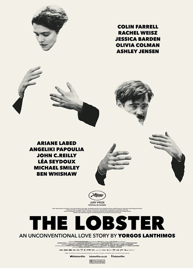
When posters for The Lobster – the first English-language film from Greek auteur Yorgos Lanthimos – were released in May, a certain kind of film fan rejoiced. The duo of posters, designed by the brilliant Vasilis Marmatakis, sees lead actors Colin Farrell and Rachel Weisz embracing the empty silhouette of their partners, hinting at the complex themes of love and isolation that are explored in the film. Marmatakis, who previously headed up the esteemed Greek design studio MNP, was also responsible for the titles for Lanthimos’s 2009 film Dogtooth, and it’s easy to see what constitutes the Marmatakis touch: clean lines, striking typography and a visual riddle that provokes real curiosity in the film itself.
Black Swan, 2015
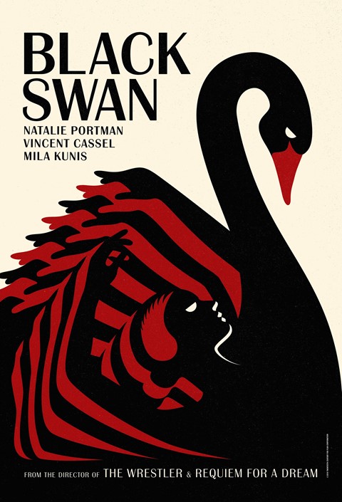
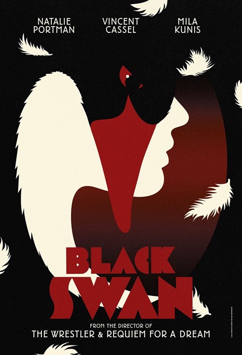
Created by London design studio LaBoca, this set of four posters for Darren Aronofsky’s Black Swan call to mind the geometric aesthetic of Czech and Polish posters that were popular during the 60s and 70s. The shape of the swan itself becomes a key element of each poster’s construction, suggesting the grace of movement, with a futurist palette of dark red, black and cream. The visual references may point backwards to illustrious 20th century design history, but the finished package represents an enduring and elegant piece of movie memorabilia.
Carol, 2015
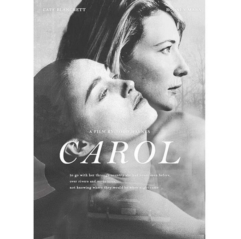
Based on Patricia Highsmith’s novel The Price of Salt, Carol brings the inimitable Rooney Mara and Cate Blanchett together to portray the relationship between a young photographer and the sophisticated older woman she falls for. The poster juxtaposes the two women in a hazy, black and white profile, allowing their relative beauty and ages to stand together, while the tagline, taken directly from the novel’s original text, makes an evocative promise of adventure and romance to come within the film’s story.
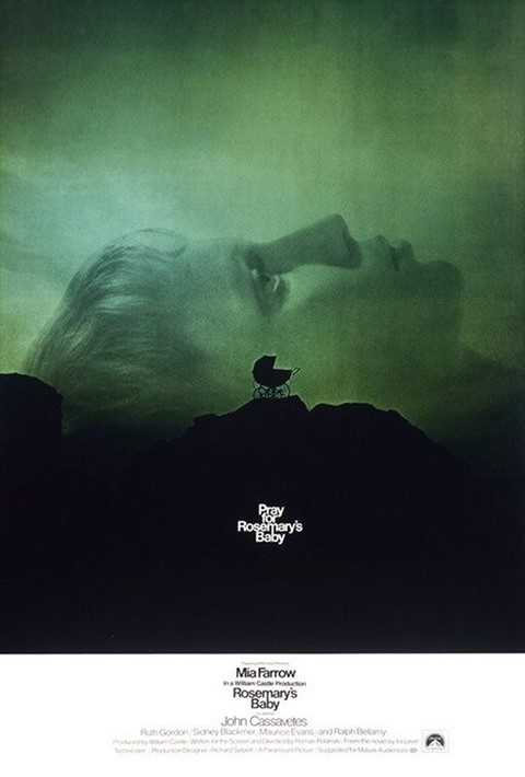
Rosemary’s Baby, 1986
Designed by prolific designers Phil Gips and Stephen Frankfurt, a powerhouse poster duo who also created the artwork for iconic films such as Network and Alien, here Mia Farrow’s profile provides the ghostly backdrop for a stark silhouette of a pram, balanced precariously on a ridge. ‘Pray for Rosemary’s Baby,’ implores the tagline, marking this poster out as one of a series of classic 60s posters which use an enigmatic sentence to entice the viewer. This method of poster design – illustrating a pervasive, haunting image with a curious strapline – creates a distinct atmosphere of intrigue around a film.
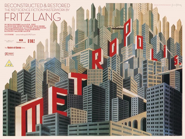
Metropolis, 1927
Fritz Lang’s Metropolis has that wonderful quality of being simultaneously timeless and ephemeral in its era, and this poster, designed by Boris Bilinsky, is no different. The Russian émigré designer was commissioned to create materials for the French release of the seminal dystopian film, and this architectural feast was the result. Recalling MC Escher as well as then-contemporary Cubist works by Braque and Picasso, Bilinsky’s stunning structural masterpiece is a perfect fit for the technical dexterity of the film itself.
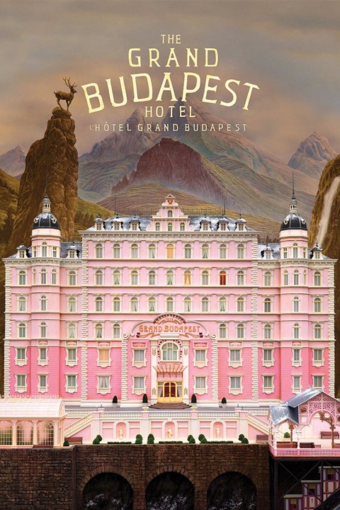
The Grand Budapest Hotel, 2014
Known for his meticulous attention to detail and illustrious art direction, Wes Anderson’s pictures always come excellently packaged with promotional materials. The Grand Budapest Hotel print introduced viewers to that eponymous building in all its whimsical, pink splendour. Designed by art director Annie Atkins, who remained on set in rural Germany during filming, the poster remains true to Anderson’s unique playfulness while also inviting the audience into the carefully created fictional world of the film itself.
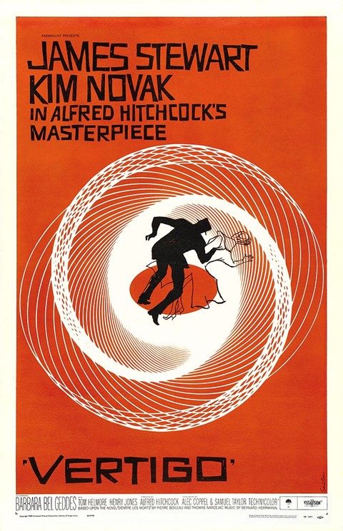
Vertigo, 1958
The poster that designer Saul Bass created for Alfred Hitchcock’s Vertigo might well be the most iconic movie poster of all time, and it’s certainly one of the most enticing: a silhouetted couple tangle in the centre of a jarring vortex, as mirrored in the film’s title sequence. Bass, who later worked on as a visual consultant on West Side Story and designed many other famous cinema posters, became known for his symbolic visual style that could encapsulate a film’s inner workings far greater than a simple still or character image ever could.
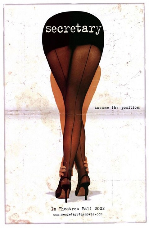
Secretary, 2002
The racy themes of Steven Shainberg’s Secretary were laid bare in its poster, which sees Maggie Gyllenhaal as submissive secretary, Lee Holloway, taking a provocative stance. Her pose plays with the well-worn design trope of the legs-akimbo film poster, familiar from the likes of For Your Eyes Only, subverting it into something more intriguing. Meanwhile, a typewriter font instructs the viewer to ‘assume the position’, lest we are confused about what the film is about, while the fact that Gyllenhaal’s face, as well as the picture’s other star, James Spader, are hidden from view entirely creates a frisson of curiosity about what might befall the pair. This provocative poster caused global controversy on its release, and has since become a highly coveted collectable.
Follow the AnOther loves film board on pinterest.
