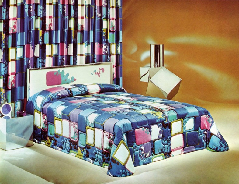
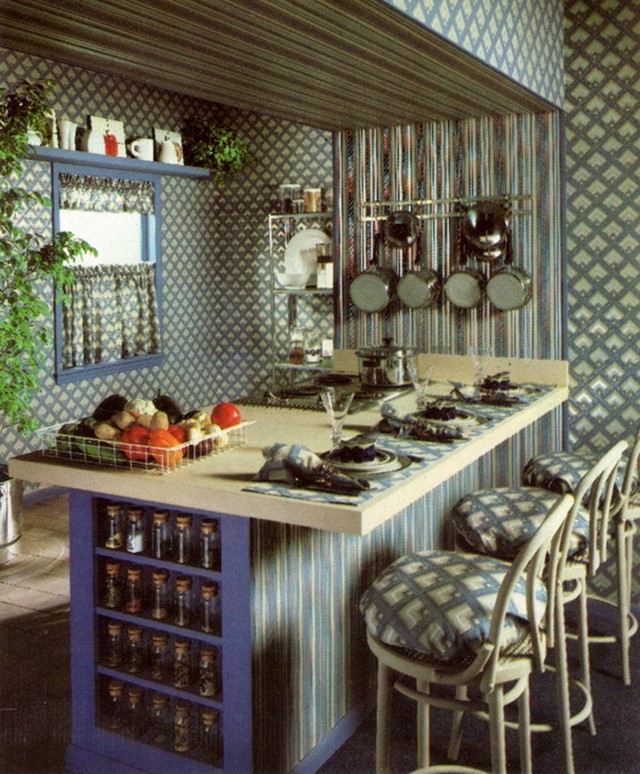
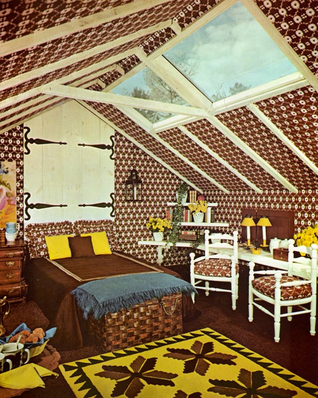
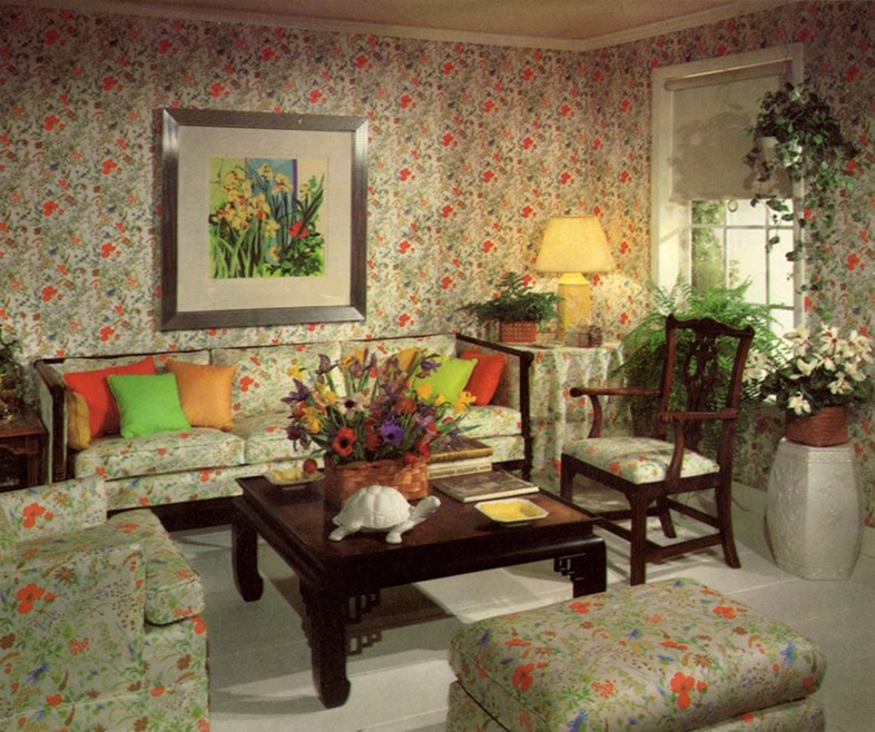
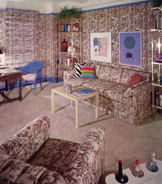
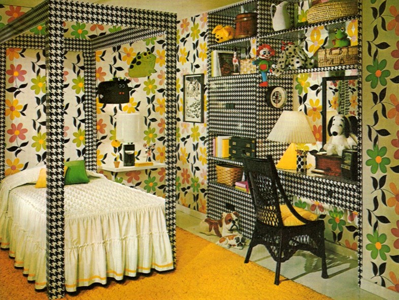
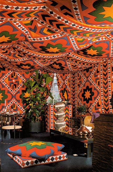
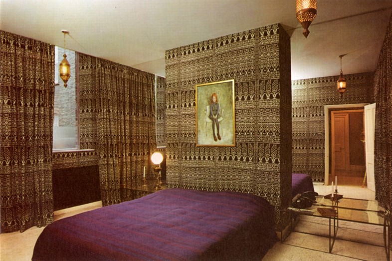
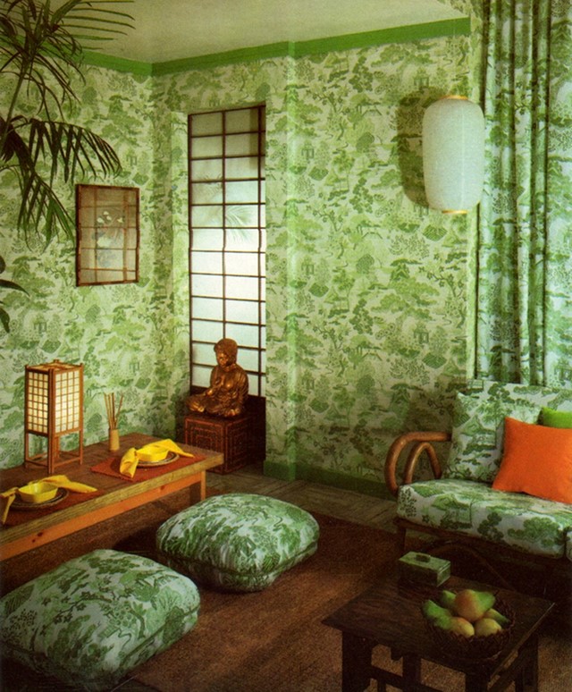
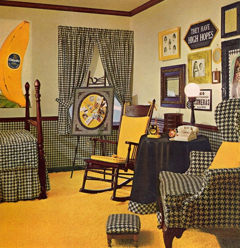
The Supreme Interiors archive is filled with vintage design trends I wholeheartedly embrace. The 1970s colour and style aesthetic fuels the passion I have for interiors, and provides endless inspiration when it comes to building furniture and manipulating my own space. Most trends I can appreciate and glean some sort of usable information from, even if I don’t necessarily agree with them or understand the original motivation. There is, however, at least one trend that leaves me scratching my head: for a period of time in the 1960s and throughout the early 70s, designers and home decor enthusiasts just said, "to hell with it, let’s make everything match!" Perhaps to simplify the design process, or to take advantage of the ease of one-stop shopping, the answer to the age old question "does the carpet match the drapes?" became "yes". The carpet does match the drapes. And it matches the wallpaper. And the pillows, and the couch, and the tablecloth...You get my point.
The result, when it comes to these rooms, is a visual mess. As the walls merge with the floor, which then merges with table, you search frantically for a blank space calm enough for your eyes to land. But it rarely crops up, and the most common result is you have an anxiety-inducing room that feels cluttered and loud. It just ends up looking like bad taste threw up all over the room. Pattern, when it is used, should be used deliberately and in moderation. And if you absolutely must use a wealth of pattern (hey, sometimes it's necessary) use multiple patterns with prints of different scale that complement one another other. A large floral wallpaper could be paired with ditsy paisley curtains and a solid couch all within the same colour palette, and it will be just fine – but a good rule of thumb to follow is to change the motif any time you change the material.
Modern interiors can be subject to a similar but slightly different problem: while we rarely see over-the-top pattern abuse anymore, we do see interiors that are so committed to one theme or trend that they have a similar effect. We’ve all flipped through Pinterest and groaned at the hipster interiors with an abundance of mid-century furniture, and shelves lined with contemporary objets d’art, or rolled our eyes while yet another authentically rustic Kinfolk-esque dining room pops up on our Tumblr feed, complete with a reclaimed wood farm table and hand thrown pottery. Just as an otherwise pleasing pattern can overtake a room when left unchecked, so can the proliferation of any trend throughout every aspect of a room. Allowing fluidity and a space for your style to evolve is essential to keeping your living environment warm, inviting, and ultimately aesthetically pleasing. It comes down to having a bit of breathing room with your design choices, something you just don’t have when you lock onto one idea with such force – exemplified by the following ten rooms from the Supreme Interiors archive.
For more Supreme Interiors, head to drydockshop.
