"If people are coming to an exhibition, there should be something exciting for them to engage with," says Isabel Gibson, one-half of the London-based pairing whose imaginative designs know no bounds
Ever since they graduated with a degree in Graphic Design from London's esteemed Chelsea College of Arts in 2012, set design duo Isabel Gibson and Helen Chesner, AKA Isabel + Helen, have nudged at the boundaries of their field, conjuring up creative solutions from constructivist play areas and noodle chairs, to Picasso-inspired air dancers and window displays about the concept of scale within our universe. There's no idea too big, no detail too small to concern the pair as they work to briefs set by the likes of Tate Modern, the Victoria and Albert Museum or Selfridges. There's every likelihood you've already marvelled at something they have set their hand to.
As the scale and scope of their impressive projects continue to flourish, we visited Gibson and Chesney at their south London studio to discover what motivates their forward-thinking practice.
On Early Experiments
Having met at university, Gibson and Chesney found one another a natural fit for their mutual ideas. "We had only worked together on two projects at university, but we worked really well together, had fun and always agreed on things," Gibson explains. They weren't always successful, however: "the outcomes didn’t necessarily go so well – one of our projects ended so badly our tutor told us to never work together again. It was quite experimental and we had gone a bit off track..."
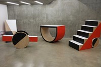
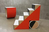
Fortunately, the pair didn’t follow their tutor's advice; soon after graduating they were commissioned by the Victoria and Albert Museum to create an artwork for Friday Late – the institution's monthly event, dedicated to celebrating "all aspects of contemporary visual culture and design in society" through installations, live performance and more. They decided to build a playground inspired by constructivism. "We didn’t want to do something 2D," says Chesney of the decision. "If people are coming to an exhibition, there should be something exciting for them to engage with. We could see how the shapes intrinsic to the movement would work in an environment where people were interacting with them, once they were abstracted into 3D forms." It was a resounding hit, which saw a complex idea executed both stylishly and practically – and, in turn, led to plenty more.

On Balance
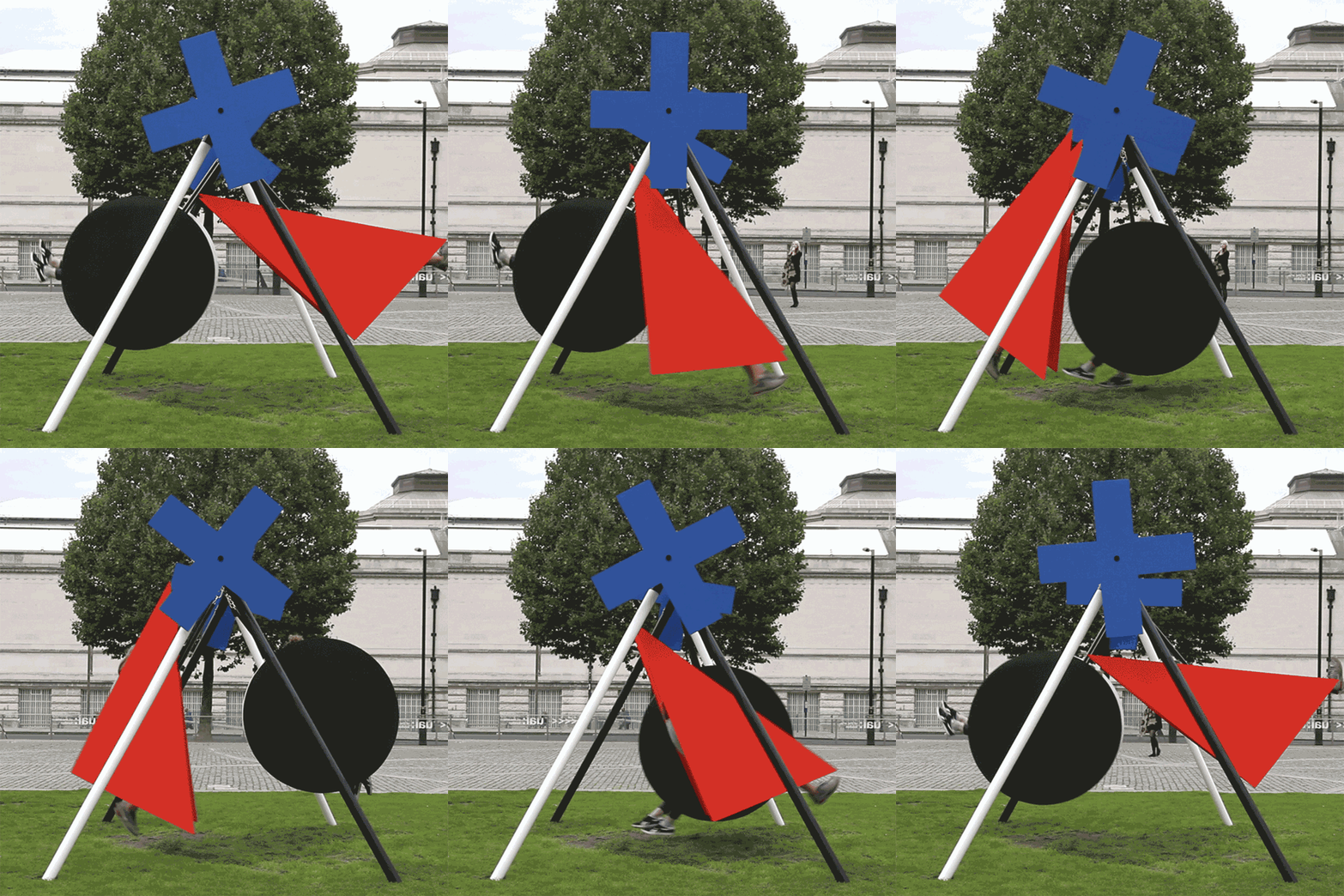
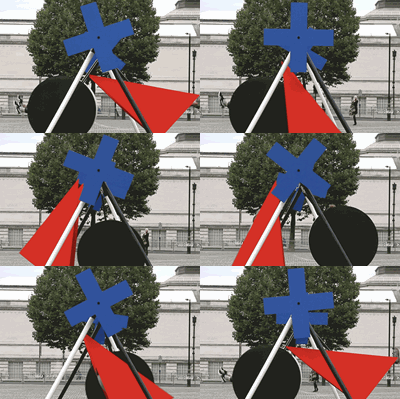
Last year, as part of the London Design Festival and Chelsea’s ten-year anniversary at Millbank, the pair were invited to show work in the courtyard exhibition. "We saw it as an amazing opportunity to do something self-initiated," says Gibson, adding: "We wanted to do something kinetic, where the people using it are the vehicle, and there aren’t any mechanics involved." The resulting design – a swing – required no small amount of calculations, "working out where to position the shapes and the seats, and what materials to use," Chesney explains. But it went down a treat: "The result was quite hypnotic, the foam shapes are so sharp and crisp – and the feet hanging out at the bottom are funny."
As well as working with great clients from the outset, Isabel + Helen have kept up a considerable personal practice alongside their commercial work, and this continues to inform their commissions. As Chesney affirms. "[Our personal projects] show people what we’re about, and we’re often offered more jobs as a result – we’ve been really lucky in that respect. But we also learn so much from the challenge of a brief, you can go on forever without limitations, especially when there’s two of you."
On Mechanisms
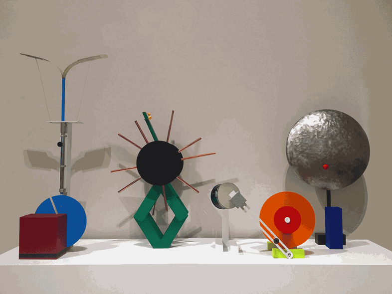
This April, Gibson and Chesney participated in Pick Me Up, Somerset House's celebrated annual illustration and arts fair – a challenge they were happy to take on because, according to Gibson, "we got to show our 3D work in an illustration context. And we also got to learn more about mechanics. We wanted to create these moving pieces which would, in turn, create a 2D piece, a print inspired by what we had made. Each instrument had its own character, formed from scraps of wood laid out according to the movements they made. It was a nice way to work, rather than drawing something first and thinking ‘OK, now I’ll just make it’," she adds.
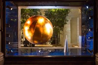
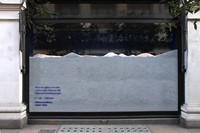
Similarly, their work at Selfridges, exhibited in the store's lauded windows over Christmas 2015, saw the twosome design and produce a series of exquisite displays that explored the scale of the universe – each depicting a fact or theory. Their ideas were certainly ambitious, as Chesney notes, "We had a lot of mechanics to install over just two nights. There wasn’t time to test it in situ, and we had a few problems, but everything came together. We learnt loads, and it’s still one of our favourite projects. We were talking about why we like doing window displays, and it’s because they are open to the public. It’s less about designing for designers."
On Dancers
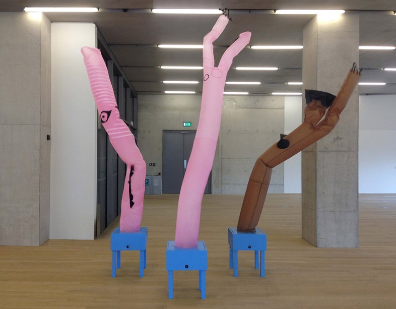
Indeed, 'designing for designers' is a far cry from Gibson and Chesney's working mantra, so the opportunity to create a piece which would be shown to celebrate the opening of Tate’s Switch House this summer was a particularly exciting moment. They were asked to respond to an artwork in the collection, which given its scope was no easy feat. "There were loads of amazing sculptural works or performance pieces but we didn’t want to simply reinterpret something in a way that would be a bad version of the original," Gibson recalls. "We had come up with loads of ideas, but then we saw Picasso’s Three Dancers and just thought – we could make three dancers."
They were enthused by the prospect of creating an engaging and entertaining solution for the Tate's diverse audience from the renowned artist's work. "We wanted it to be a really immediate, light-hearted response," adds Chesney, "and air dancers are so satisfying to watch, they have this incredible rhythm to them." Again, the potential for experimentation in dimensions appealed to the duo, as well as the fact that Picasso would be unavailable to air his views on their interpretation. "It was better to do something that could go from 2D to 3D," Gibson concludes, "and it was also good to choose an artist that wasn’t around anymore – what would Picasso say?"
