Wisteria climbs and collapses over Milan’s streets in spring, and with the bustle of Salone del Mobile, its terrazzo floors and imposing concrete arches are set aflutter with throngs of design devotees and cherry-red Campari. Built up around land which had largely been occupied by private gardens and allotments, the city’s palazzos can be quite unassuming from the street – at least in comparison to their opulent interiors and lush gardens which, during Salone, are opened up for exhibition.
Their architecture falls between, and often combines, the styles and practices of the 15th and 20th centuries, due to both the need for restoration and aesthetic whim. One architect who fell on both sides of the restoration process was Piero Portaluppi, who had been particularly popular with the 20th century Milanese bourgeoisie, renovating Casa degli Atellani, Palazzo and Villa Crespi, among others. His most famous work, thanks in part to Luca Guadagnino’s 2009 film I Am Love, is the Villa Necchi Campiglio, which would later be renovated by Tomaso Buzzi, combining Portaluppi’s Rationalism with 18th-century Rococo.
This approach, with its fluctuations and shifts of style and purpose, can be felt across the Salone, where ornament and utility sit both alongside and atop one another, and humour and earnestness in an enthralling to and fro.
1. New Ornament
Such contrasting styles can also be seen at the Casa degli Atellani, which played host to Passegginata, an exhibition curated by magazine editor Martina Mondadori Sartogo and hosted by Airbnb. It featured a variety of personal collections from Faye Toogood, Forma Fantasma and Ashley Hicks; of rocks, clay forms and textiles, as well as abstract totems, curiosities and utensils.
Set against the frescoes and grand architecture of Atellani – which once played host to Leonardo da Vinci while he painted The Last Supper at the Santa Maria delle Grazie across the street – these cabinets of curiosity read as both expressions of process and abstract ornament.
Meanwhile, Nobody & Co’s Bibliochaise, exhibited down a garden trail with structures decorated by Toogood, is a chair-cum-library – and in the case of the special edition held at the garden – decorated in gold leaf.
2. Remake/Remodel
Sustainability and social consciousness as principles and behaviours are difficult to communicate successfully through furniture or product design. At this year’s Salone, there were a number of projects which engaged with those media as a form of resistance, or productive output, as well as advanced applications of re- or up-cycled materials.
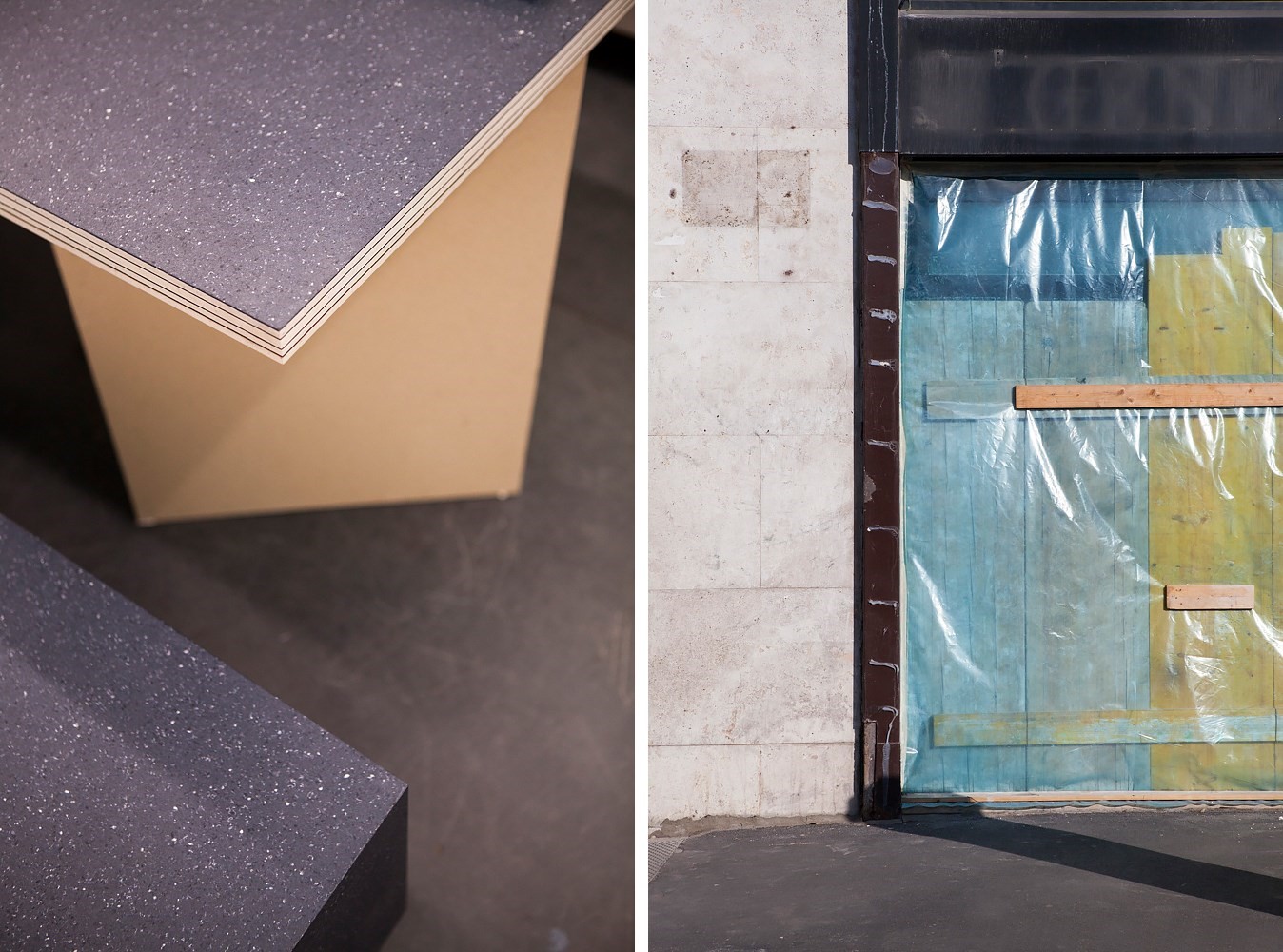
In the lower floors of the Fondazione Luigi Rovati, Paul Cocksedge exhibited a series of tables, shelving units and sculptures made, predominantly, from his London studio floor. On being handed an eviction notice, he excavated the site, creating concrete rounds and obelisks which contribute to a comment on the uncertainty and displacement inherent to London’s property market.
For Danish textile company Kvadrat’s new project, Really, whose aim is to up-cycle end-of-life textiles into solid textile boards, Max Lamb designed a series of benches using waste cotton and wool. Lamb’s benches employed curved edges, wavy patterns, geometric stacks and hover-effect structures in an experimental approach to an everyday material and form.
3. Play
Equally integral to the fair was a focus on entertainment and design as a playful distraction. At the Palazzo Serbelloni, quartz manufacturers Caesarstone collaborated with artist Jaime Hayon on Stone Age Folk, an exhibition of fantastical furniture including a mask as cupboard, clown faces and carousels.
Another exhibition which exemplified the theme was Marni’s Playground, made up of various shades of sand, rocking chairs, out-of-proportion games and picnic blankets, all in a concrete warehouse; while for Atelier Swarovski Home, Barbara Barry designed a series of multifunctional candle holders and vases in mellow, 70s hues which could be stacked, turned and repurposed.
4. Layers
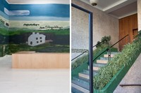
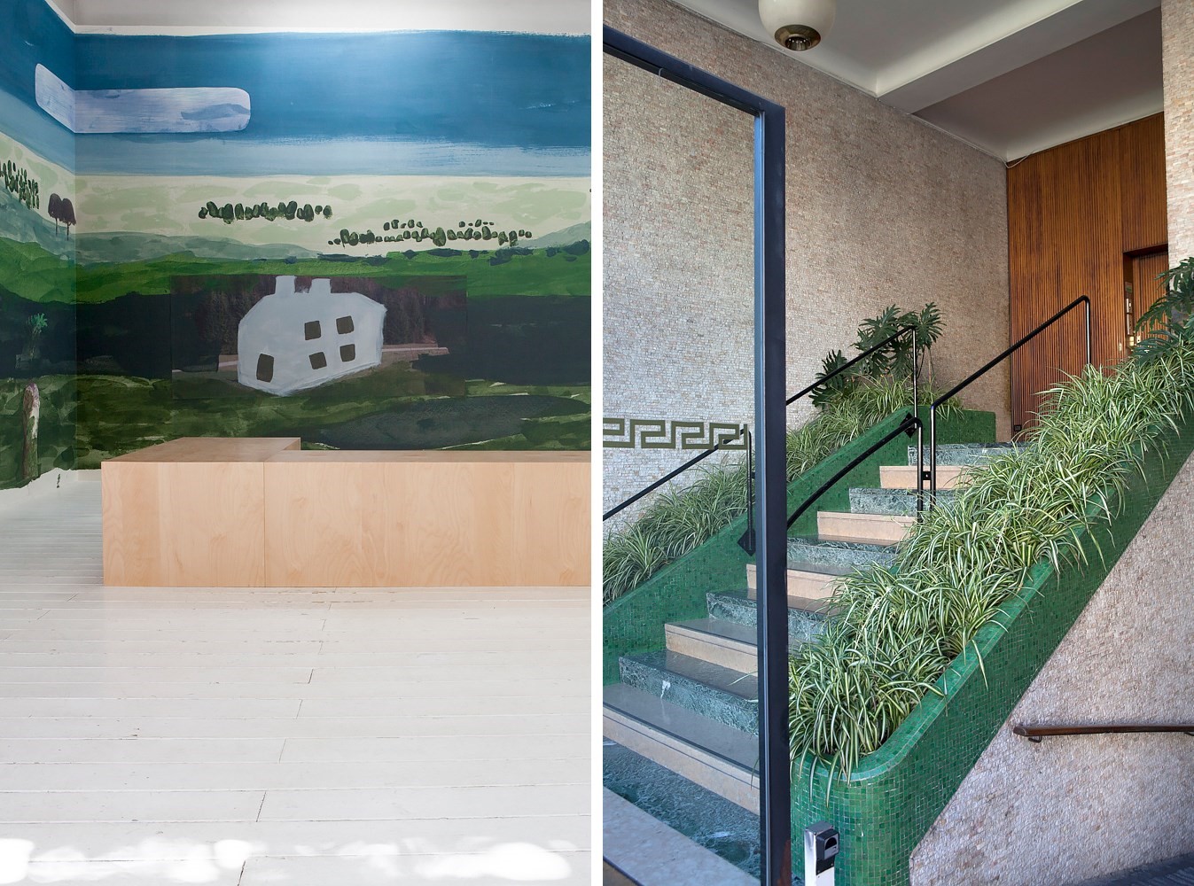
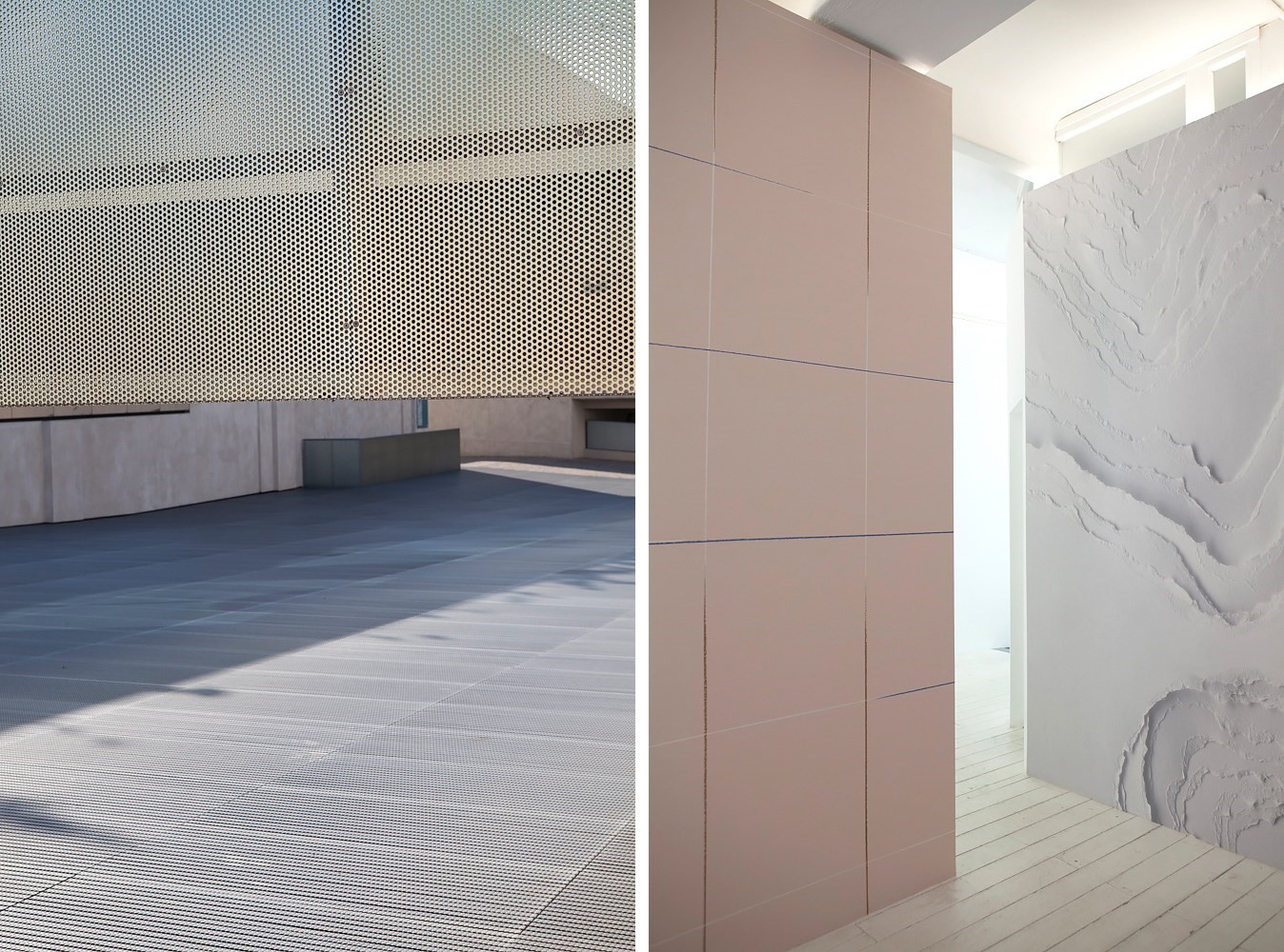
Layers of material, layered perspectives, stacks and tiers appeared here as both practical solutions and decorative details. At Matter-Made, there was a variety of flat-colour pastel furniture, which could be stacked, slotted or reformed, doubling up materials and cascades of light. At Calico’s Imagined Landscape exhibition, Ana Kraš designed a wallpaper with a linear pattern which created the illusion of slotting papers, while Faye Toogood combined three paintings – of moors, woodlands and fields – into a single landscape.
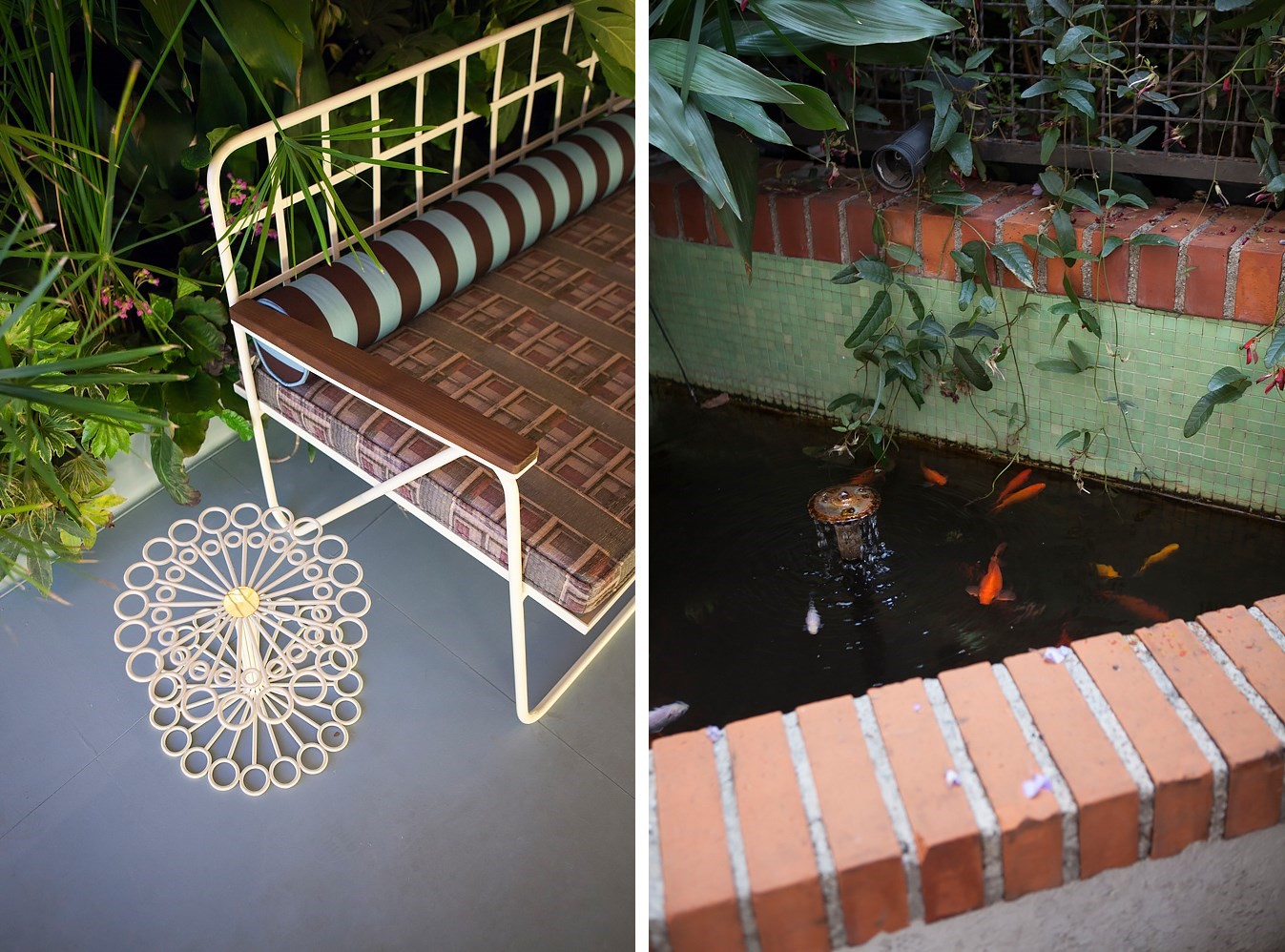
At Louis Vuitton’s Objets Nomades, pieces were woven, spliced and formed into organic rounds and repeat patterns akin to honeycomb. Design duo Fernando & Humberto’s sculptural Cocoon chairs were suspended over the Palazzo Bocconi’s grand staircase, while cheese plants and palms filled each room, collapsing over a variety of chairs and daybeds which were made for lounging, including Patricia Urquiola’s Palaver Chair and Atelier Oï’s Swing Boat.
5. Narrative
Design and theatre coalesced at a number of exhibitions as immersive multi-sensory experiences, maximalist installations and temporary TV channels. In a fine example of the latter, students and alumni from Design Academy Eindhoven presented a “mashed-up media and design studio” at the Atelier Clerici, which analysed the relationship between design and contemporary media in both high and low culture.
Another design school working with an immersive approach was ÉCAL, who presented More Rules for Modern Life, an exhibition by the Fine Art and Product Design students that considered the grey zones between the two practices via crispy golden walls, exaggerated forms and elaborate patterns. Milan-based Dimore Studio presented two exhibitions, one of an Art Deco-inspired geometric interior, the other of a plush, surreal veranda, with palms and pastel pink balloons growing out of tiled beds. Like much of this year’s Salone, the Dimore presentation imparted a sense of having stumbled upon a private oasis, works and spaces that held a wealth of elaborate tales.
