From 90s shots of Amber Valletta to Patrick Bateman’s cellophane-wrapped apartment, creative director Julien Dossena talks us through his inspiration
Brought up in Brittany on a diet of Americana and 90s fashion imagery, Julien Dossena’s latest campaign as creative director of Paco Rabanne is a pristine example of the brand’s new direction. Working with photographer and artist duo Scheltens & Abbenes and revered art director Marc Ascoli for a second series of images was a cherished experience for Dossena. “He really educated me when I was a kid, I was obsessed with his images!” Dossena says of Ascoli. “I remember some amazing Jil Sander images he did: Amber Valletta, sitting, dressed in a deep v-neck black dress and she was pulling this weird face with her eyes looking sideward as if she was thinking of something. Also Guinevere, on the flower wallpaper, she’s touching a wall or something, that was Jil Sander too. These are pictures I’m still looking at all the time because they’re so iconic, still so amazing and desirable but also precise in that balance and that strength. They are exactly the register I love. I’m so lucky to be able to work with these guys now.”

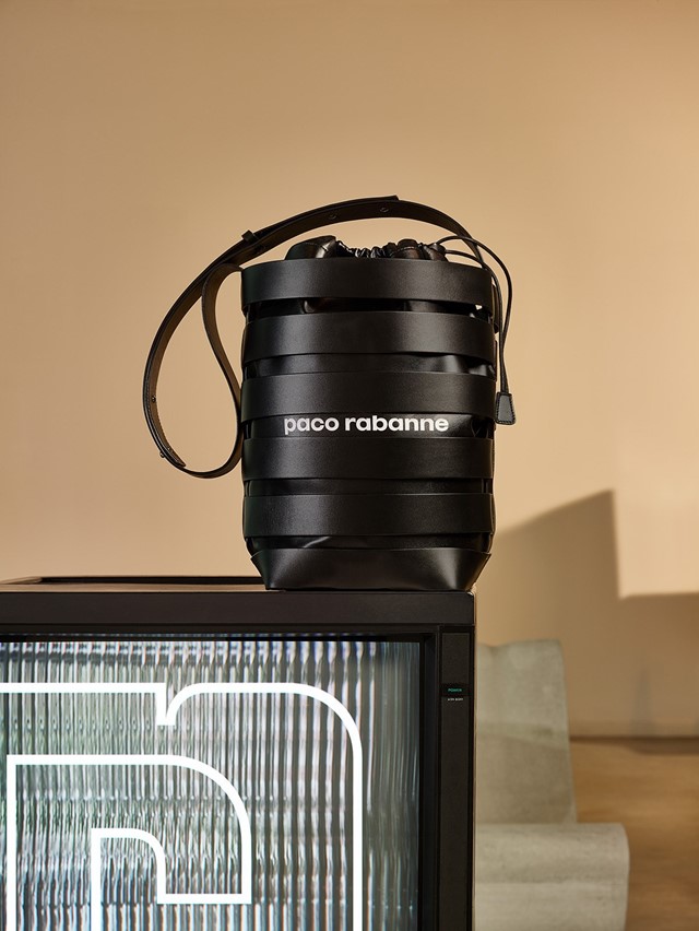
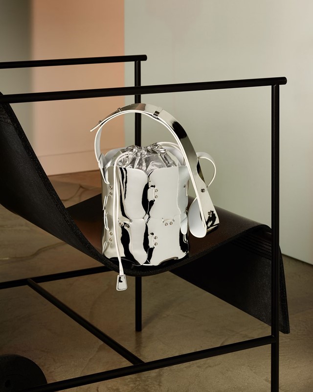
Fed up with fashion images of just “a girl, holding a bag or something,” Dossena set out with Scheltens & Abbenes to create a compelling still life scene that would build an institutional idea of the brand. With a seductive, synthetic sheen these images fit as seamlessly in a fashion glossy as in an interiors, design or art magazine. “That’s because it’s not built for you to buy the dress,” Dossena explains. “It’s more for you to be aware of the brand, of Paco Rabanne, and to give you a taste to go to see the product and the clothes. We loved that freedom of not having to put the clothes or the product frontal.”

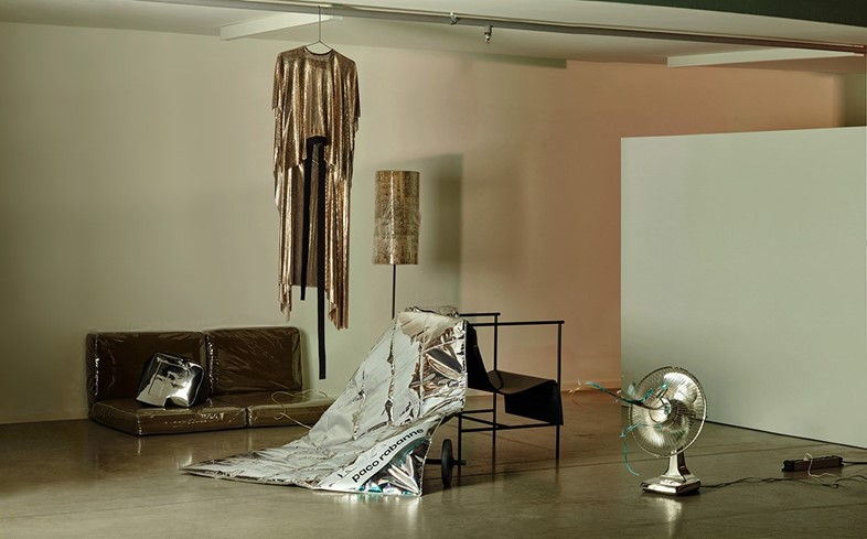
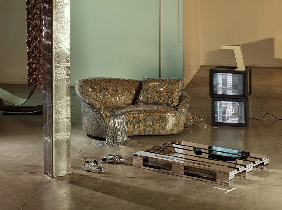
Instead of being presented with ‘the girl with the bag’, we are offered an installation, an insight into her world: the space in which she leaves her bag offering far more colour and character than a mere snap of her clutching it. While for the S/S16 campaign Dossena depicted a gallery-like space, occupied by a “grunge incarnation of a girl” who, “you can imagine is watching this kind of teenage movie on this old TV but in that set-up, everything is slightly twisted.” This time around, it’s the same girl, just darker: with cellophane-wrapped furniture and the metallic slink of Dossena’s reworked chain mail dress, the set reads part American-Psycho-style-murder-scene, part artist’s-squat-cum-performance-space. “I really loved that kind of film noir feeling, it gives a little bit of mystery and danger. This girl is a little more grown up: something has changed, she was safe and now she’s exploring different possibilities.”

With this alluring blend of sharp, futuristic finishes, an 80s industrial New York edge, and an air of nostalgia for grandma’s curtains, Dossena, Ascoli and Scheltens & Abbenes have a crafted a contemporary brand of retro-futurism. It’s a fitting approach to the renovation of a brand like Paco Rabanne, known for its innovation and 60s space age style. Rabanne was a visionary with an outlook, as Dossena describes, focused on “modernity, the radical and the conceptual. At the same time though, he stayed sensual and took the body as the basis of his work.” With his deft hand, Dossena continues to invigorate this heady combination.
