From Céline’s marble tiles to Balenciaga’s surgical steel, we select the best of the best when it comes to high-end retail spaces
One doesn’t need to invest in the clothes hanging on their rails to enjoy visiting the retail spaces of fashion’s best-loved brands. The great houses have long treated their store interiors as architectural extensions of their core vision and values – and when the furniture design and concept are as remarkable as the designs themselves, window-shopping becomes a pleasure in and of itself. The sculptural power of a shoe atop a plinth, or the mid-century chair supporting a lustrous new leather bag, can transport a store to the realms of an art gallery or museum – and the figures responsible for constructing them become their esteemed curators. Here, we select some of our favourites from around the world.
Prada, Aoyama, Tokyo
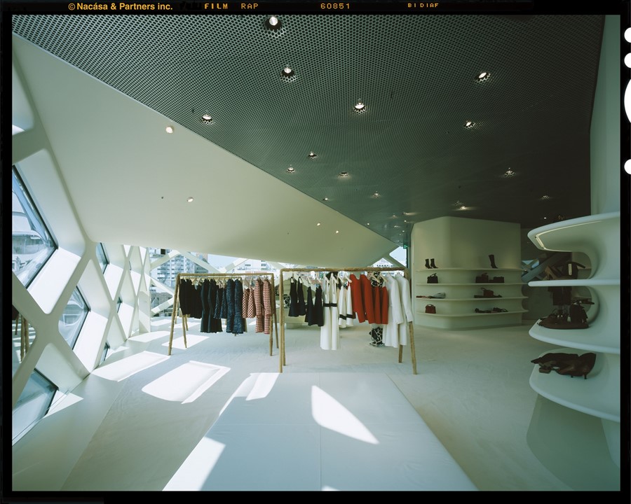
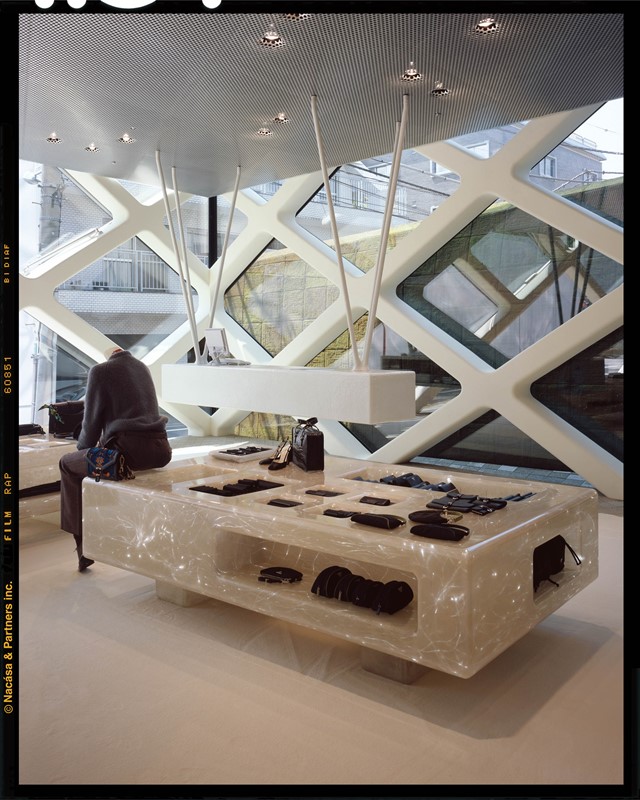
Prada’s flagship store in the heart of Tokyo’s Aoyama shopping district is part of the house’s Epicenter Store programme, which launched in 2000 and focuses, in typical Prada style, on the way we experience shopping, both conceptually and aesthetically. The building opened to the public in 2003, its Herzog & de Meuron-created façade designed to mirror the facets of a crystal, lending itself to both exterior and interior views that rival no other. “The resulting building challenges our perceptive energies in the most radical way,” reflects Jacques Herzog. The structure is a must-see, and its equally impressive interior houses Mrs Prada’s fabulously subversive designs to powerful effect.
Balenciaga, Rue St Honoré, Paris
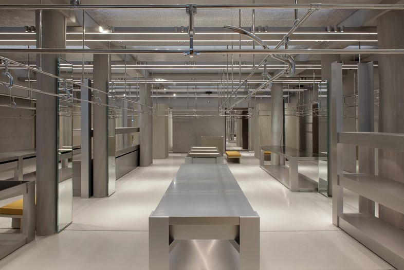
Radical change has been afoot since Demna Gvasalia took the helm of Balenciaga in 2015, and it is as tangible in the store’s revered retail spaces as it is in the collections themselves. Take, for example, the Rue St Honoré flagship, which was redesigned in March this year and manifests as a sort of fashion abattoir, its walls clad in exposed industrial concrete and its tables made from a surgical aluminium. Most curious of all are the rails, which are made from the same coveyor belts as those used in production at the label’s manufacturing headquarters in Italy. The ceiling, covered in aluminium foil à la Andy Warhol’s silver factory, and the furniture draped in synthetic leather, speak to Gvasalia’s blending of ‘high’ and ‘low’ culture – a weighty reflection on how the two are perhaps not so different after all.
Simone Rocha, Wooster Street, New York
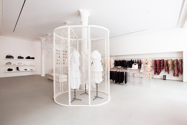
Simone Rocha’s Wooster Street store has high ceilings and a large shopfront, creating a more expansive-feeling space than in her London shop on Mount Street. Taking the art-gallery-meets-shop model – the designer is a prolific art collector, referencing works by the likes of Louise Bourgeois, Roni Horn and Jackie Nickerson – she hopes to create a sense of equilibrium in all the pieces on display. “There is always a balance in the collections, to create a modern form of femininity,” says Rocha. “I wanted this to be reflected in the store as well. So there are contrasts of hand-made moulded floral cornicing with clean perspex and a pink onyx till with origami paper chairs. The contrast of textures creates an environment for the collections to be housed in.”
Céline, Mount Street, London
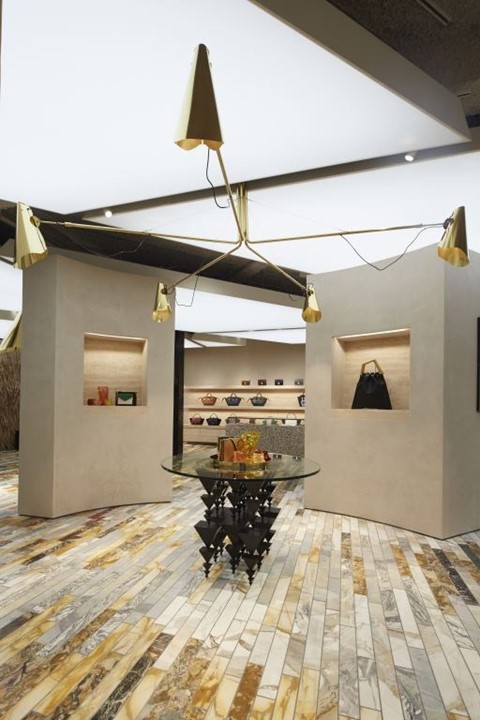
6,000 multicoloured marble tiles inlaid with semi-precious stones form the basis of Céline’s Mount Street store, and as is so often the case when it comes to Phoebe Philo’s influence, their impact is offset with an otherwise largely minimalist space, with the odd unexpected touch thrown in for good measure. The creative director has long made a name for herself for amalgamating the achingly chic with the esoteric, and in this case, the latter took the form of Danish artist Thomas Poulsen, who was given free rein over the design of the space. Philo was so happy with the results when it opened in 2014 that she soon asked him to transform the New York store with his magic touch too. The only way to truly understand why she was so enamoured with his work is to visit it for yourself; it’s quite something.
Acne Studios, Brera District, Milan
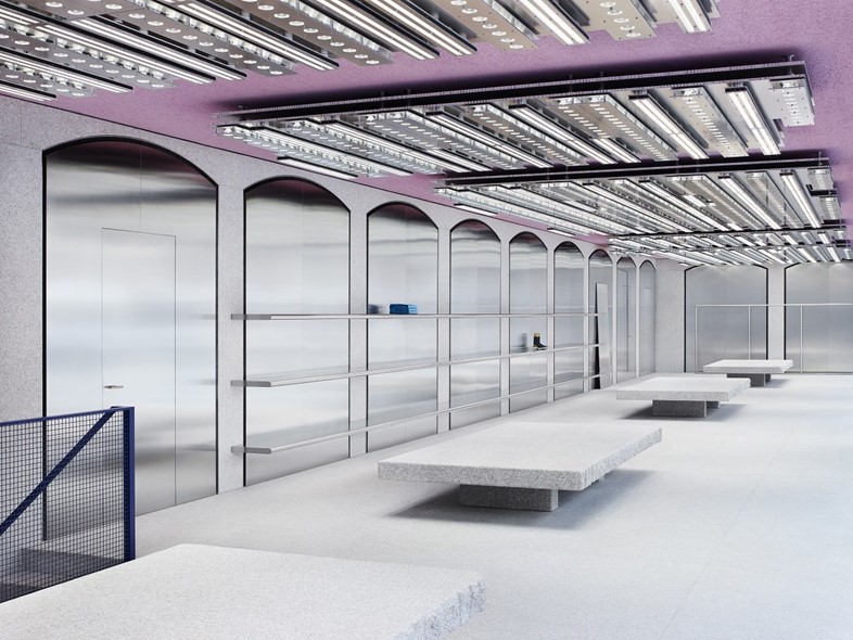
Newly opened in June this year, Acne Studios has added to its roster of retail spaces with an architectural response to the city of Milan. “It took five years to find the perfect place for us in Milan,” says creative director Johnny Johansson. “I am so happy that we waited, because the Piazza del Carmine has the exact sense of individuality and community that I like. The store is totally unique, and also totally Acne Studios.” Granite benches set 45cm from the floor act like ancient stone monuments, with the granite in the store sourced from the Baveno region of the country. Yet despite such an Italianate influence, the brand’s signature Scandi tropes haven’t been left by the wayside; neon strip lighting and plenty of stainless steel have the effect of paring back such grandeur.
