From the authentically urban to the utterly ethereal – the Autumn/Winter 2018 show venues provided an endlessly inspiring backdrop to the season’s collections
And just like that, it’s all over: the whirlwind of Autumn/Winter 2018’s cities, trends and spectacles will now defuse, trickling down into the visual culture of the forthcoming season. But it would be a sin to instantly forget the magic of those showspaces – from infinite, foggy forests to Louvre-landed spaceships and a replica of Colorado Desert’s Salvation Mountain – not least due to their ecological implications. Here, we pay tribute to the tremendous backdrops that served as metaphor and extension to some of the season’s key collections.
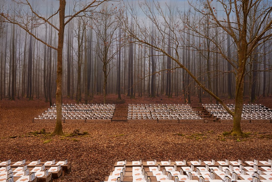
1. Chanel (above) at the Grand Palais
An astounding sight greeted guests at the A/W18 Chanel show: a seemingly endless forest, its trees “stripped bare by the season,” its floor covered with russet-hued autumn leaves. This limitless landscape was situated beneath the nave of the Grand Palais; its brimming blue sky and warm sun whispering memories of Indian summers. For Karl Lagerfeld, this life cycle of nature reflected the seasonality of fashion itself: “Chanel, it’s life itself, clothes that have a possibility of life,” read the show notes. As such, lace with inlaid leaf motifs resembled the graceful delicacy of the fallen foliage. Hailing from the Perche region of France, oak trees more than ten metres tall lined the flanks of seats – each of which will be recycled and composted by now.
2. Miu Miu at Place d’Iéna
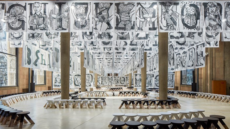
“Fashion is a language, can’t you see?” demanded the Miu Miu A/W18 show notes. Against traditional form, Mrs Prada opted not for a folly – recent iterations at Conseil Économique, Social et Environmental on Place d’Iéna, Paris, include a purple faux-fur enclosed staircase (A/W17) and red-brick patios complete with white plastic furniture (S/S18) – but for a stripped back installation space. Rows of black and white stools lined a hall draped in an illustrated alphabet – “The Miu Miu Type, An ABC of Actions Behaviours and Comportment” – imagined into being by creative agency M/M Paris.
It was an all-female alphabet. White flags were emblazoned with this new typography, designed to present a Miu Miu behavioural propaganda with each letter representing an alternative feminine state – body parts, famous figureheads and historical fashion statements each symbolised an independent conviction for the Miu Miu woman – a new alphabetical system for her to live by. “This for us is the modernity and the strength of Miu Miu, instead of imposing a message it offers girls the chance to embody a variety of characters by wearing the clothes” – a manifesto worth swinging from the rafters if ever there was one.
3. Balenciaga at Studio 107
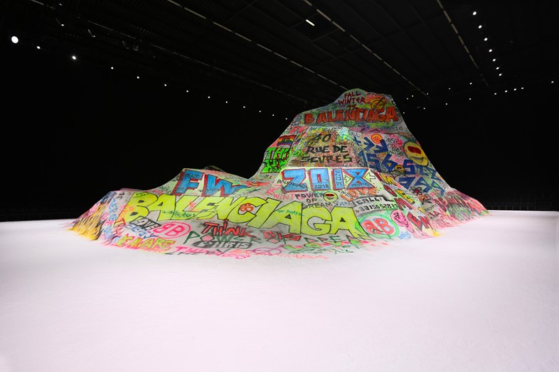
“Now I only do two shows a year, I can make mountains,” said designer Demna Gvasalia of his A/W18 show for Balenciaga, the first time his mens- and womenswear collections were shown concurrently. In this case, he was speaking literally – a mountainous peak dwarfed the vast television studio in northernmost Paris in which he chose to hold the show, standing more than two stories high and daubed with swirls of colourful graffiti. The notes deemed it a “snowboarder’s paradise” (the runway too came with a fine dusting of white powder) but in its optimistic messages – “you are the world,” “no borders,” “power of dreams” were all scrawled in neon-bright spray paint – it also evoked warmer climes, namely, California’s Salvation Mountain, the entrance point to Slab City in the Colorado desert where travellers move to live completely off the grid in the winter months. Gvasalia cleverly melded these ideas together, the collection at once an ode to the outsider – band hoodies and lumberjack shirts had a subcultural bent – at another, a tenable proposition for cold weather wear. Most notably, this came through in the outerwear, where piles of coats – parkas, puffas, leather, faux fur – were piled atop each other, their full shapes not only suggesting warmth, but Cristóbal Balenciaga’s original excessive silhouettes.
4. Dior at Musée Rodin
May 1968 saw the violent culmination of a long period of civil unrest in Paris: factories went on strike; students demonstrated in universities; political leaders started to buckle down in preparation for revolution, while Charles de Gaulle, for his part, secretly fled the country. But in the midst of the ensuing chaos, tangible change was affected in anger at the effects of capitalism, consumerism and corruption in the government. For decades afterwards, ‘May ’68’ was remembered as a moment that marked sweeping social shift.
This May marks 50 years since that tear in the fabric of France’s national identity, and this anniversary has not gone unnoticed by Italian designer Maria Grazia Chiuri. Since her appointment as creative director of Christian Dior in the summer of 2016, Chiuri has invested much energy in marking the slow shift in attitudes in the fashion industry as fourth wave feminism takes effect in earnest. For the house’s A/W18 collection, she spent time digging through documents pertaining to this moment of unrest, and came across a black and white photograph of protesting girls taken outside the Dior store because it did not stock enough miniskirts.
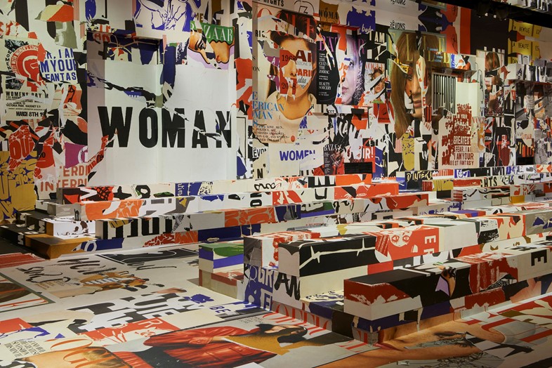
The A/W18 collection comprised slogan sweatshirts (“C’est non, non, non et non!” the opening look read), peace signs, hippie-like patchworks and baker boy caps, and the Bureau Betak-created set paid homage to the spirit of the time too. For the occasion, the interior walls of the Musée Rodin in Paris’ relatively serene seventh arrondissement were plastered with no fewer than 3,000 posters bearing feminist slogans, vintage magazine covers, and protest photography, collaged together in a cacophonous mass calling for uprising, resistance, and strength in the face of adversity. There were miniskirts too, those early protesters would be happy to hear; 50 years on and the spirit of revolution shows no sign of abating any time soon.
5. Louis Vuitton at The Louvre
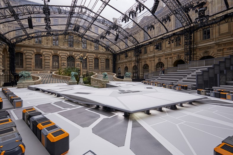
Nicolas Ghesquière once again chose Paris’ grand temple to culture, the Louvre museum, to stage his latest offering for Louis Vuitton – this time, the Cour Lefuel, one of the palace’s several internal courtyards. Open to the sky above but previously unseen by the public, it was a suitably grand setting for a collection that played on the buttoned-up uniform of Paris’ bourgeoisie – constructed in the 1850s, the courtyard was designed with two sets of vast steps for Napoleon III’s horse and carriage that served as the evening’s runway. Not that Ghesquière dwelled on the past for long – he is a designer who has long preferred flights of sartorial time travel – here, implanting a platform reminiscent of Star Wars’ Millennium Falcon in the centre of the space. (As a child Ghesquière slept with a Stormtrooper helmet in his bedroom, and his C3PO-esque gold leggings are one of the resounding memories of his tenure at Balenciaga.) It meant that futuristic details were melded into the collection – bags came with a motherboard print, while an LV badge, stitched to the chest, was stylised like those you might find on a Star Trek heroine. “We all have the experience of having more and more information about what we believe will be our future, and more and more information about what was our past,” explained Ghesquière. “In between those things is how we define our present.”
6. Loewe at Maison de l’Unesco
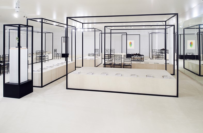
“You don’t have to run away from classicism; you change the cover and you make it relevant for today,” said Jonathan Anderson backstage at Loewe A/W18. The designer was, of course, referring to the classic doorstop novels distributed on the seats in the showspace housed in the Maison de l’Unesco: re-imaginings of Flaubert’s Madame Bovary, Miguel de Cervantes Saavedra’s Don Quixote and Bram Stoker’s Dracula, by M/M Paris and Steven Meisel. The audience took their places on chairs designed by 19th-century architect E.W. Godwin, juxtaposed with sculptures by Tetsumi Kudo (whose grotesquely organic forms had vicariously influenced Godwin’s work). The collection itself manifested as Anderson’s most fully realised for the Spanish house to date. Through an intersection of contemporary fashion and art history, he can curate the thinking woman’s wardrobe just as meticulously as he can curate a showspace – and we are thankful for it.
7. Molly Goddard in the kitchen
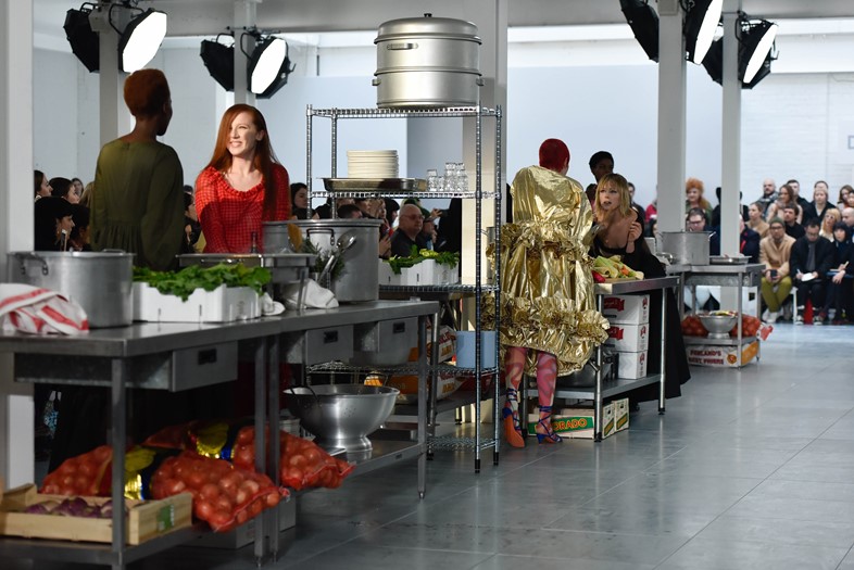
It’s a fact well known that the humming hub of any house party can be found in the kitchen – and naturally, the same goes for Molly Goddard’s A/W18 show. The collection presented a whole gathering of girls ready to have a good time; their voluminous gathered dresses in vibrant shades, teeny crop tops, and psychedelic printed tights all attested to that fact. And continuing in the bacchanalian theme established by shows past – from a series of banquet tables heaped with food and wine (for A/W17) to a factory line of models making ham sandwiches in foil trays (S/S16) – this season they walked the narrow passageways of a restaurant kitchen. There were towering stacks of industrial-sized saucepans, bain-maries gently simmering, and carrot sticks and crudités piled high all around.
After walking their lap of the show space, Goddard’s girls clustered around the banks, pouring wine, nibbling on snacks and chattering raucously among themselves – as Goddard’s mum Sarah Edwards, who designed this set (as she does them all) intended; the concept was inspired by a show by Argentinian artist Rirkrit Tiravanija, in which he used boiling pots of broth and piles of vegetables. It felt oddly familiar, these groups dotted about, hidden from the party happening elsewhere, starting one all their own. “Goddard’s woman doesn’t get FOMO,” the notes read, tellingly. “In fact, she isn’t too sure what it stands for.”
8. Calvin Klein at the American Stock Exchange
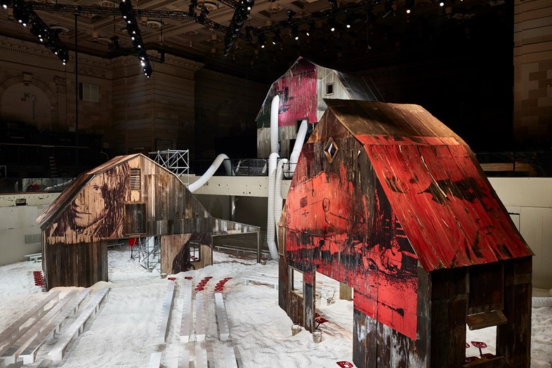
Models walked through popcorn – 50,000 gallons of it – at Calvin Klein A/W18, though from afar the spectacle was more akin to wading through a thick layer of snow. The American Stock Exchange building provided the vast backdrop for the show, housing gargantuan replicas of a wooden barn whose slatted walls became canvases for Andy Warhol artworks, while Sterling Ruby pom pom sculptures hung from its beams. Punctuated with scaffolding, burned wood, air conditioning tubing vents, and corrugated iron roofing, the out-building staging evoked Little House on the Prairie-esque rural Americana and a post-apocalyptic future in equal measure – codes reinforced by the clothes: balaclavas (inspired by those worn by Julianne Moore in Safe), blankets (silver emergency foil on one side, quilting on the other), and hi-vis detailing appeared among Looney Tunes-adorned knitwear, prairie dresses, patchwork and plaid. It was Raf Simons’ vision of America, spliced and constructed from archetypes of different historical periods, landscapes and pop culture eras.
