The polka dot has had an enduring presence throughout fashion history. A timeless print, it has never gone out of fashion: worn across dresses by Eleanor Roosevelt in the 1930s, Marilyn Monroe’s bikinis in the 1950s and featured throughout designs
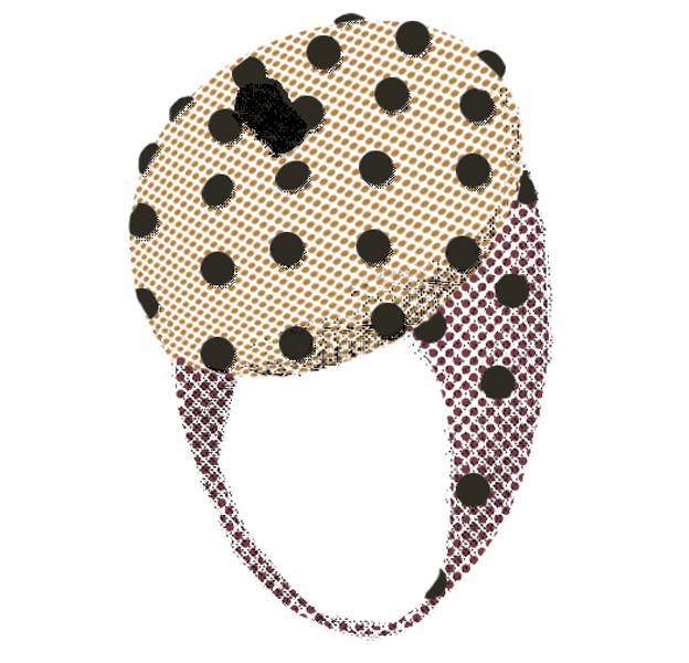
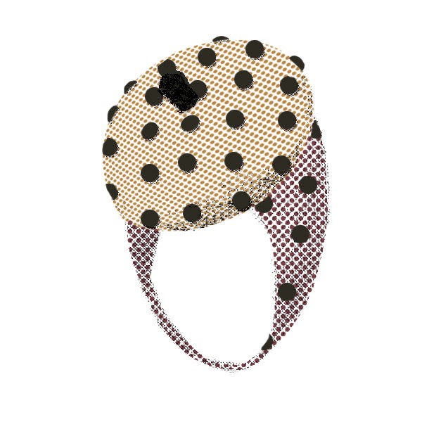
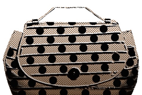
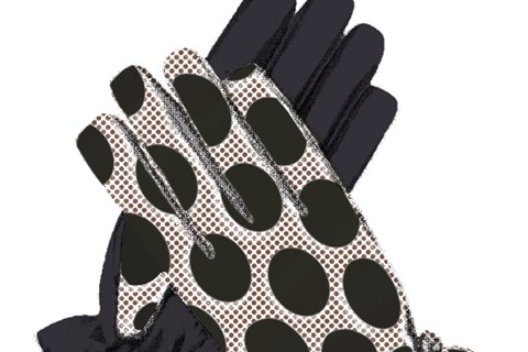
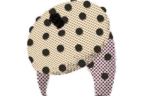
The polka dot has had an enduring presence throughout fashion history. A timeless print, it has never gone out of fashion: worn across dresses by Eleanor Roosevelt in the 30s, Marilyn Monroe’s bikinis in the 50s and featured throughout designs by Mary Quant and Rudi Gernreich in the 60s – during which Roy Lichtenstein created his comic strip Ben-Day dot paintings and Bridget Riley produced her dotted Op Art. In the 80s the polka dot was used as a fashion statement adorning oversized garments and bold shapes and in the 90s famously worn by Julia Roberts in Pretty Woman. For autumn/winter 2011 the polka dot has come out in force once again with the print featuring heavily throughout Marc Jacobs' catwalk collection. Dressing models in head to toe polka dot – large, small and even in three dimensions – most exciting of all was seeing the designer translate the spot across his accessories, the focus of our latest Object of Desire by Rosha Nutt. The perfect pairing we commissioned London-based Nutt, renowned for her polka dot screen-printing process, to reinterpret Marc Jacobs’s gloves, bags and Stephen Jones vinyl berets in her signature style.
The Ben-Day dot, made famous by Roy Lichtenstein, is central to a lot of your work – why is this and what inspires you?
I love all pop art – especially the bold, graphic works of Roy Litchtenstein, Andy Warhol, Bridget Riley and Damien Hirst – and I also draw inspiration from the Constructivist and Bauhaus movements. My background in beauty advertising also influences my work and I’ve been inspired by commercial artists, graphic designers and fashion photographers such as Peter Saville, David LaChapelle, Sølve Sundsbø and Nick Knight. At the moment, I’m a little obsessed with Georgia O’Keefe and planning a series of glamorous flower images.
How did you approach the reinterpretation of these Marc Jacobs’ accessories?
I didn’t really have a strategy – it was a more a process of trial and error. I tried different effects until I was happy. The images are simplified, graphic and clean and this simplicity is tricky to achieve.
How did you adapt your signature style to work with Marc Jacobs’?
Before I started work on these illustrations, I thought it would be easy to work with the dots in the collection. But it was quite a balancing act to achieve the results I wanted.
Did you face any challenges?
I’m used to screen-printing my illustrations. I like the extra dimension this physical process adds to the pictures and it is always full of surprises –colours morph, accidents happen and the whole piece changes. These images are entirely digital, so giving them the quality of a screen-printed image was something I had to work hard on.
Which is your favourite Marc Jacobs accessory piece and why?
The polka dot gloves are objects of desire. My sister is getting married at the weekend so the pill-box hat and matching tights would be great addition to my outfit.
If you could illustrate one piece from the Marc Jacobs A/W11 catwalk what would it be and why?
One of my favourite fashion illustrations is Antonio, Joanne Landis Carnegie Hall Studio for New York Times Magazine 1967. So if I could do anything I’d love to illustrate a model head-to-toe in the new collection.
Are you coveting any other accessories for A/W11?
I love the white lace-up boots worn at Balmain.
Text and curation by Lucia Davies
