Raf Simons' spring/summer 2011 collection, currently on sale, marked 15 years since the designer debuted in Milan. For this landmark collection, Raf decided to play homage to the collection that inspired him to work in fashion. If you haven't
Raf Simons' spring/summer 2011 collection, currently on sale, marked 15 years since the designer debuted in Milan. For this landmark collection, Simons decided to play homage to the collection that inspired him to work in fashion: Maison Martin Margiela's third show, which took place in a playground in Paris in 1989. Margiela (also a former student at the Antwerp Royal Academy) showed an almost all-white collect, with tape, plastic bags and other everyday materials. Instead of a literal homage to Margiela, Simons also revisited his own archive, incorporating ideas, details and silhouettes which have become Simons' house codes.
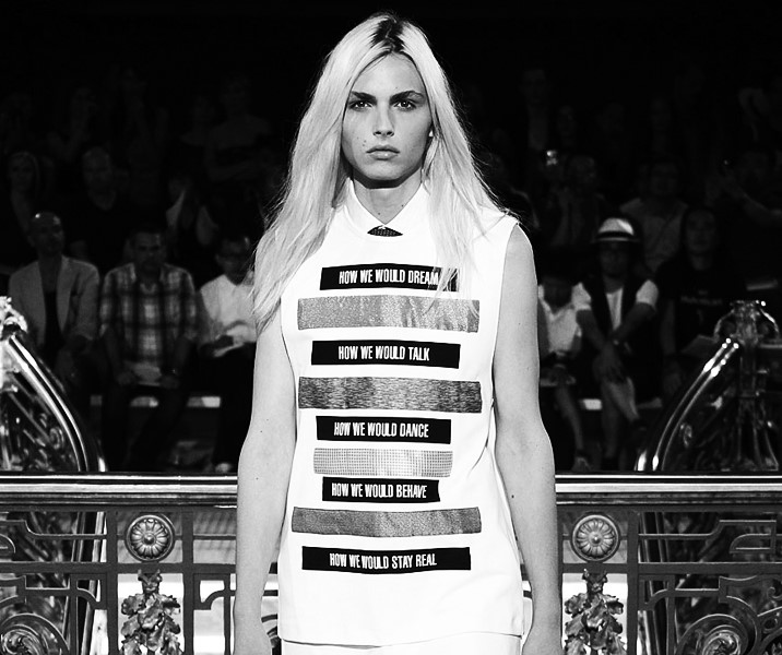
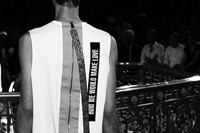
Raf Simons is a forward-thinking, minimalist designer, feted for his economy of expression. In each of his collections, there are a handful of ideas at work; each of them used sparingly but always cleverly explored. For spring/summer 2011 it was strips, zips and voluminous, floor length trousers. The strip idea started with different ways of showing the men's tie – hidden under semi-transparent tops or peeking out at the top of a v-neck – through to abstract versions, in strip form. These panels appeared on pockets and strips over shoes and as oversized zip pulls. Not dissimilar to the straps used for technological accessories (Simons regularly references digital culture). Simons' designs always deserve closer inspection, not just for the fabric and production but for the hidden details. Some of the best views are when his models exit the runway: in this case, aprons with ribbon ties inspired by hospital gowns and oversized zip pulls at the back of garments, in metallic and patterned silk, providing an indulgent luxury counterpart to the minimalist silhouette.
Another idea Simons proposed for the season was voluminous, floor skimming trousers worn with slim fit tops. Perhaps a reaction to the skinny pants and ankle-show trend long championed by designers (including Simons). The collection's colour palette was rooted in Simons' archive – focused on white with intense bursts of colour; in this case, sunflower yellow, mint green and varying shades of pink. The only pattern came on those zip straps and T-shirts with graphic prints – a nod to his previous collaborations with artist and writer Peter de Potter.
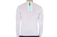
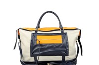
If you haven't invested already, now is the time. Pieces which incorporate the key ideas of the designer's collection but also serve as key wardrobe staples are currently available on thecorner.com. A lightweight knit crewneck features the aforementioned strip/zip detail and a grosgrain travel bag has graphic strips of colour. A pair of black twill bermuda shorts were seen on the runway under layered shirts but can also be worn alone. The shoe with strap is seen on a pair of high-top sneakers with rear zip – the chic black and navy colour combination another of Simons' trademarks. The spring/summer collection closed with slim suits – a similar black blazer is also currently available in cloth with two buttons.
Text by Laura Bradley


