For this week's Most Loved, we're shamelessly judging pencils by their packaging with a brilliant set of test tube encased pencils by Kevin Angeloni, Loved by photographer Olena Slyesarenko
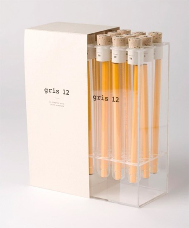
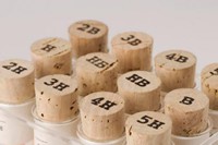
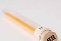
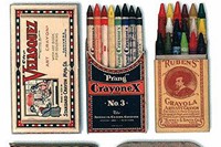
"Never judge a book by its cover," so goes the well-worn adage. But sometimes its impossible not to. As companies are only too aware, packaging can make or break a product. It's what catches the potential buyer's eye and draws them in, and if it's really good can act as the deal-breaker that secures the purchase. That would certainly be the case were we to encounter this week's Most Loved product first-hand: a beautiful set of pencils – each encased in a glass test tube with a cork stopper displaying its grading, and placed in a plexiglass holder – posted by photographer Olena Slyesarenko. The set, titled Gris 12, was dreamt up by Swiss designer Kevin Angeloni, whose brief was to package twelve pencils as if they were luxury items.
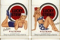
Great packaging has of course been key to successful marketing since advertising began; often we remember as much, if not more, about what the product comes in than the product itself. In 1915 Coca Cola opted to change the shape of their glass bottles, corncerned that their original bottle wasn't distinctive enough, and in 1916 the contour bottle – inspired by the curves and grooves of a cocoa bean – was born. To this day it remains one of the most iconic packaging designs of all time.
"Packaging can make or break a product"
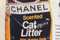
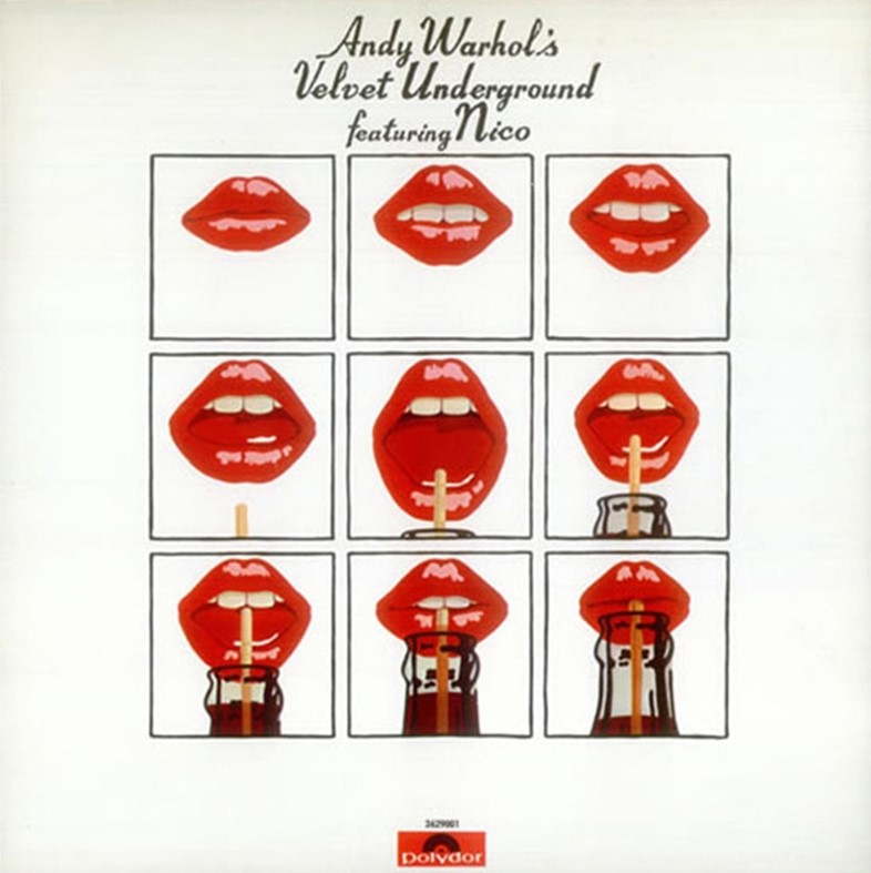
Andy Warhol was of course integral in highlighting the importance of packaging in an increasingly consumerist society, his reappropriation of Cambell's soup cans, Brillo pad soap boxes et cetera, immortalising the designs thereafter. Warhol is also behind some of the world's most famous album artwork – another key example of incredibly effective packaging – think The Velvet Underground banana and the Rolling Stones Sticky Fingers zipper. In fashion terms, one need look no further than Azzedine Alaïa shoes boxes and Comme des Garçons fragrance and beauty packaging for chic, and highly tempting, design. And if any product comes with bubble wrap, well we for one are sold.
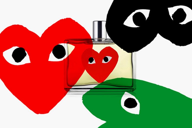
But before we let loose on an entirely exterior-driven shopping spree, we catch up with Slyesarenko to discover why she chose to Love the Gris 12 packaging and her preferred writing implement.
Why did you choose to Love this Gris 12 Pencil Package Design?
It is such a witty design which makes something mundane and simple look very precious.
Where would you keep it if you owned it?
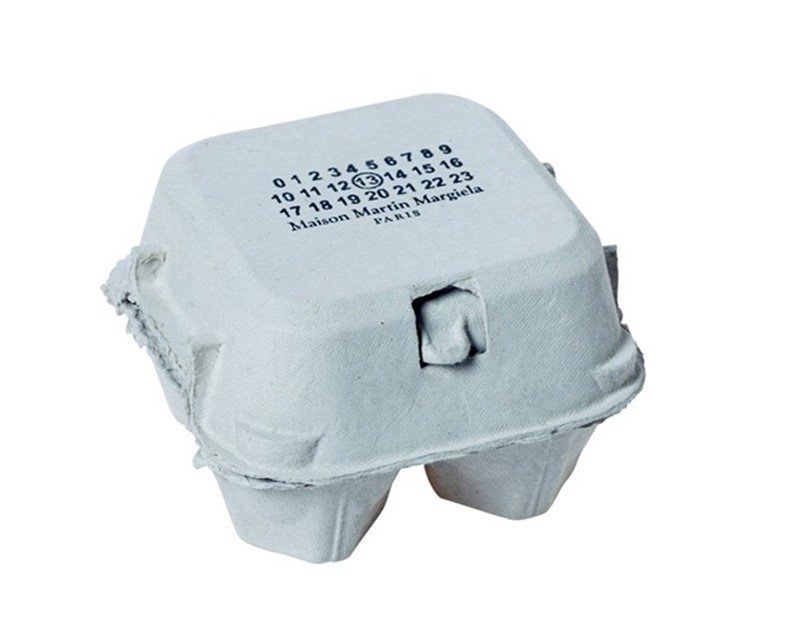
In the kitchen by the blackboard... Next to my Maison Martin Margiela egg carton.
Did you enjoy science at school? Were you a biology, chemistry or physics fan?
I definitely enjoy the idea of it more now than I did at the time. Chemistry is the top choice because it felt so otherworldly, volcanic and colourful. Astrology should be a compulsory science programme at school – it would be my favourite.
What's your preferred writing implement?
A 0.5 dark blue Muji pen. But in the ideal cinematographic world it would be red lipstick on reflective surfaces – I always wanted to leave a note like that.
What's your all-time favourite packaging?
Tough one… at the moment I wouldn’t mind owning this Byredo perfume box by Inez & Vinoodh.
Who's your design hero?
It would be unfair to give the title to just one person... I'd say many Swedish furniture designers and Brazilian architects. As well as Margiela of course.
What are you excited about this August?
Hopefully interacting with Marina Abramović at the Serpentine.
