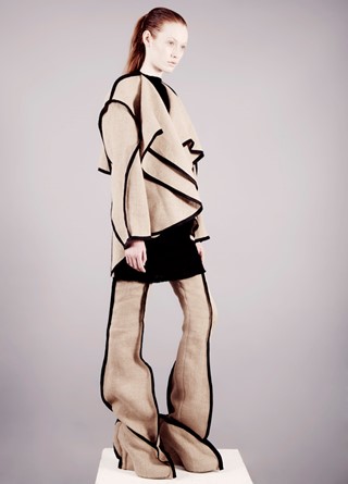
Jamie Cockerill was one of six standout designers chosen by Cathy Edwards from the Central Saint Martins MA show for our Exclusive story, The Masters. A look from her collection was styled by Edwards and photographed by Ben Toms, and here the designer reveals ideas behind his inaugural collection.
Was it difficult to work with a monochrome colour palette?
The initial starting point was to work with the principal of seaming and make it become something beautiful; using the coat and the many different forms it could take and exposing particular seams. It felt very natural to work with a restricted colour palette as it was the most graphic.
You used a material similar to sandbags throughout the collection, why?
When I started the collection I wanted to do something with a raw and natural element but still graphic and clean. The collection is about contrast and texture, as the black and natural coloured hessian is contrasted with a soft mohair. You get this great juxtaposition of a luxury fabric with something raw, but both remain quite textural. The hessian is actually a large painting canvas, that I washed many times to make it very soft. The hessian gives the clothes great movement.
There is an overlapping quality throughout the designs – was this something that developed through the process or was it there from the beginning?
It was a process of working foremost with the coat and all the different proportions and lines it could take. The graphic trousers were something I worked on straight away. The contrast of the coats then fed into the dresses, working with different ways of building the contrast and the negative space. Later the shape from the trouser fed into my shoes.
Who do you see as your role models in the industry?
In a design sense there are always the same designers that come up a lot in my research: Pierre Cardin, Geoffery Beene, Prada.
What words would you use to describe your designs?
Graphic. Texture. Contrast. Proportion. Movement.
See all the designers chosen for our Exclusive, The Masters here.
