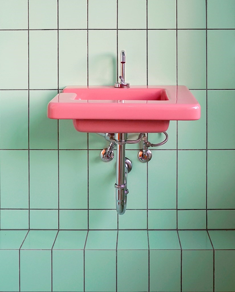
The Swedish photographer and designer shares some of her tips for creating spaces you’ll want to be in
Still lifes, pink walls, the perfect balance of light and shade. Is there a formula for Instagram success? According to Tekla Evelina Severin, it’s more about finding what comes naturally.
“I’m always researching interesting architecture and interiors to shoot,” says the Swedish photographer, interior architect and set designer. “And what’s interesting changes with time – the aim is to move forward. But sometimes I could just happen to stumble on a great-looking detail in an ugly-looking back street. I’m not searching for concrete things, like the colour pink or arc shapes. I just know it when I see it. Like a gut feeling.”
Severin trained as an interior architect before taking to Instagram to express her frustration with the dominance of bland beige and grey tones in the interiors around her. Since 2012 her page @teklan has been a paean to colour, lines and shape, in both the natural and the built environment. Abstract images, still lifes, sunsets and wallpaper compete for attention in a grid that readily reminds the viewer of the sheer joy of colour. In an overstimulating world, it’s a celebration of the purity of pigment and contrast. Recent commissions have seen her shoot for Air France, Urban Outfitters and The Gourmand.
Severin speaks to AnOther about how Instagram, colour, and the long Swedish winter have all influenced her work.
On the relationship between interior architecture and her photography…
“I wouldn’t take the photos I do if I weren’t used to working as an interior architect and to drawing angles and perspectives in different 2D and 3D programs. However strange it may seem, I actually feel closer to architecture as an photographer than as an interior architect, since I can choose to shoot a particular angle or detail to highlight what I feel to be the essence of the architecture. But architecture isn’t photography, and photography isn’t architecture. I have the biggest respect for the complexity of designing spaces: I know how difficult it is to create a good ‘wholeness’, while also always working with compromises. Time, budget, clients’ requests, the premises of the site and so on.”
On the pervasive influence of Instagram and its trends…
“Instagram has a huge effect on how I work and even why I work like this; it’s actually the reason why I can work as a freelance photographer instead of working solely full-time as an interior architect. Though I’m not saying one is more noble than the other.
“I definitely think my work is a part of those Instagram trends – abstract still lifes, or certain colours – even if I want to believe I’m not that generic... But seriously, it is hard to distinguish yourself and your Instagram work from Instagram itself, and hard to see it objectively.
“What I have noticed that feels restricting sometimes – even if I try to not pay notice – is that people just want you to post the exact same thing. Like if I post a few façades in a row, people start to expect that and they get disappointed when I post a self-portrait or a still life or an interior, and vice versa. I think I would be more successful if I just stuck to one thing [on Instagram]. That doesn’t interest me at all, though. I think these Instagram trends are kind of sad; the time and effort people put into it, time spent not being present. And also everything starts to really look alike, and there are so many copycats out there!”
On surprising colour combinations…
“I don’t think there are any rules at all. I’m always searching for new and interesting combinations. My latest find is some kind of hazelnut brown and lavender-ice blue, combined together. Pink and red will always be my favourite. I have a hard time with hard contrasts, like black and red or yellow and black, but on the other hand black isn’t really a colour and you should never say never! I never thought I would find brown and yellow beautiful together – I thought it was too 1970s and overdone – but I did it here... Probably because the 70s are trendy again, I guess.”
On living and working in Stockholm…
“Most of my clients aren’t Stockholm-based. I don’t know if it is because ‘it’s hard to be the Pope of your hometown’, as the Swedish expression goes, or if it’s because I’m more colourful than the common Scandinavian style. I’m not a super fan of either the atmosphere – which is a bit uptight – or most of the motifs of the Stockholm city and its interior – mostly sand colours and grey, even if it’s a very nice and beautiful city itself. With that said I have a great network here, and that’s probably why I’m still based here.
“[Do the dark Swedish winters have an influence on my relationship with colour?] Definitely. If I lived in LA I probably wouldn’t be this obsessed at all. But more than that, my use of colour is informed by a reaction against working with mainly beiges for rich people as an interior architect. I started using Instagram as my own creative space, exploring unwanted materials, such as pink plexiglass, et cetera…
“I think my obsession about colour is about distinguishing and clarifying things and objects. In the same way you use colours to distinguish different subway lines, or how warning signs are yellow or red. I think the reason is probably psychological: being a controlling person, I also like to control and clarify my surroundings. But maybe it’s also physiological, because my eyesight is so bad. Maybe that is also the reason why it’s so important to me to capture things at all: the preciousness of being able to see.”
For more information on Tekla Evelina Severin’s work, see her website.
