These days, it’s impossible to write about a Calvin Klein show without discussing 205 West 39th street, Klein’s historical HQ. The brand has attached that appellation to the tail-end of the moniker of its catwalk line (it snakes along the garments’ labels like a punctation-free stream-of-consciousness text), and the space there has become an integral part of Raf Simons’ vision for the house of ‘Calvin Clean’.
Although, it’s not so clean anymore: for Simons’ debut Autumn/Winter collection last season, when entering 205 (as we’ll abbreviate, for convenience’s sake) for the first time, his guests were confronted with an installation by the contemporary American artist Sterling Ruby. Dangling overhead were US flags, Calvin Klein underwear, and multicoloured scads of fringe. Afterwards, Calvin Klein kept the piece hanging for six months; the windows are frosted, with a band left clear at the top, framing the work for the public to view. If you didn’t know better, you’d think it was one of Manhattan’s many contemporary art spaces, albeit geographically confused.
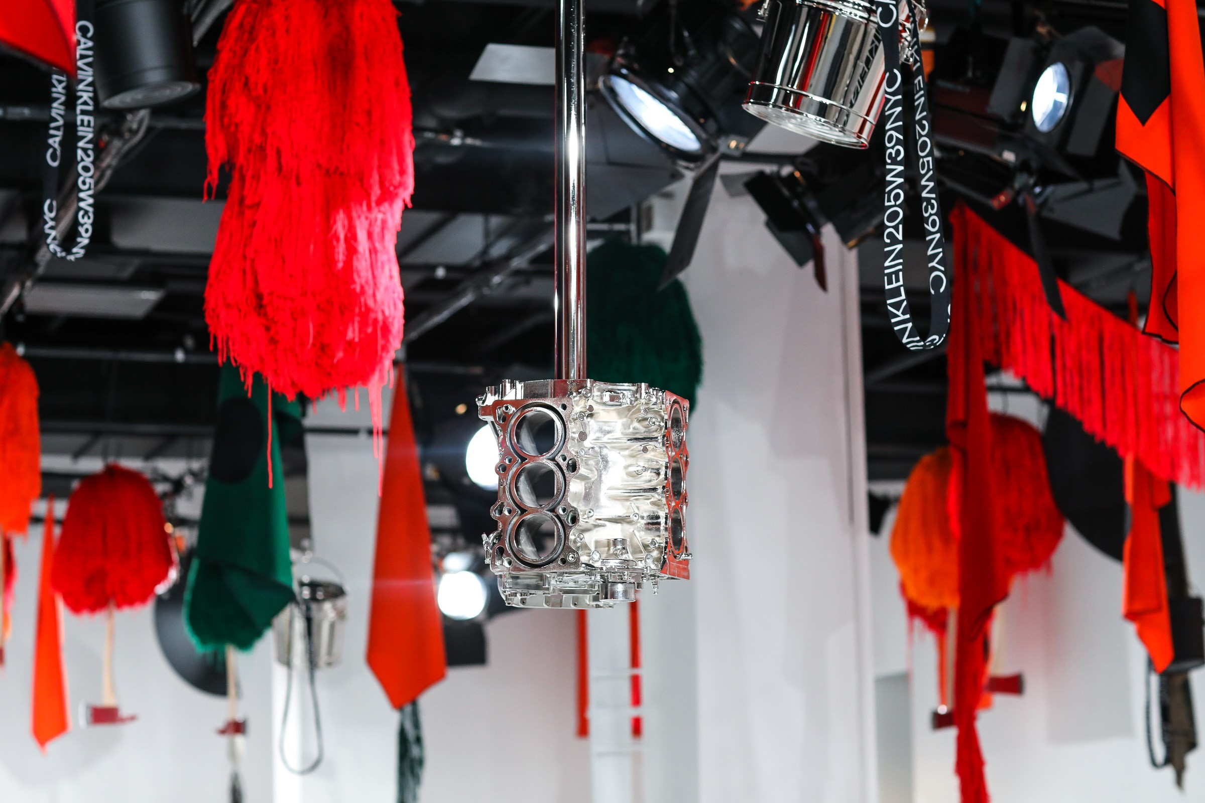
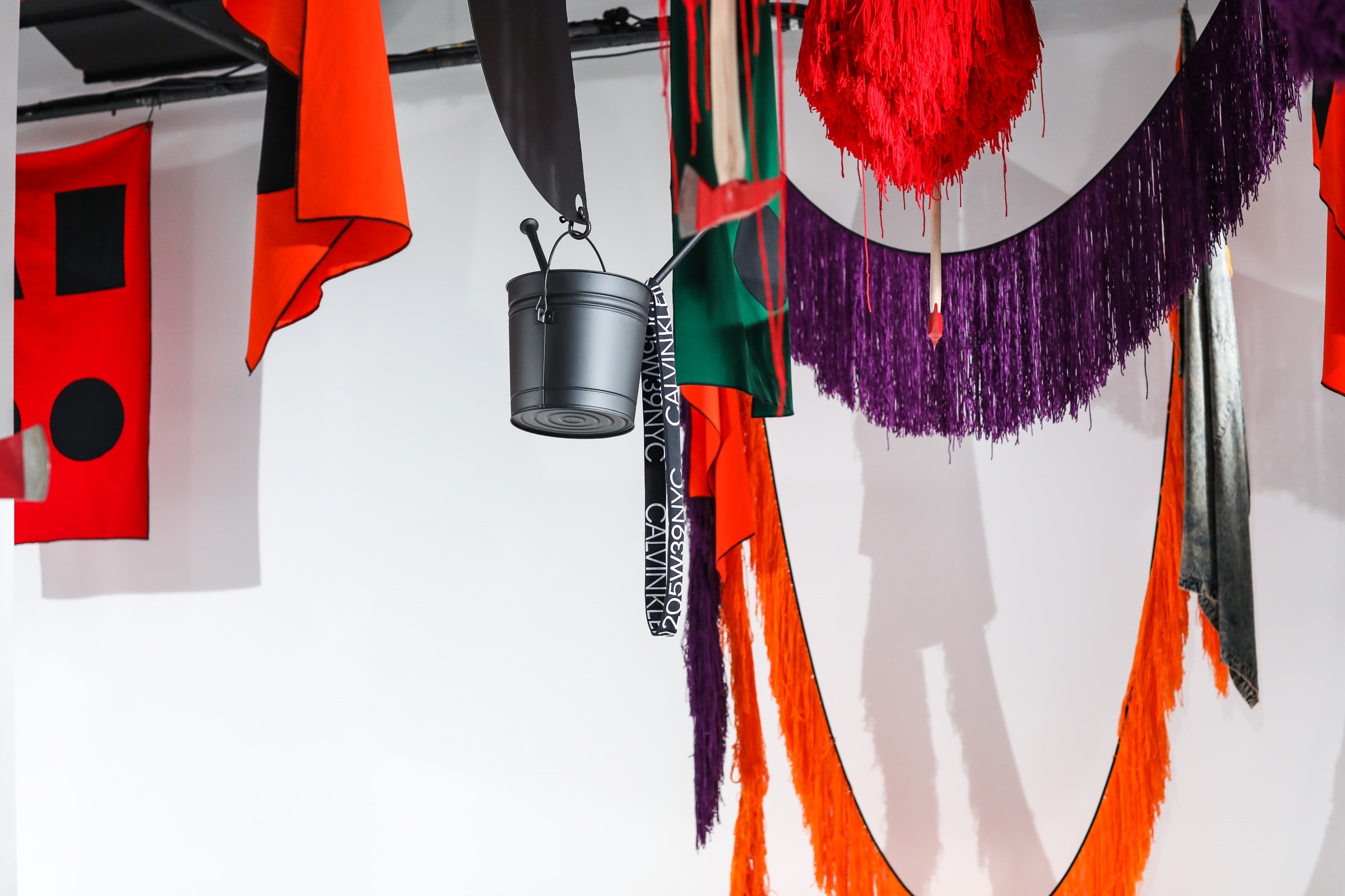
For Spring, Ruby installed on top of that installation (he kept about 30 per cent of the original, he said). His original exploration of Americana was twisted: the fringe knotted up into cheerleading pom-poms, which wound up dangling hatchets. The flags were no longer stars and stripes, but abstractions from halloween jack-o’-lanterns in searing pumpkin orange and black. The title was Sophomore – which, technically, just means a second outing. And yet, culturally, it’s a word heavy with American influence – it implies sorority cheerleaders, pumping those pom-poms, and possibly getting chopped up by one of those axes.
“His original exploration of Americana was twisted: the fringe knotted up into cheerleading pom-poms, which wound up dangling hatchets” – Alexander Fury
The influence behind this Calvin Klein collection was American horror stories – nightmares, and dreams, melding together. Cinema was Raf Simons’ point of reference – which is clever. Simons is Belgian, but his route into all that American iconography has been made easier via movies. We’re all familiar with Americana; the cultural touchstones of America proposed and promulgated by Hollywood. The cowboy, the cheerleader, Doris Day in full-skirted 50s housewife mode, sweater-girls and hustlers. They’re images not only of America, and that define America in the popular imagination, but they’re available to the whole world with the click of a remote control button (or these days, a mouse).
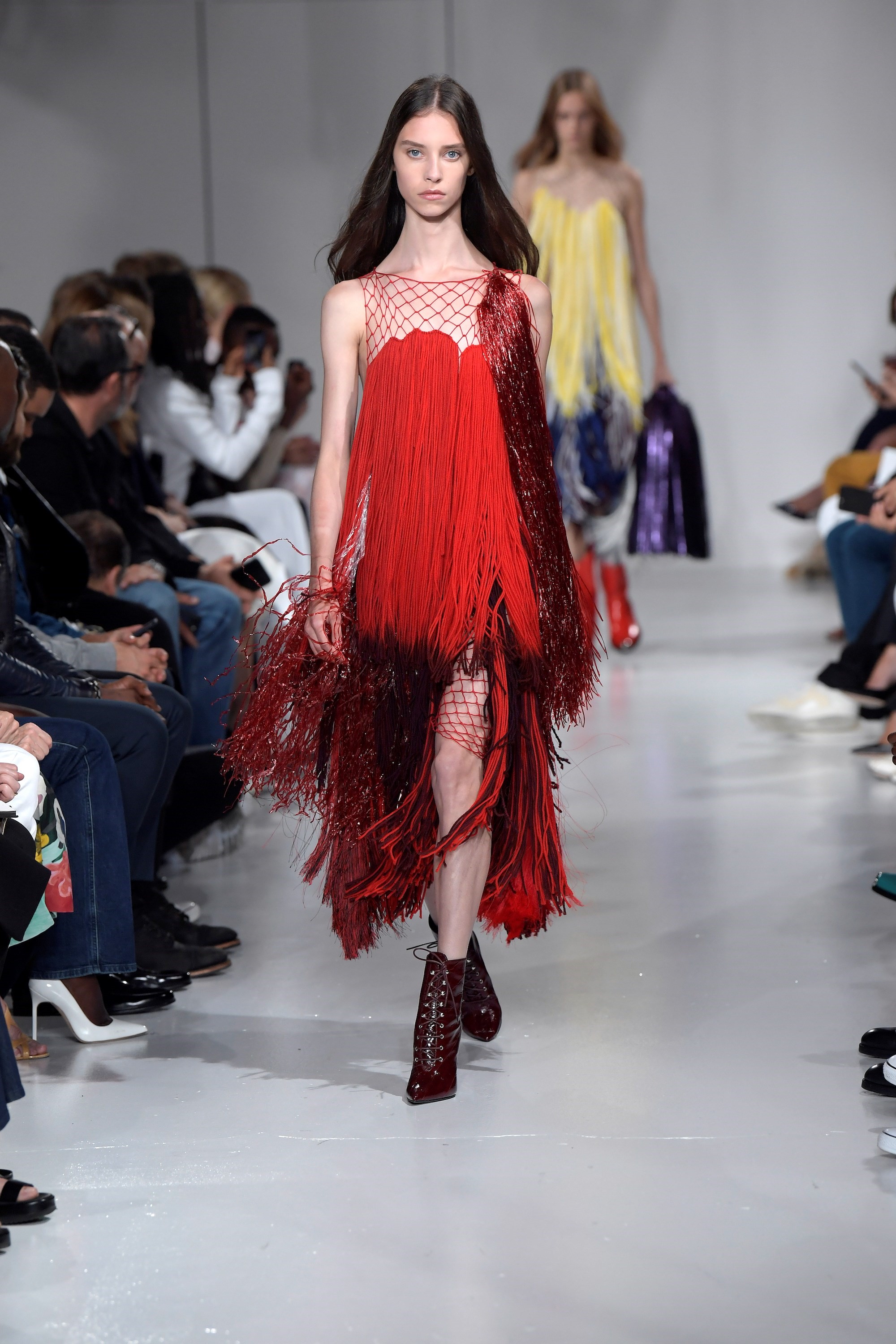
Their conspicuous familiarity makes the newness that Simons pulled from them all the more interesting. Take the pom-pom prom dress of scraggly fringe in a shade of beet red: look at it hard enough and you could see Sissy Spacek soaked in pig’s blood in Carrie, a stereotypically sliced-and-diced sorority cheerleader from any number of slashers, or perhaps the stringy Sideshow Bob wig of Stephen King’s It. But, synthesised together, those references were fresh, new and exciting. Every outfit combined multiple riffs and re-takes, compressing heroes and villains into single outfits. Was a leather full-circle skirt swiffered with the blood of the wearer, or her victim? Or was it just an artsy print? You half-remembered what you saw, but you don’t remember seeing them like that.
Hollywood is a clichéd reference. So is Andy Warhol, the most American of American artists, and one obsessed with the glamour of cinema. Marilyn is the most obvious example of this, alongside his own movie-making aspirations. So to pull something fresh from those two much-mined reference points takes serious talent. Especially when you’ve referenced them before. Raf Simons created a collection punctuated with Warhol imagery when he was at Christian Dior back in 2013, using Warhol’s scratchy drawings of spindly, couture shoes. This time, it was his Death and Disaster series, images of car crashes and electric chairs, real-life trauma that wound up resembling film stills. It’s a different eye, for a different time, and a different house, and again it avoided the obvious (no Marilyns).
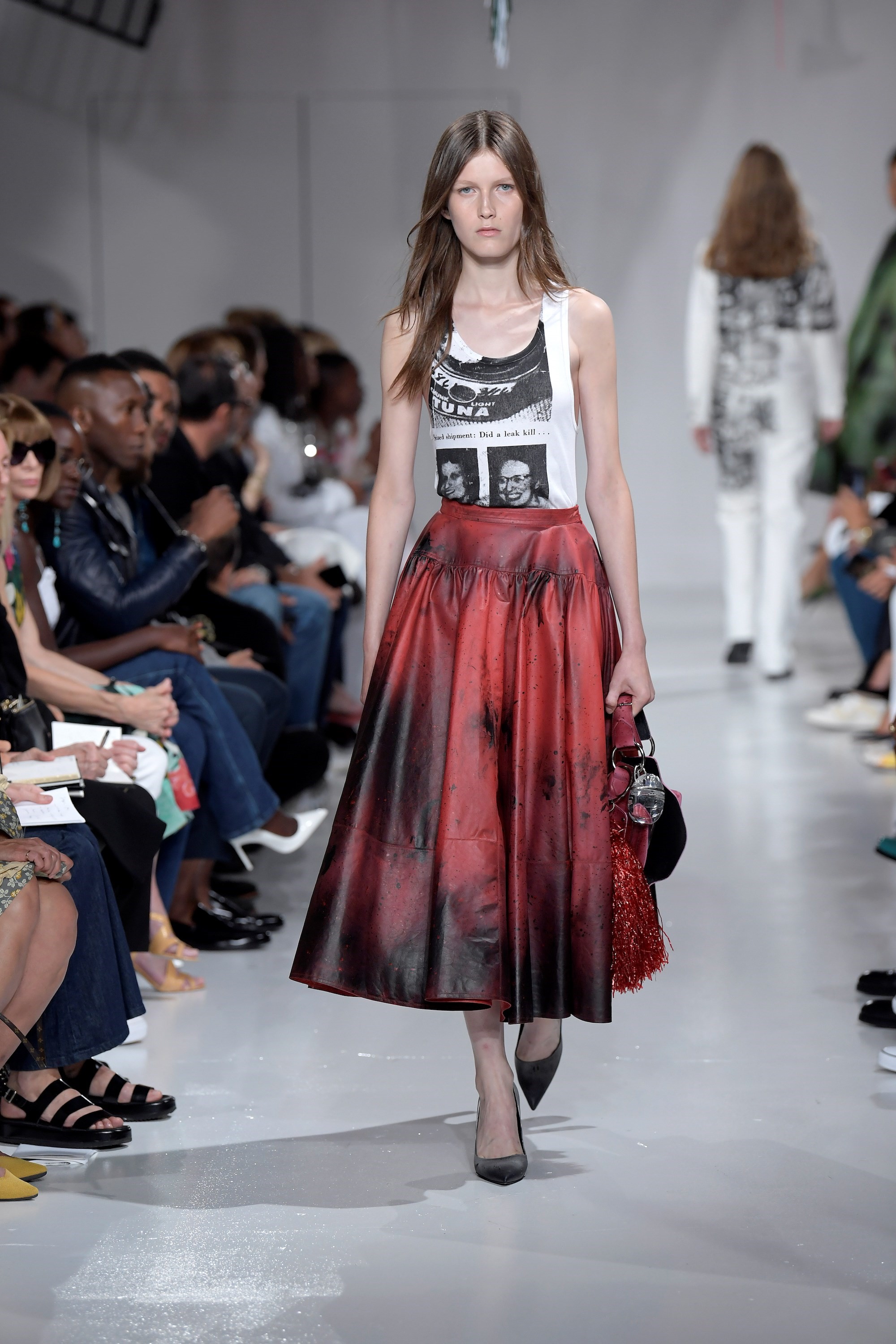
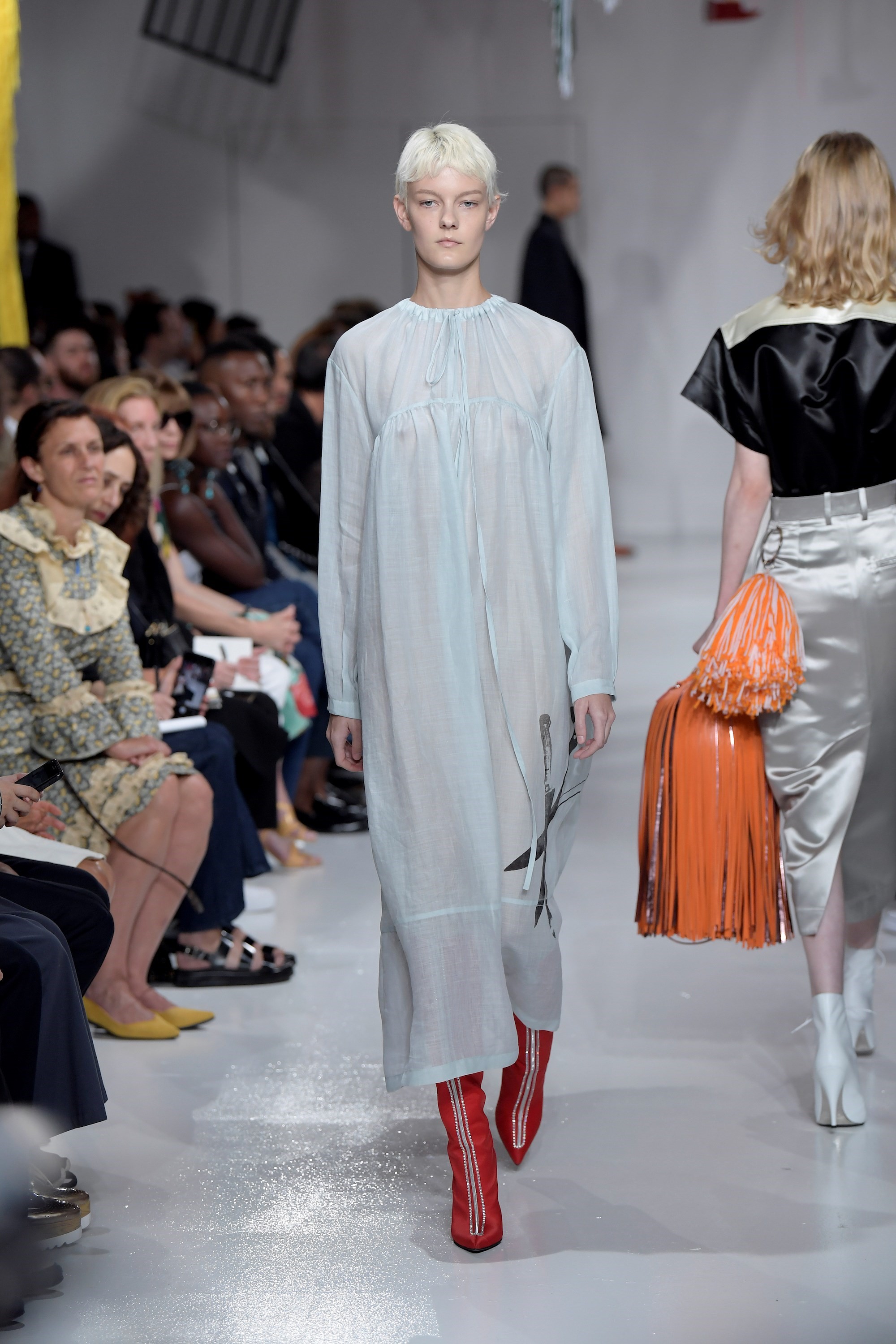
“This wasn’t about art on clothes; it was about art in clothes. Raf Simons doesn’t appropriate art to stick on the garments he creates; he fundamentally reassesses his methods and means of creating clothing to key it to the artist and art references he is working with” – Alexander Fury
This wasn’t about art on clothes; it was about art in clothes. Raf Simons doesn’t appropriate art to stick on the garments he creates; he fundamentally reassesses his methods and means of creating clothing to key it to the artist and art references he is working with. And it isn’t a one-time thing: when he created a collaborative collection with Sterling Ruby (2014), his clothes were executed in thick cotton twill splattered with bleach and pigment as if cut from the artists’ own canvases; a collaboration with the Robert Mapplethorpe estate (2016) yielded clothes as cold and precise as Mapplethorpe’s own, with images inset into garments, using cloth to ‘frame’ them and mirroring Mapplethorpe’s own obsessions with rendering his pieces as three-dimensional sculptural objects, rather than just photographs. Simons used a series of images that could not be commercially reproduced (he wasn’t allowed to sell anything featuring a penis), simply to round out the artistic demands of representing Mapplethorpe. Integrity, to him, is everything.
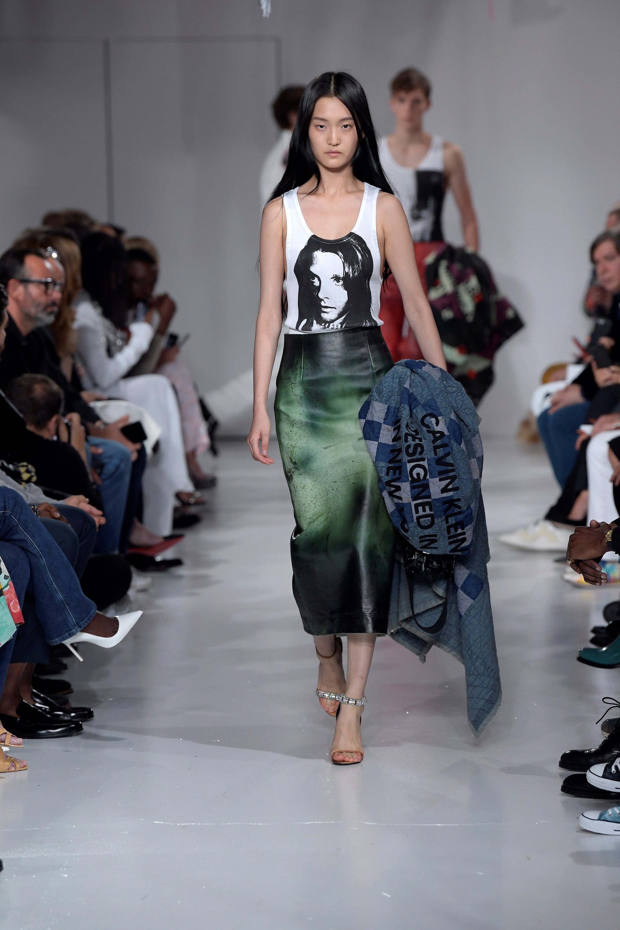
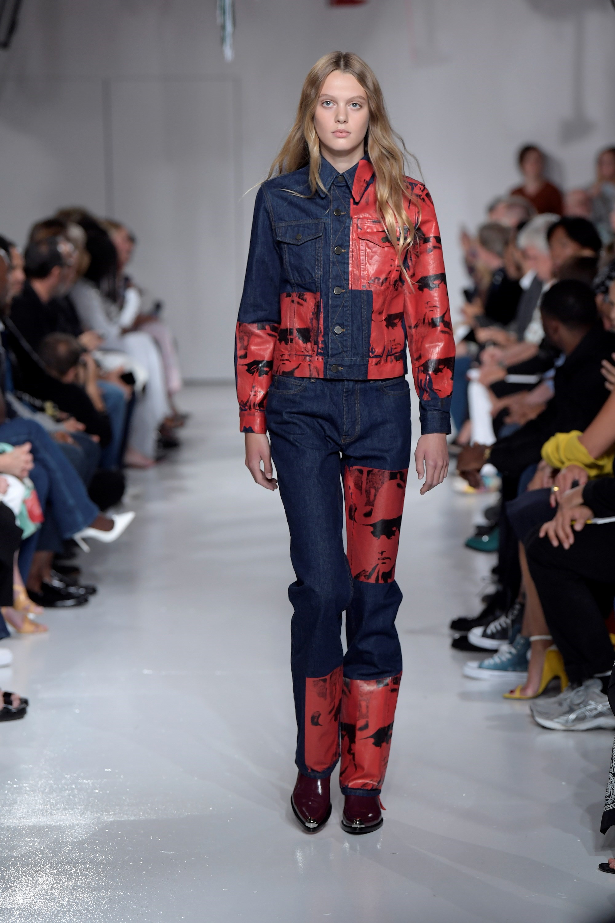
So, Warhol featured in his Calvin Klein clothing, too, not only selected but reproduced with a sense of an exacting curatorial eye. These clothes weren’t just printed with Warhol images: Klein set up a screen-printing ‘factory’ in their headquarters, to key the images to the garments, in the same fashion Warhol produced his original artworks. Warhol’s deaths and disasters, his kitchen knives and deadly tuna fish tins, were screen-printed directly onto the clothes, as placement prints, covering collars and plackets and leaving hidden areas bare. The process was visceral – the clothes often seemed bloodied, marked by the images like scars, soaked through the fabric. The colours glistened and glowed, ink thick on the body. They reflected both Simons’ respect for the nature and identity of the works themselves, their original methodology, and the themes of this collection as a whole; out of horror comes beauty. They also identified a new point of differentiation. Just as no designer can slap their names on jeans without it recalling what Calvin did in the 70s – the first fashion designer to create their own iteration of this mass-appeal garment – it feels like, today, no fashion designer can use art without referencing the way Raf Simons does it.
For S/S18, however, it was taken to a new, meta level of art reference atop art reference: Warhol wares worn in a Sterling Ruby room. All of which could have been overly heavy, saturated even, but wound up feeling light, natural. The Ruby room wasn’t a set, but neither was it exactly an installation – which implies an interruption, an alien presence. It was an environment – an American landscape, of sorts. A Grand Canyon, for Calvin. Raf Simons is building his own monuments to America, and also his own American monuments, at Klein. He is making pieces from American culture and iconography that will, in turn, become a part of it again. Calvin Klein, after all, is American fashion. It’s shorthand for what the nation represents, sartorially.
