Stephen Sprouse was, arguably, the great American designer who never quite happened. Fêted during his lifetime and after (the designer died in 2004), financial security could never be counted among Sprouse’s nonetheless considerable achievements – he went bust, blew up and went bust again after he opened an ambitious three-storey store in a former firehouse at 99 Wooster Street, New York (now a Victorinox store). It was 1987: after the markets crashed, Sprouse only showed two more collections and then was out once again. “I just decided to stop,” said Sprouse at the time. Although just a year after Black Monday, the reasons were far more complex than that.
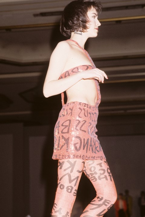
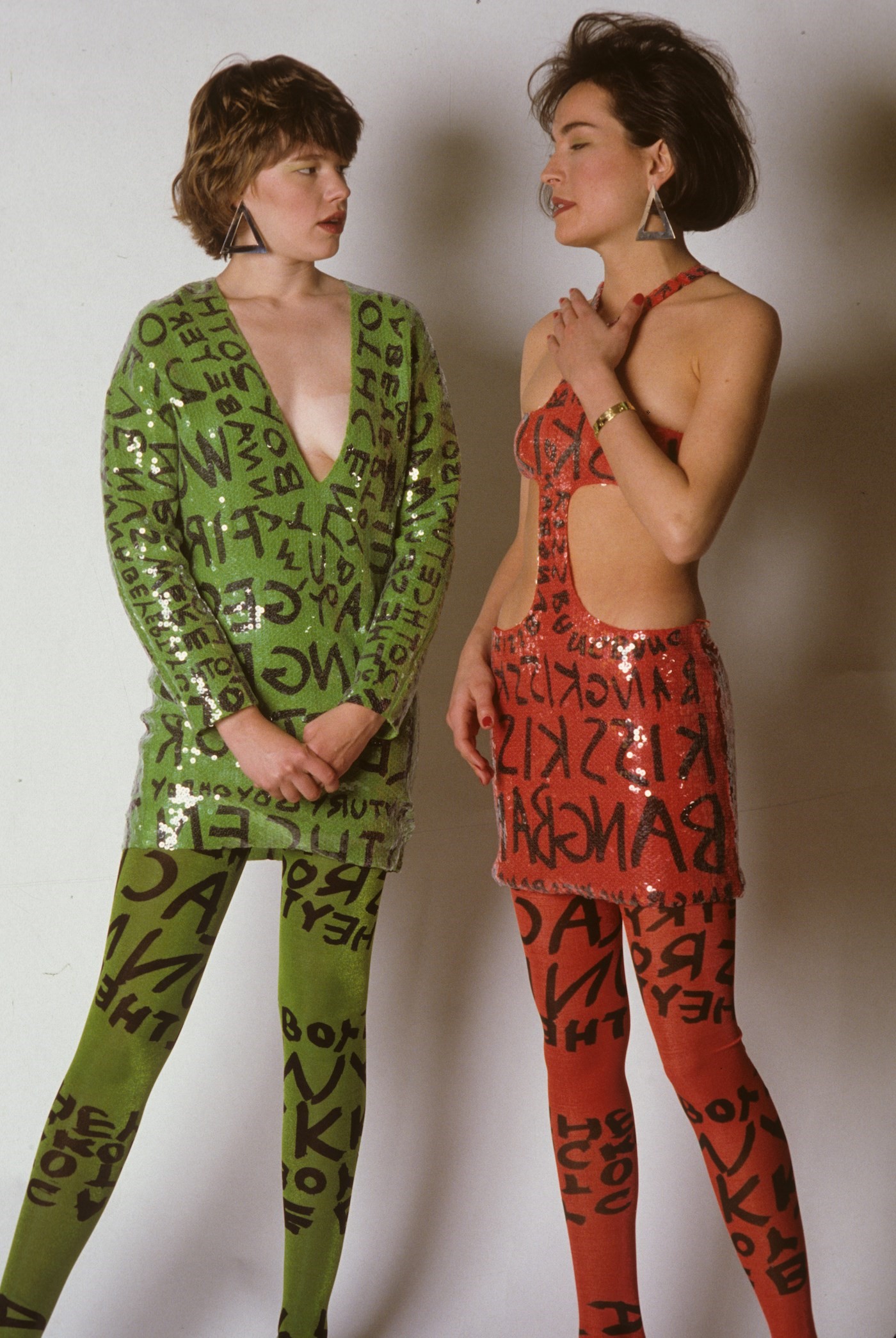
Then again, Sprouse has never really stopped. Despite the brevity of his businesses, his mark on fashion has been deep, and as indelible as one of the trademark marker pens he used to scribble backwards and forwards graffiti across his earliest collections’ chiffons and leathers and neon sequins, along his own arms, and around a whole range of Louis Vuitton monogram accessories in the French house’s first ready-to-wear collaboration with an artist in 2000. That graffiti was Sprouse’s hallmark – eschewing language, it pushed writing beyond the idea of a logo, deconstructing it into pure, instinctive pattern. You easily looped Sprouse’s clothes into what Jean-Michel Basquiat and Keith Haring were doing with art in New York at the same time: elevating graffiti, and simultaneously challenging ideas of status, privilege, representation and refinement. Sprouse was spraying graffiti across day-glo cashmeres, silks and sequins, creating expensive, polished clothes with a sense of downtown. It was something utterly unique, and distinctly New York. Sprouse was knocking the stuffing out of designer ready-to-wear, which, by the early 1980s, had become inflated and self-important, often as stiff and formal as haute couture used to be.
“People say, oh he did these fluorescent 1960s-inspired clothes,” said Marc Jacobs – an ardent admirer and friend of Sprouse (and the instigator of that Vuitton collaboration) – to Roger and Mauricio Padilha for their The Stephen Sprouse Book. “That’s really over-sampling things. I just think Stephen made cool, luxurious, young clothes,” he said.
“People say, oh he did these fluorescent 1960s-inspired clothes. That’s really over-sampling things. I just think Stephen made cool, luxurious, young clothes” – Marc Jacobs
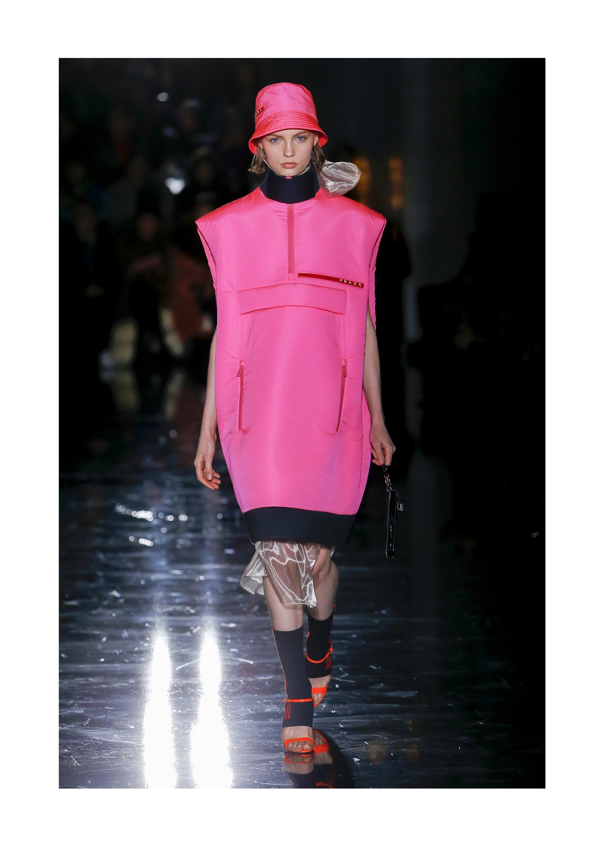
This season, with the influence of the 1980s riding high, Sprouse has emerged as an obvious favoured reference. But, with Jacobs’ words ringing in your head, his sensibility has made the season’s collections feel younger, fresher, faster and somehow more vibrant. His influence can be detected across a whole host of collections, coloured with his favourite highlighter shades of neon green and hazmat orange (Prada, Marni, Balenciaga), scribbled with abstract patterns across sequins and fabrics (Halpern, Marine Serre) or abbreviated high on the leg, patterned boots or tights matching dresses, the 1964-meets-1984-meets-2054 feel to squared-off, spare shapes. Back in the 1980s, those were a hangover from Sprouse’s original training with the original King of Clean, Roy Frowick Halston. At Halston, Sprouse was allegedly responsible for the designer’s ‘Skimp’ of 1974, a short shift that ran counter to the generally elongated silhouette of both that era, and that designer. It was, however, signature Sprouse.
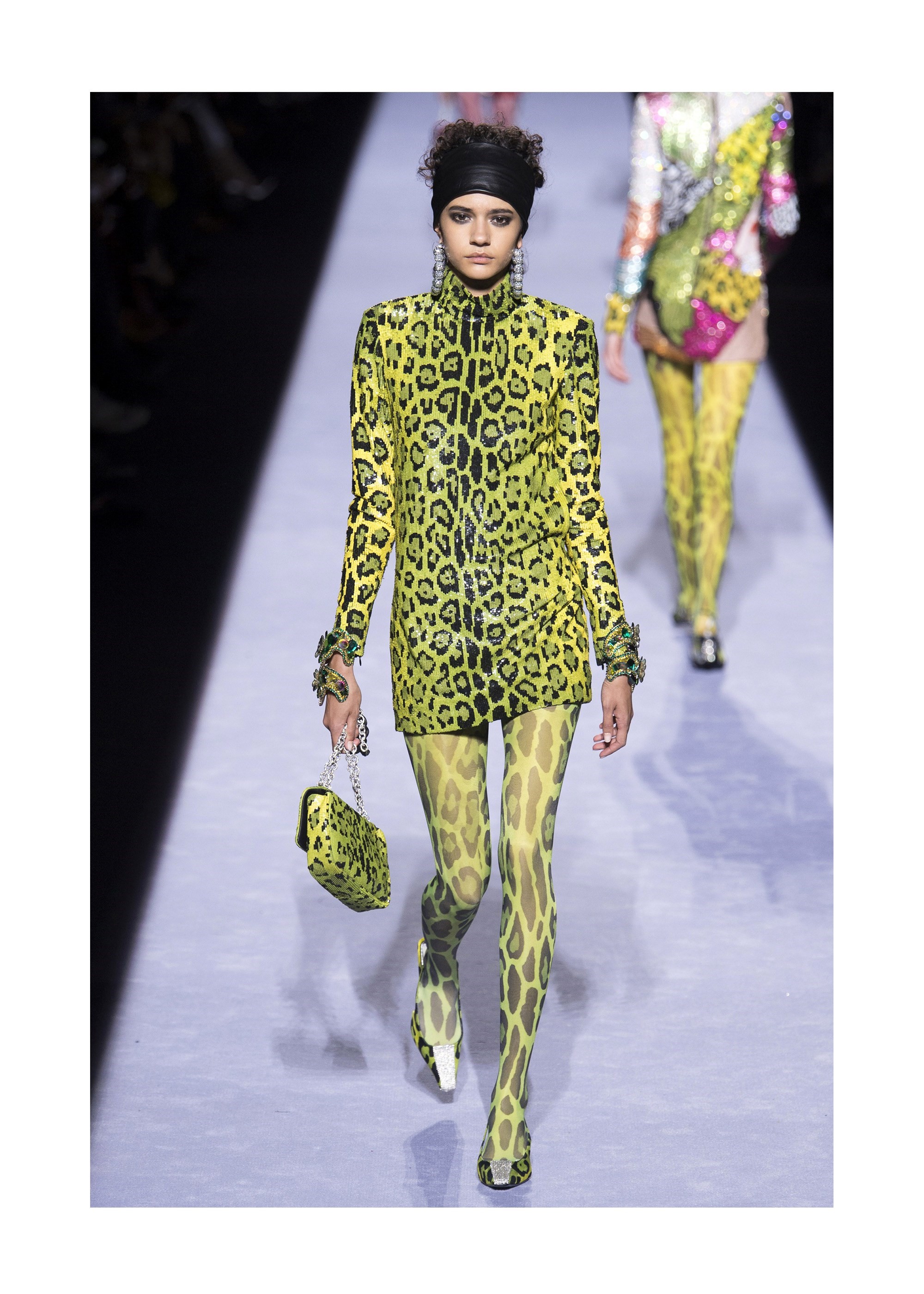
This season, the two strongest Sprousean statements emerged, fittingly enough, in New York City, at Marc Jacobs and Tom Ford. Both were distinct, different, and strong – homages rather than rehashes, evocative rather than exhuming. Tom Ford’s ideas came via Edie Sedgwick, her oversized hoops and wide headband were omnipresent. She was a Sprouse heroine – born in 1953 in Ohio in the American Midwest, a teenaged Sprouse plastered his walls with her image; later, he Xeroxed images of Edie’s kohl-ringed eyes to create artwork in 1976, and her likeness stalked his catwalks for the entirety of his career, in leggy cut-out shifts and skinny T-shirt dresses in Warholian brights, even when the era and the aesthetic were ostensibly out. Ford’s came in neon leopards, beaded and printed with matching tights and low-heeled, glittering pumps. They socked a Sprouse-level punch.
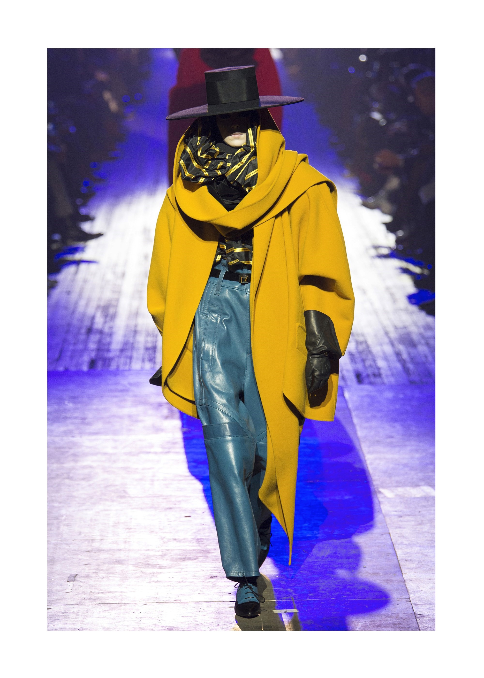
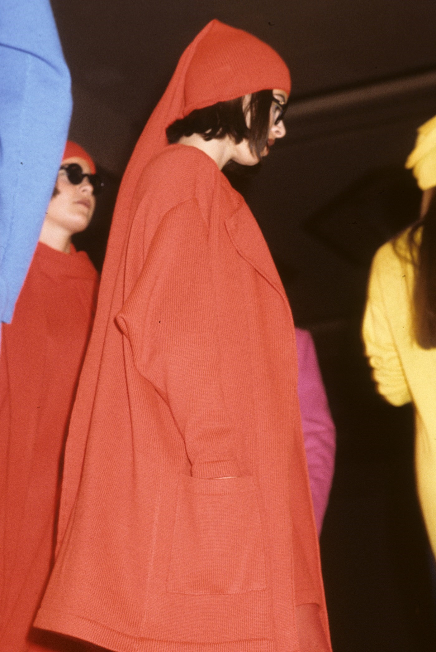
Marc Jacobs’ ode was different – to Sprouse himself, rather than the heroines that inspired him. “I loved his clothes, I was a real fan,” Jacobs said. “They were just really cool New York kind of clothes.” In his own winter collection, an ode to the exaggerated silhouettes and electric colours of the 1980s, Jacobs paid homage to numerous talents that had shaped his aesthetic – the rich colours and fabrics of Yves Saint Laurent; the silhouettes of Claude Montana via the work of Tony Viramontes. But the greatest swipes, for me, were at Sprouse – his opening four looks were vast, square-shouldered overcoats, executed with swaggering confidence in that brilliant palette of searing, unapologetic colour. They blasted through the darkness of Sprouse’s breakthrough show, staged on May 1st in the Ritz, not a poncy Paris hotel but an East Village club packed to the rafters with a crowd of 2,500 – including Andy Warhol – and they glowed out of the show in Jacobs’ show in the uptown Armory. In the 1980s, those coats were dubbed ‘power-dressing’ and they, like the rest of Sprouse’s legacy, are still potent, and powerful, today.
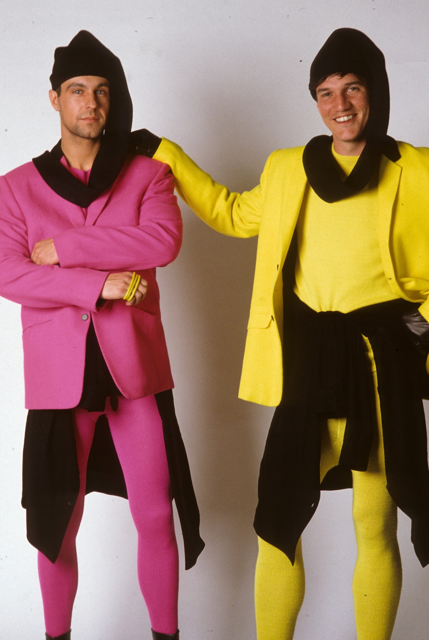
It’s easy to boil Sprouse down to a look. Unlike so many other designers, past and present, he had one that was all his own: abbreviated shirts, luxed-up sweatshirt dresses and biker jackets, jarring fresh-from-the-spraycan neon colour, prints of stuff like bullets and nails and safety-pins. A sharpness, an edginess, nothing soft bar the materials, if you got close enough to touch them. But more than that, it was an ideology – something begun by Yves Saint Laurent in the 1960s and Chanel in the 1920s, and carried through by Sprouse – that of reflecting what was going on in the street in your clothes but refracting it, elevating it, designing it. Sprouse’s clothes were the perfect foil for their time – their closest contemporaries were the clothes created by Vivienne Westwood and Malcolm McLaren. Incidentally, Sprouse originally wanted Haring to design his graffiti prints, but the artist was under contract to Westwood and McLaren’s ‘World’s End’. (Haring created the graphics for the Winter 1983 ‘Witches’ collection.) Arguing that Westwood and McLaren were a mirror to Sprouse is easy, because it’s accurate – he even had his own version of the Sex Pistols: Debbie Harry, who he dressed in a one-shouldered dress printed with television static for her band Blondie’s Heart of Glass video in 1978, and garnered immediate international recognition. While Westwood and McLaren were impaling the Queen on safety pins and dressing young Londoners as pirates and savages, Sprouse was lifting street graffiti and printing it onto Italian Agnona cashmere. Both approaches were quintessentially punk. It’s that attitude – of questioning establishment values, of rebellion, of innovations – that is Sprouse’s strongest legacy. And exactly what designers should, and hopefully will, be mimicking today.
